


CLIENT NEEDS
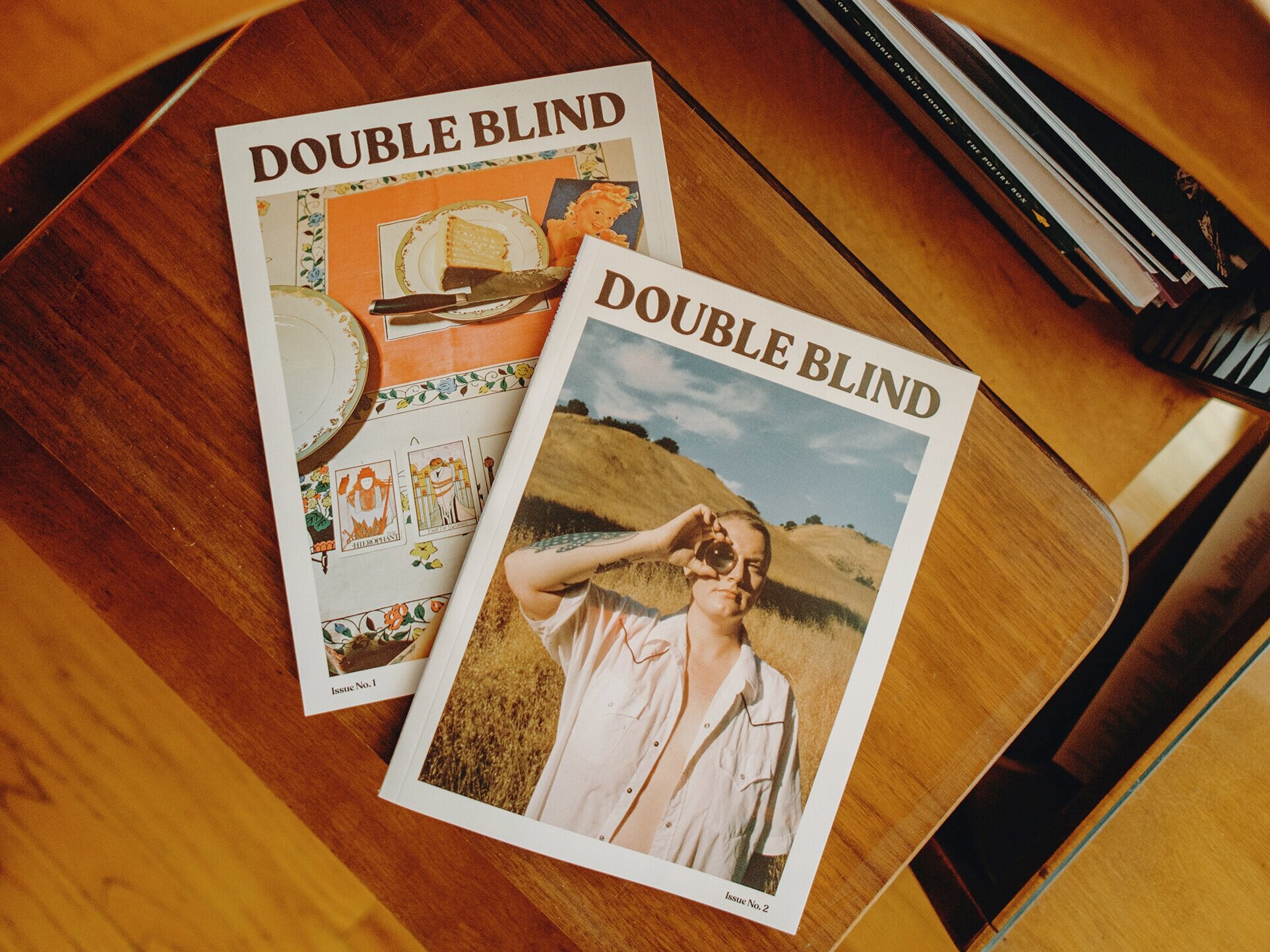
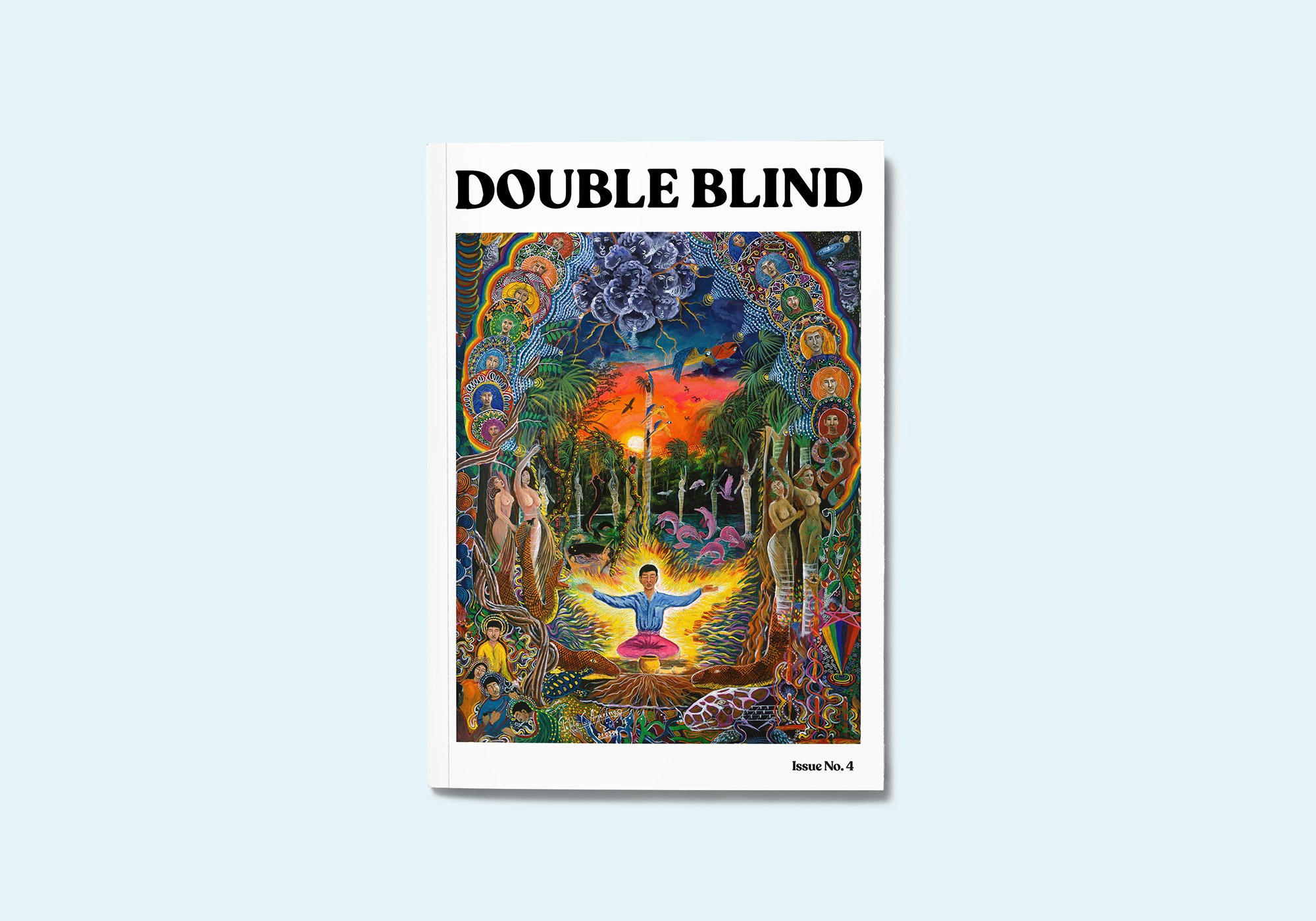
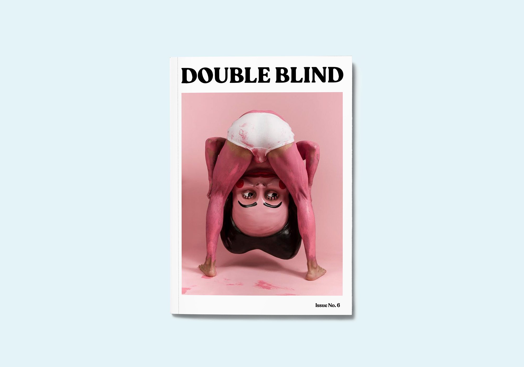
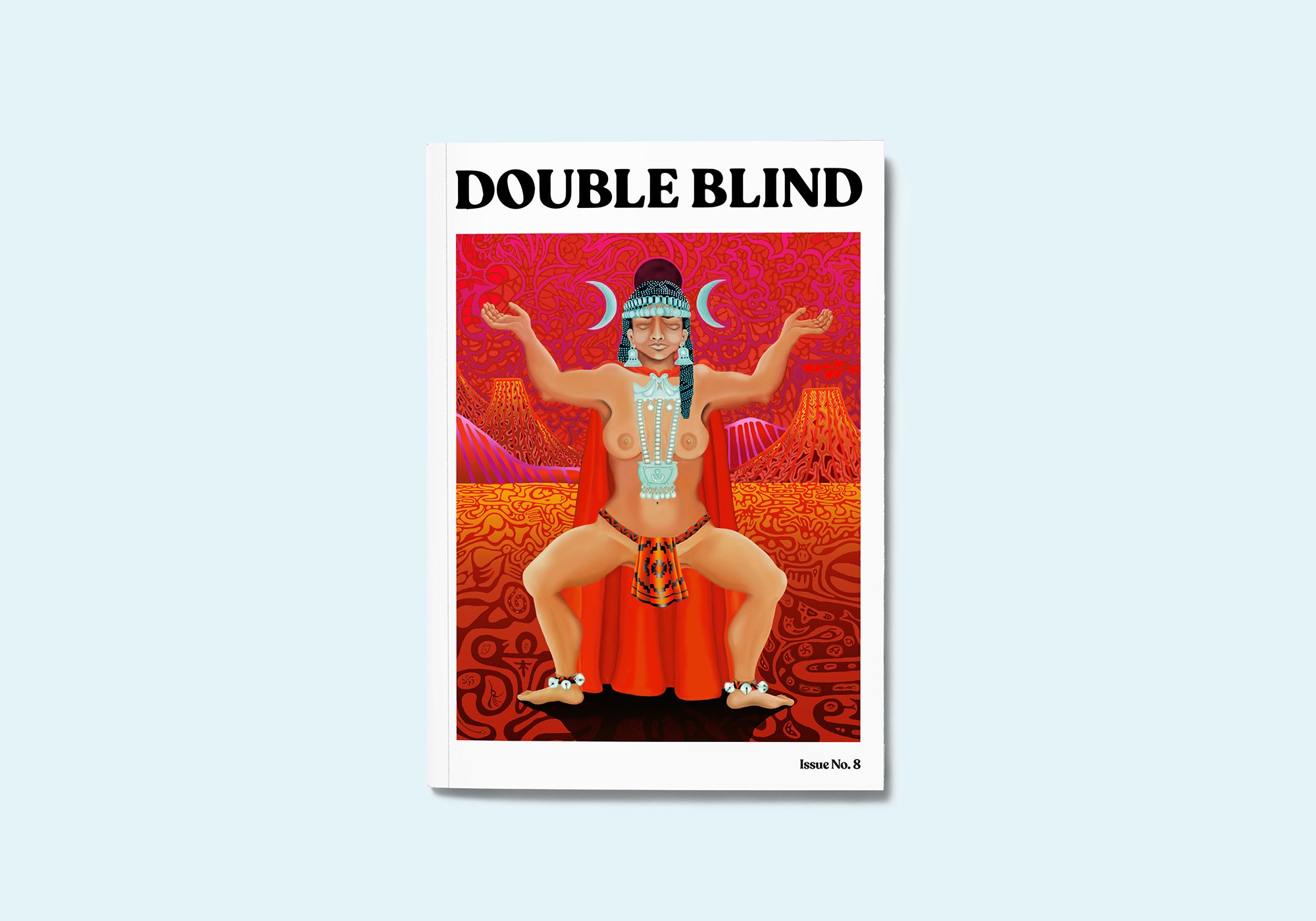
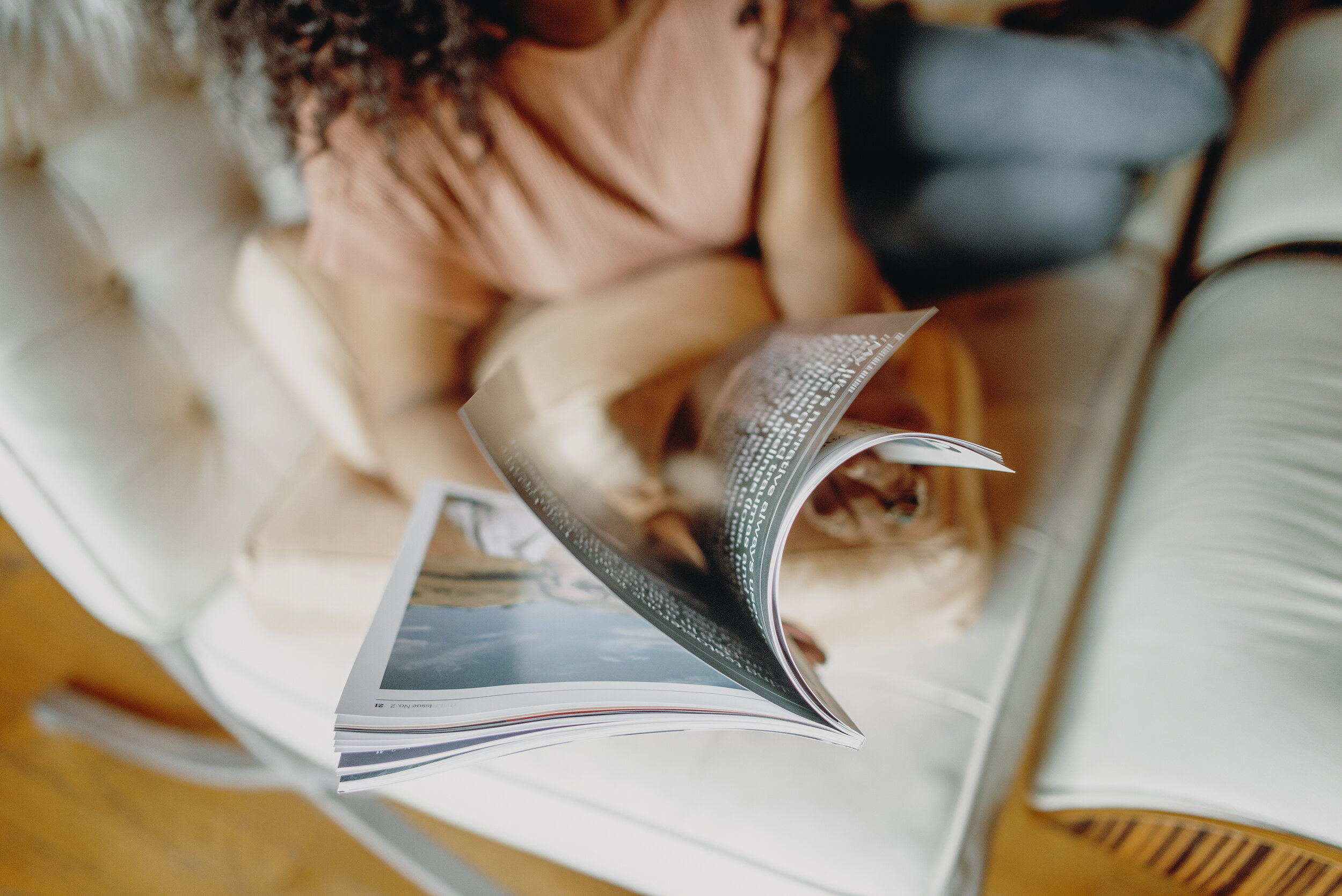
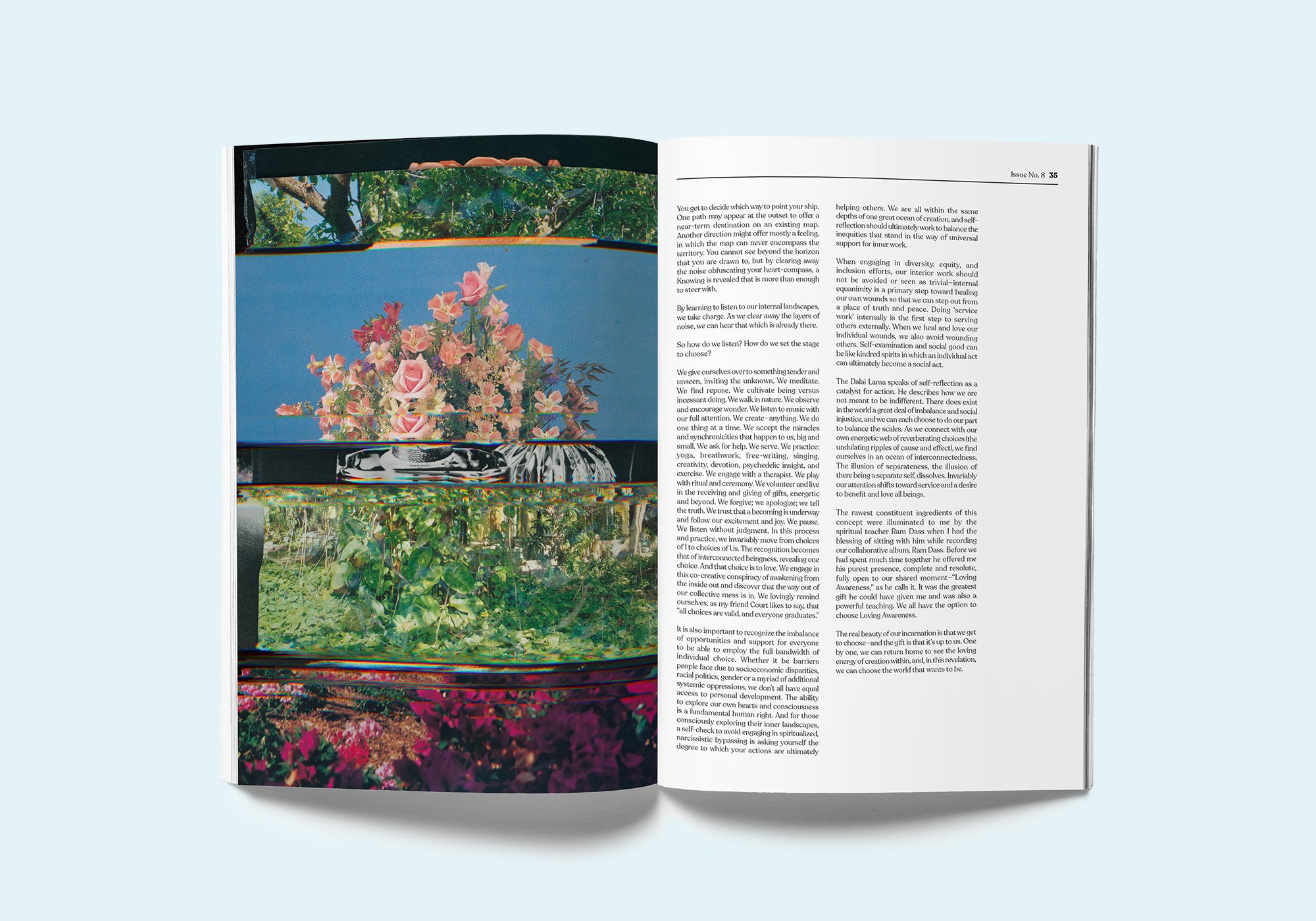
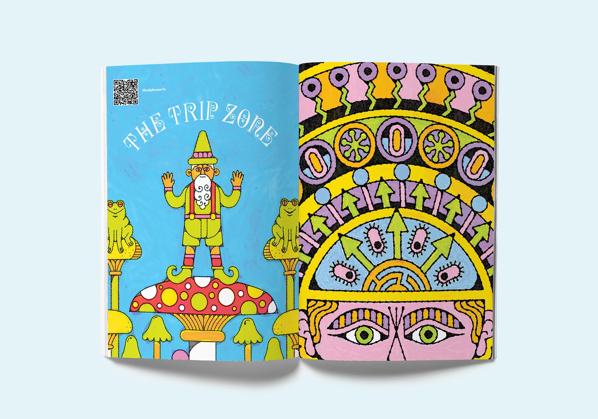
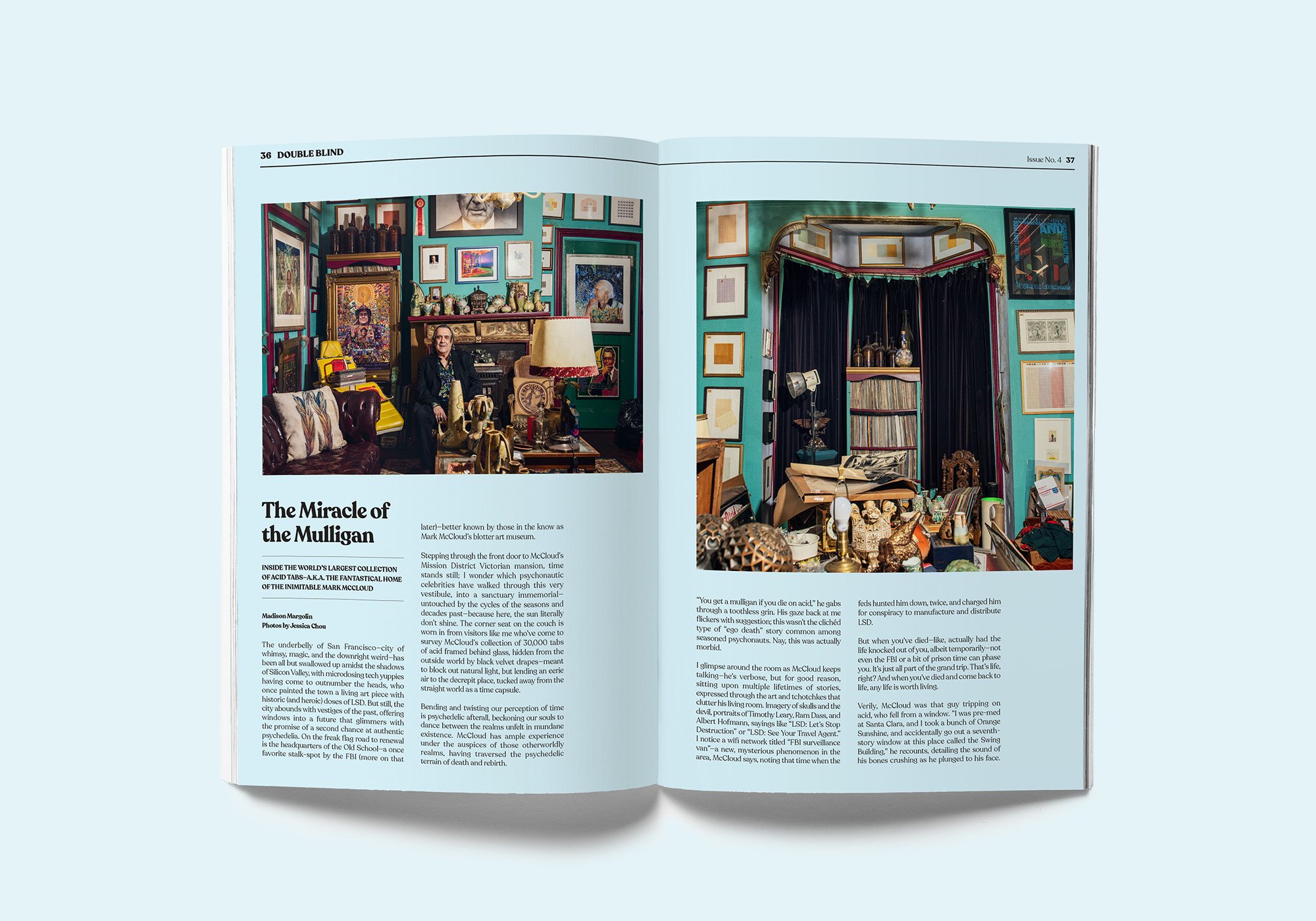
DOUBLEBLIND Magazine, a biannual print magazine and media company covering timely, untold stories about the expansion of psychedelics around the globe, needed a complete brand identity. As a start-up, they needed the design for a print magazine and editorial website.
DESIGN SOLUTION
DOUBLEBLIND takes a deep dive into the world of psychedelics, a taboo topic and aesthetic that is often too playful and unrefined. To compliment the echelon of content in the publication, a minimal design with negative space, bold, yet soft colors and impactful artwork including photography and illustrations were combined to elevate the brand. Click here to see DOUBLEBLIND featured in The New York Times.
MY ROLE
I was and remain the Creative Director of DOUBLEBLIND from its inception. I created the brand identity including logos, the print magazine, and the website. I worked with the Editor-In-Chief as well as the Photo Editor, Web Developer, and Social Media Strategist to create a contemporary, vibrant look and feel for the publication across both print and digital channels. More recently, I was tasked to create the first psychedelic billboard ever in Times Square for DoubleBlind. Click here to visit the DOUBLEBLIND website.
Uploaded by DAVID GOOD DESIGN on 2017-06-23.
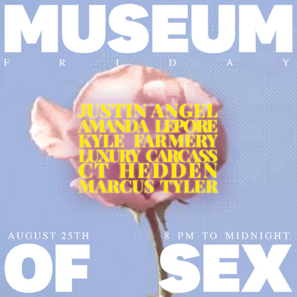
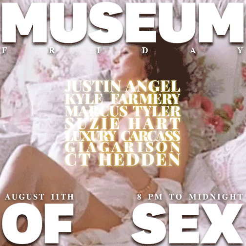
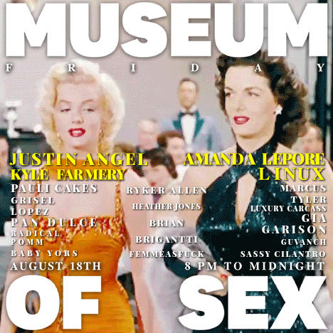
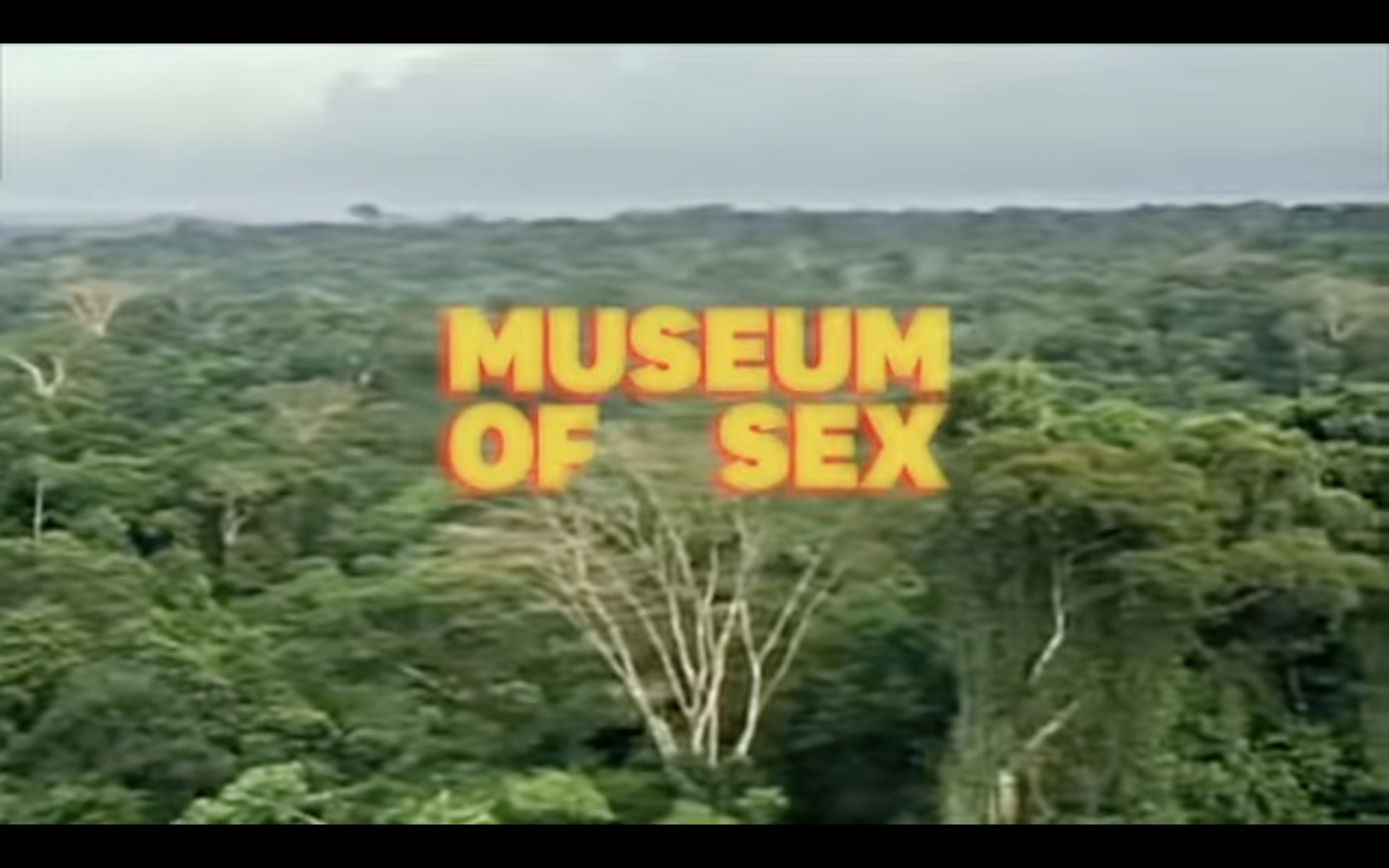
CLIENT NEEDS
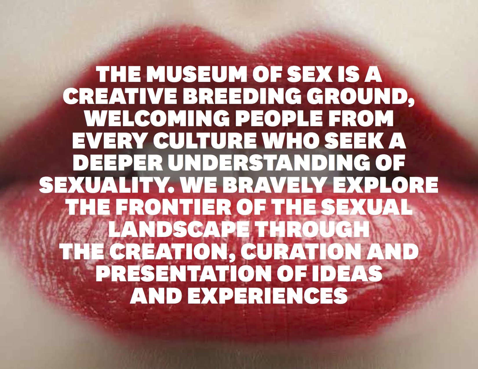
Museum of Sex in New York City showcased an up and coming fashion line named Possessed by designer Grisel Lopez. Museum of Sex wanted promotional material that would be heavily advertised on social media platforms such as Facebook and Instagram. Moving forward, the Museum of Sex and I have partnered to promote events, retail, and current exhibitions.
DESIGN SOLUTION
Rather than designing a static flier, I created a short, abstract video to pique interest. Possessed exhibited their newest snakeskin collection and therefore I incorporated snakes accompanied with an Amazonian jungle theme.
MY ROLE
I was the sole designer on the videos, choosing and editing the clips in addition to selecting the music. I functioned as a brand strategist, design consultant, and social media manager for their social media channels. Check out the video below to see a short social media promotion I wrote, directed, shot and edited with the world famous icon and activist Amanda Lepore!
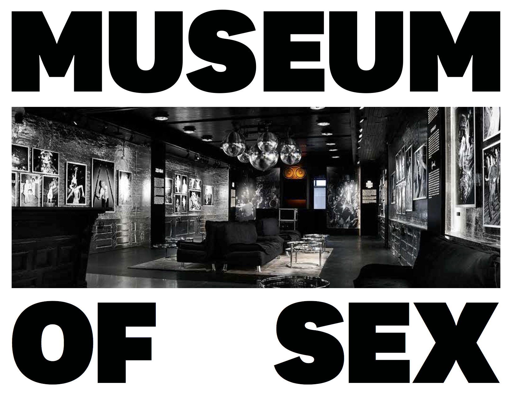
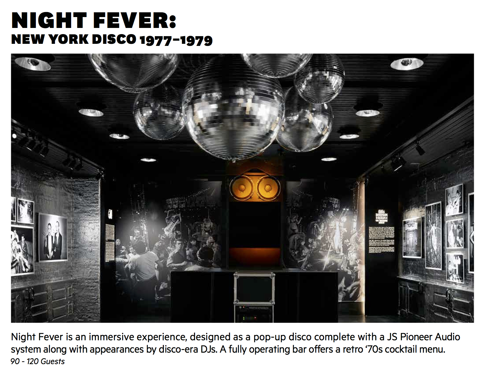
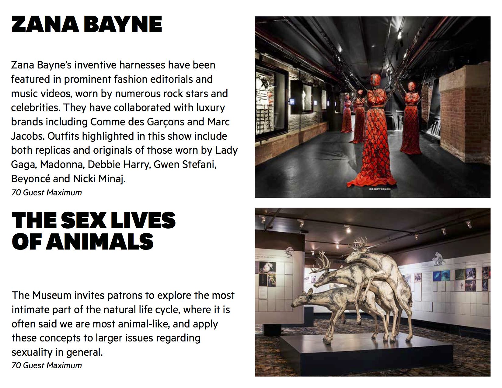
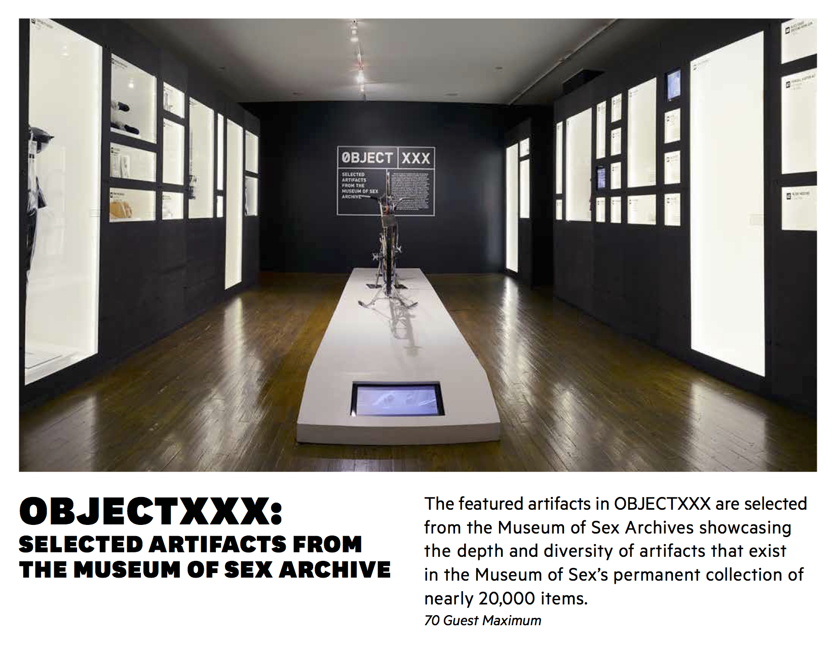
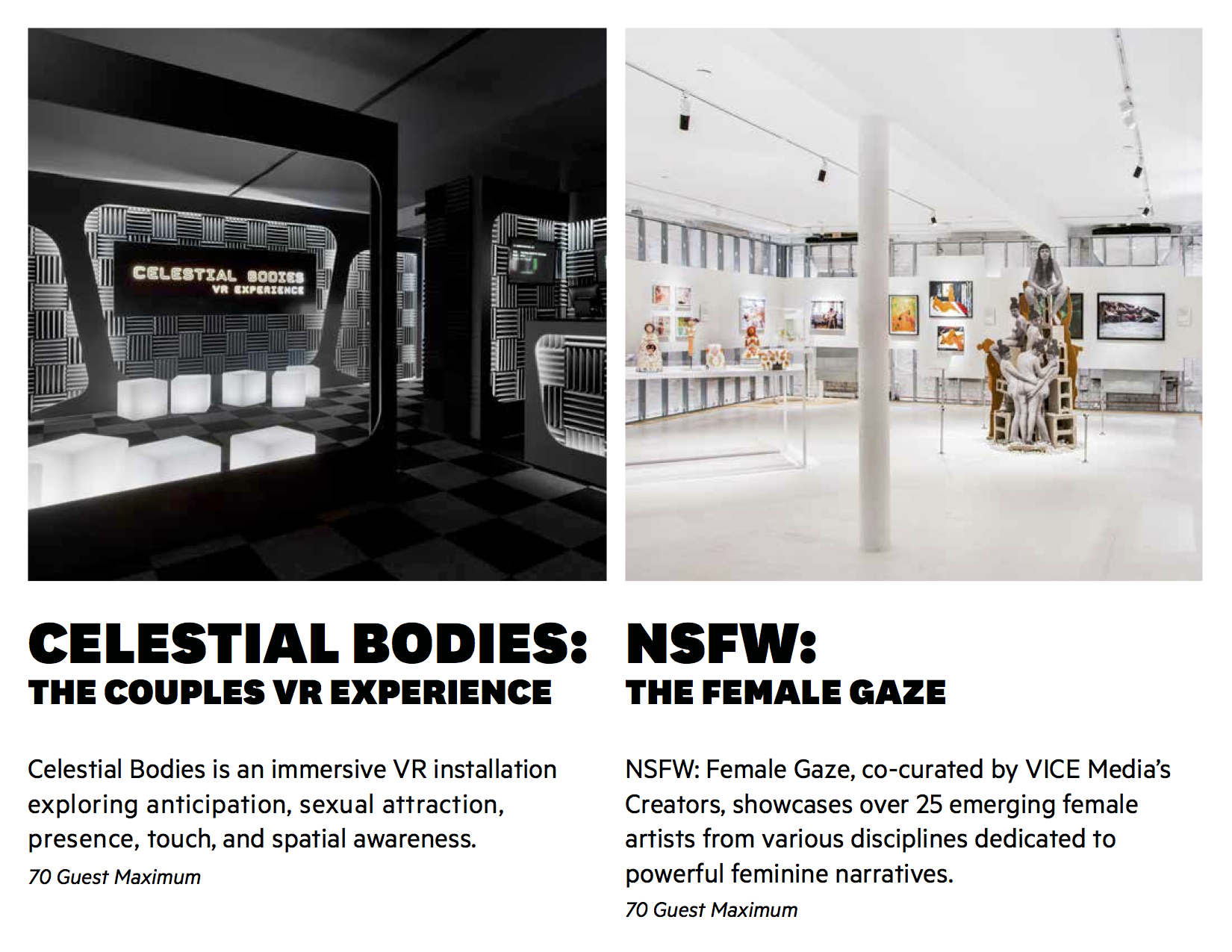
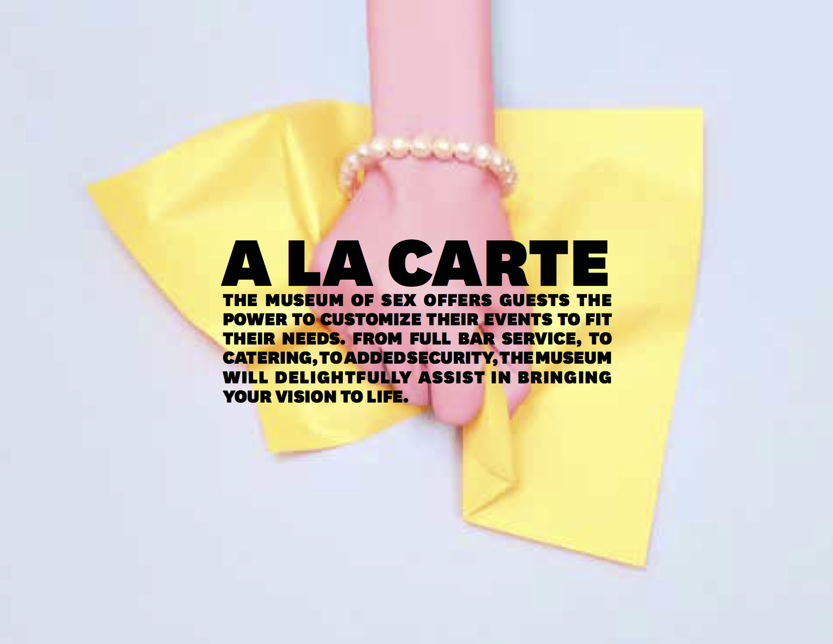
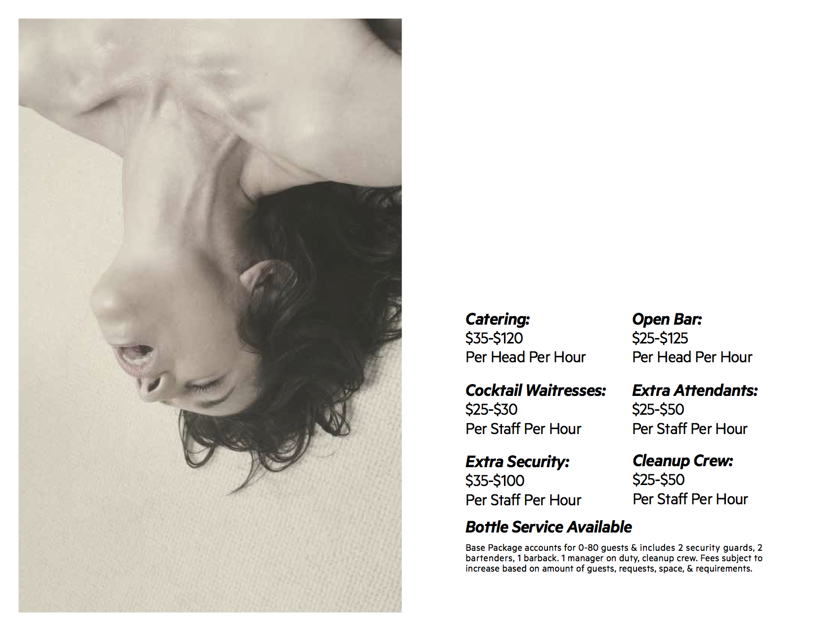
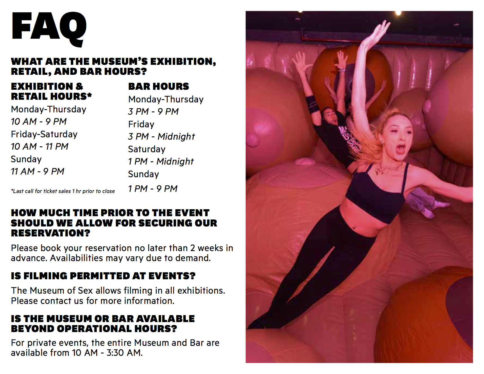
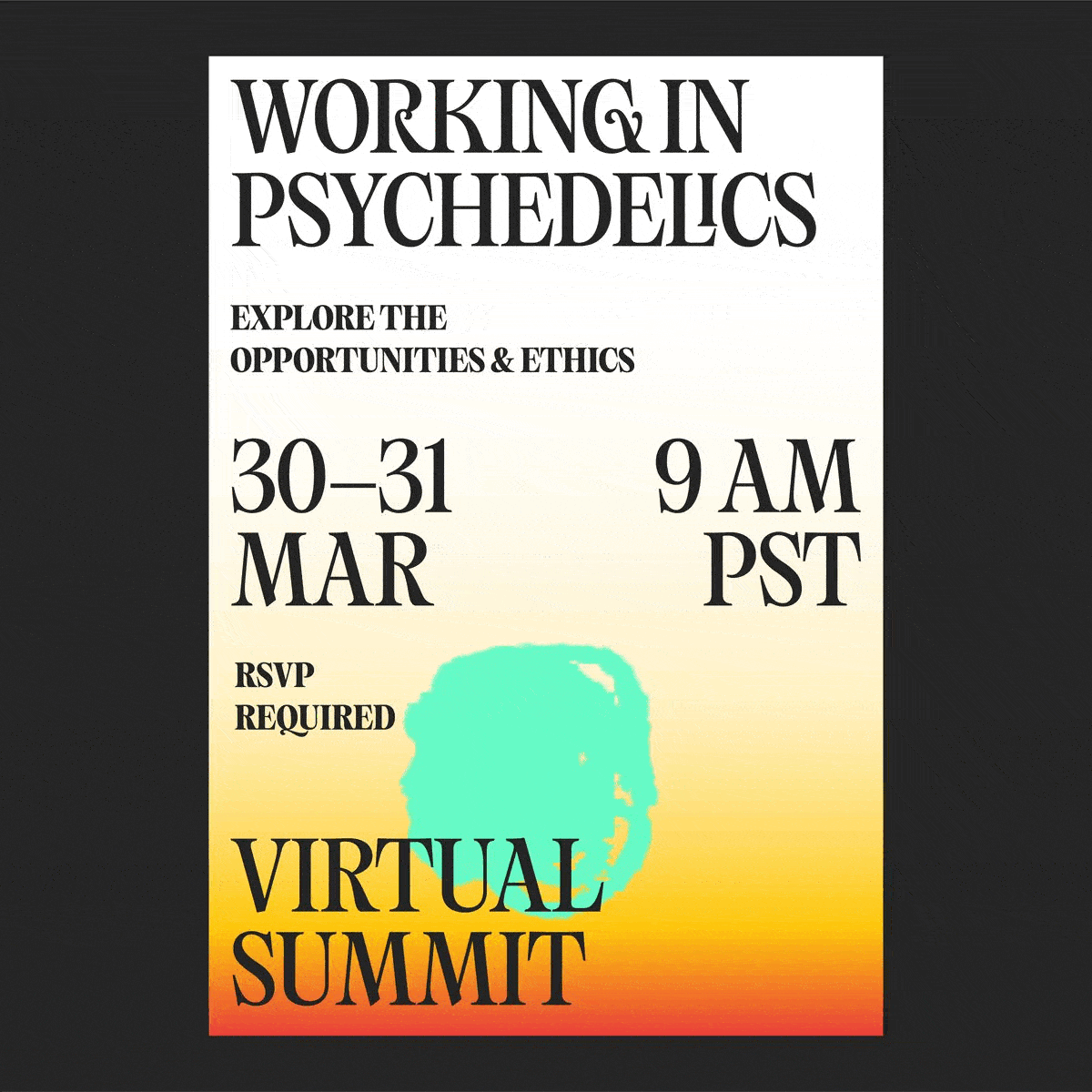
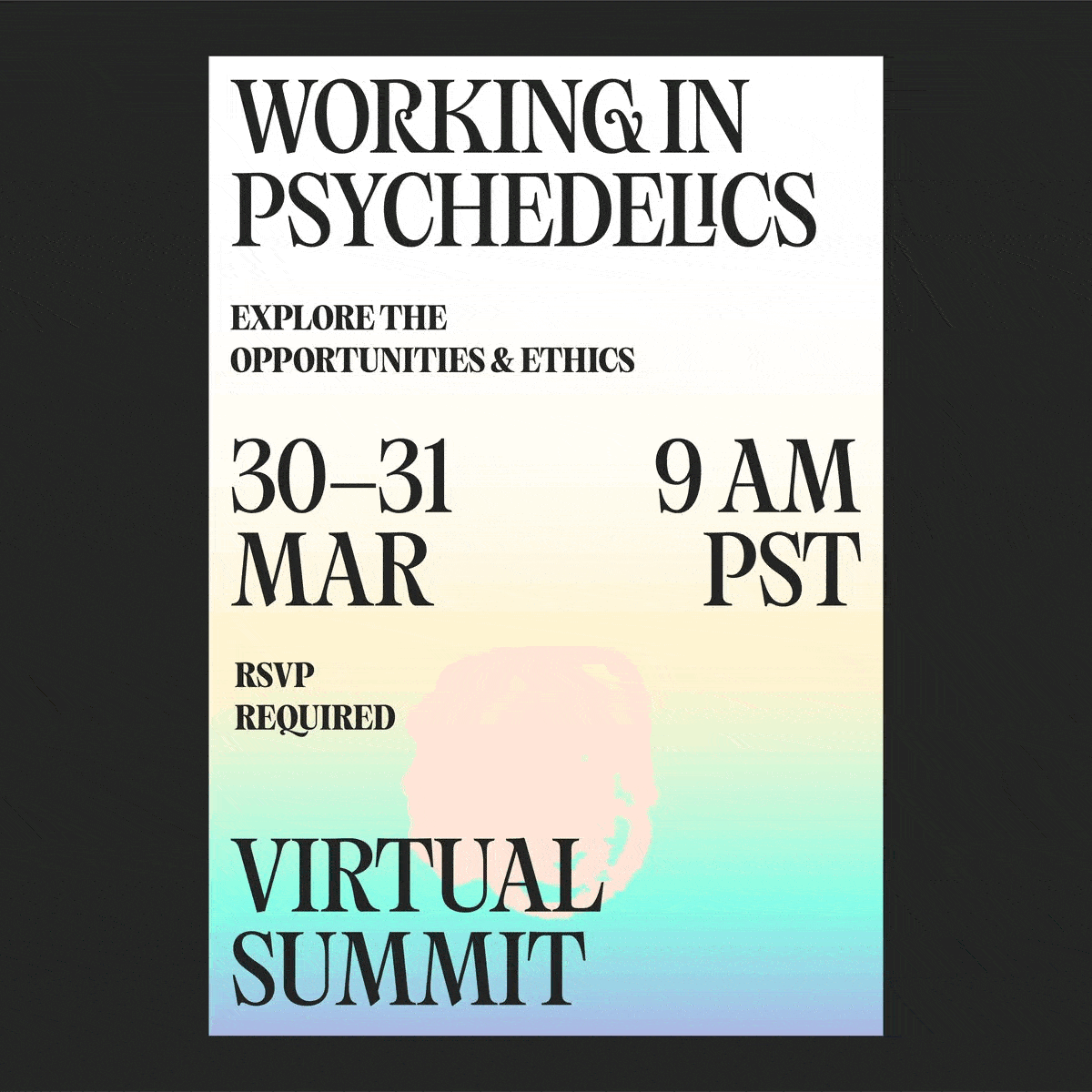
CLIENT NEEDS
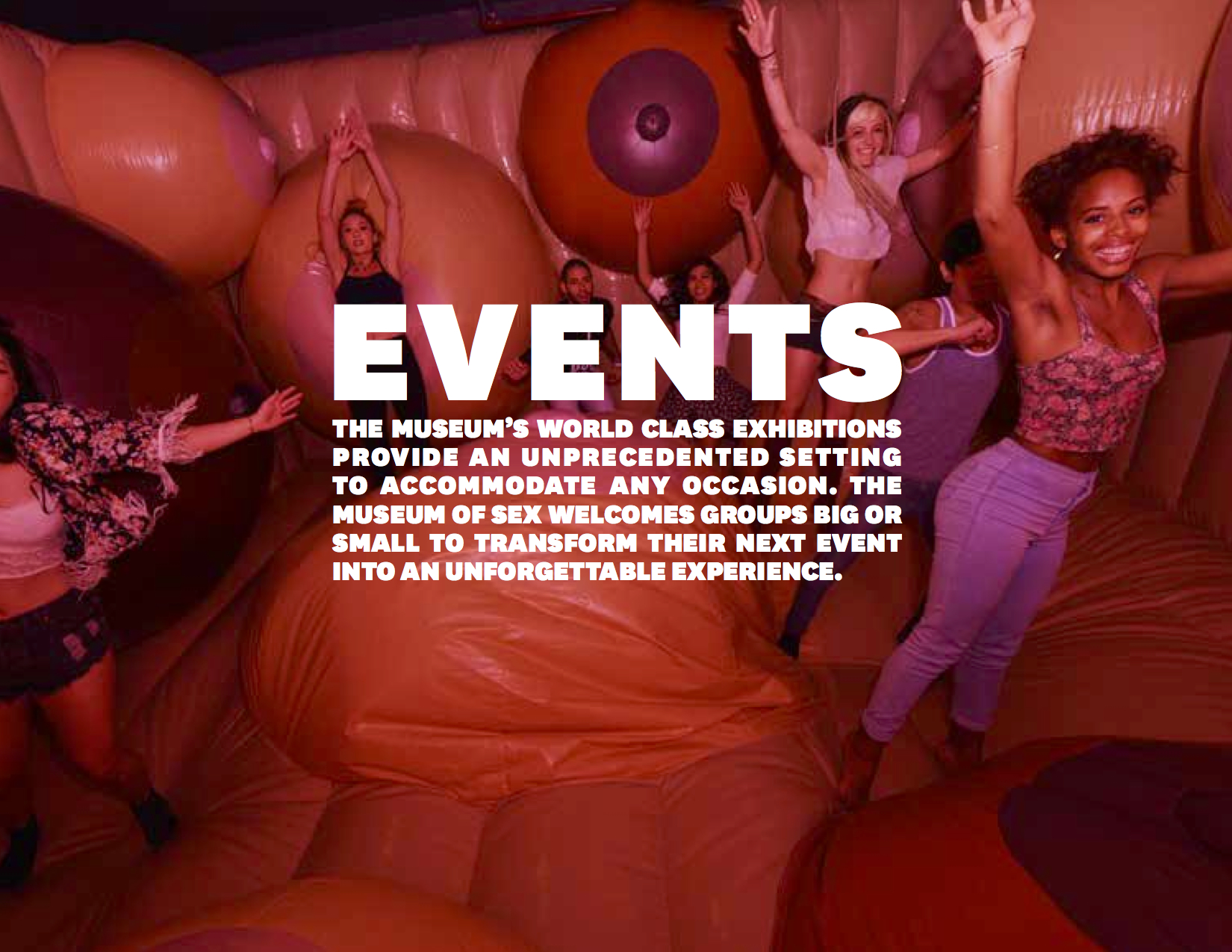
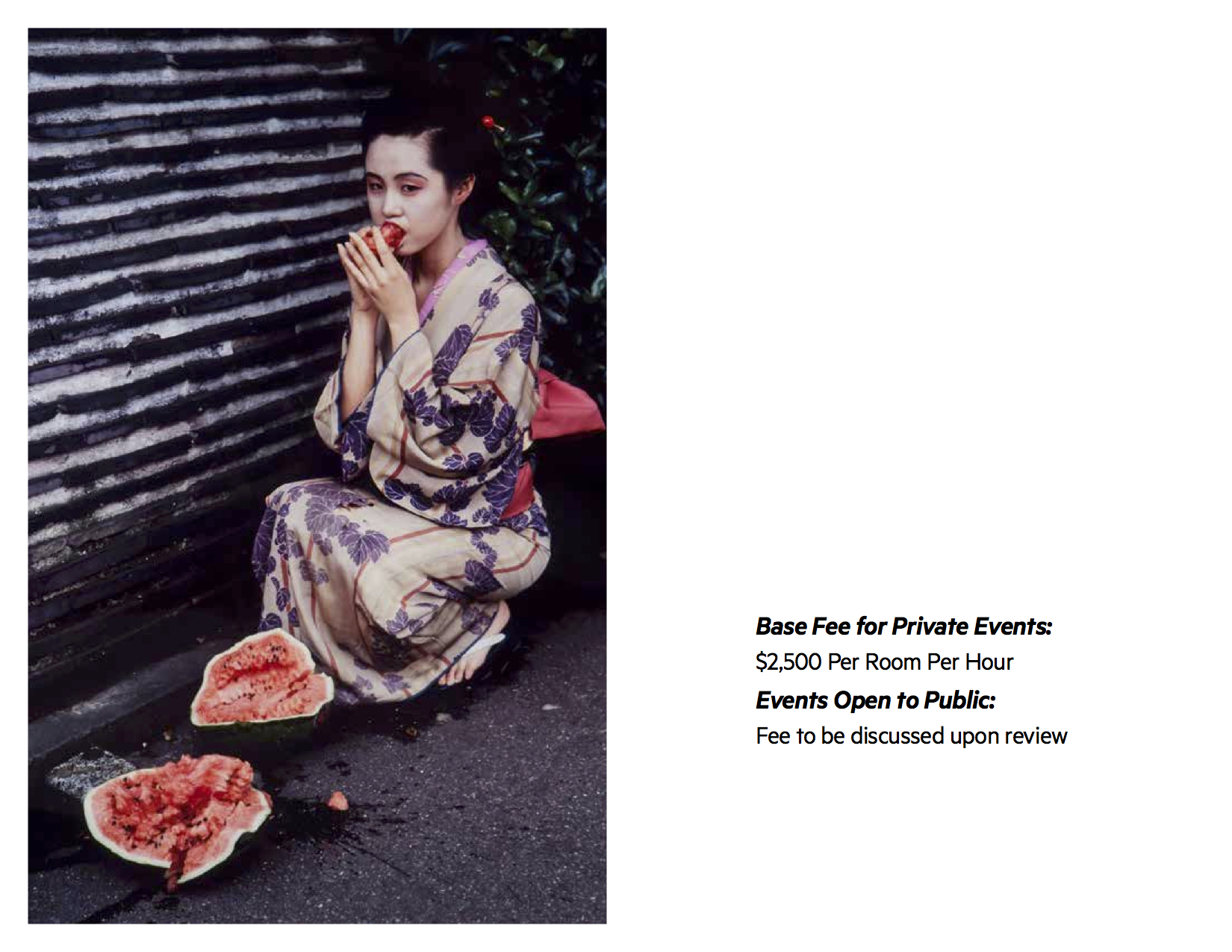
Museum of Sex needed a presentation deck for current and potential clients inquiring about hosting private events at the Museum. The presentation deck needed to be appropriate for a wide variety of audiences, yet consistent with the Museum of Sex brand.
DESIGN SOLUTION
Through the bold and deliberate use of photography, clean layout, and typographic selection, the presentation deck feels sophisticated, yet seductive. The largely image-driven design makes it approachable to the reader.
MY ROLE
I was the designer on the presentation deck - selecting images and type in accordance with the established brand guidelines. I wrote original copy and edited pre-existing copy.
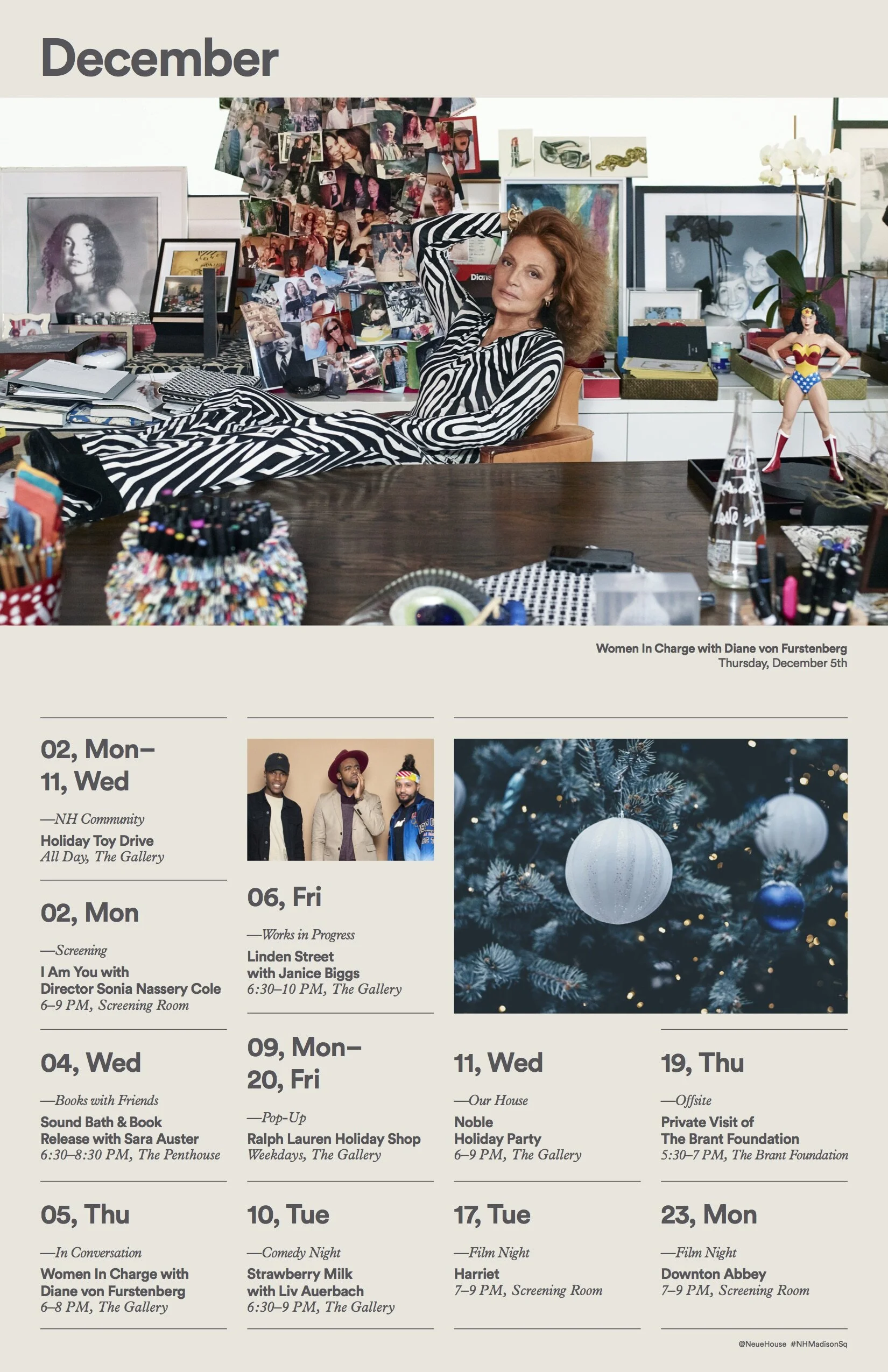
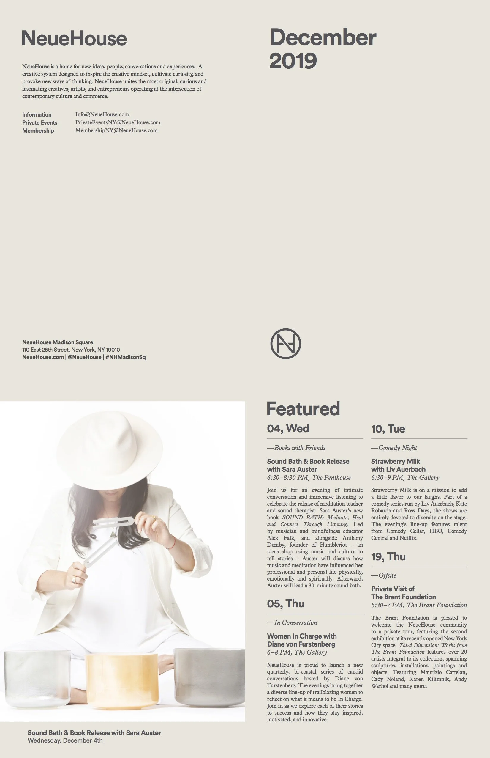
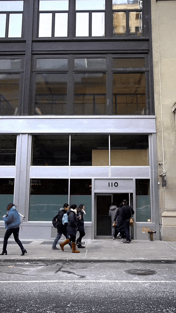
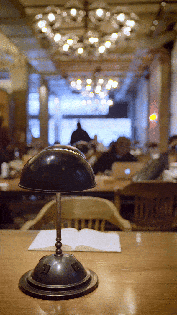
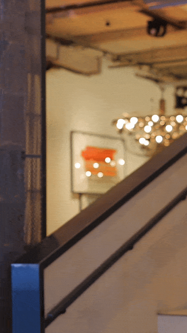
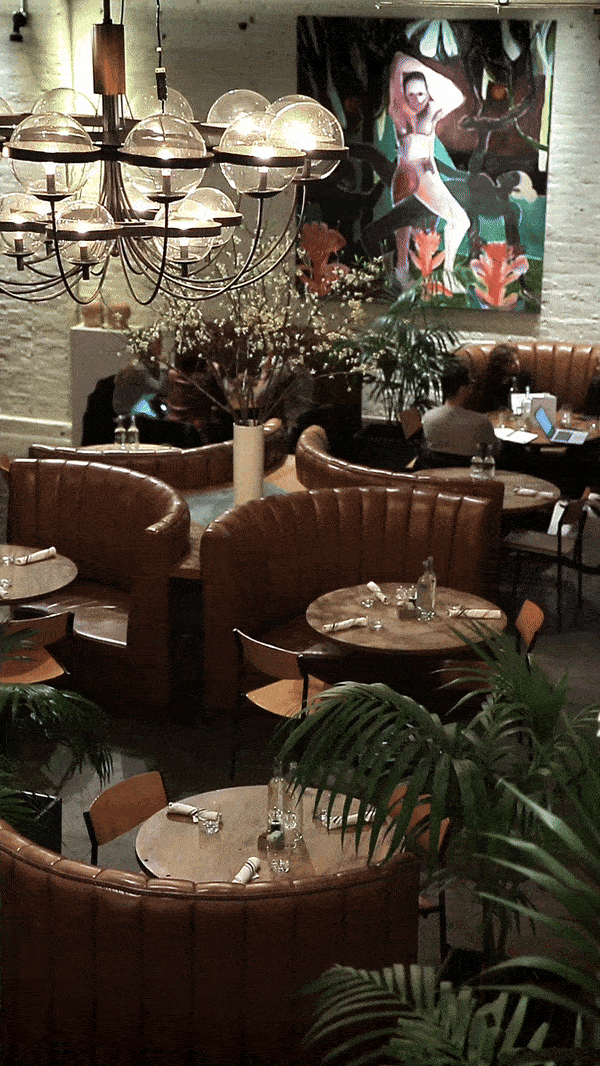
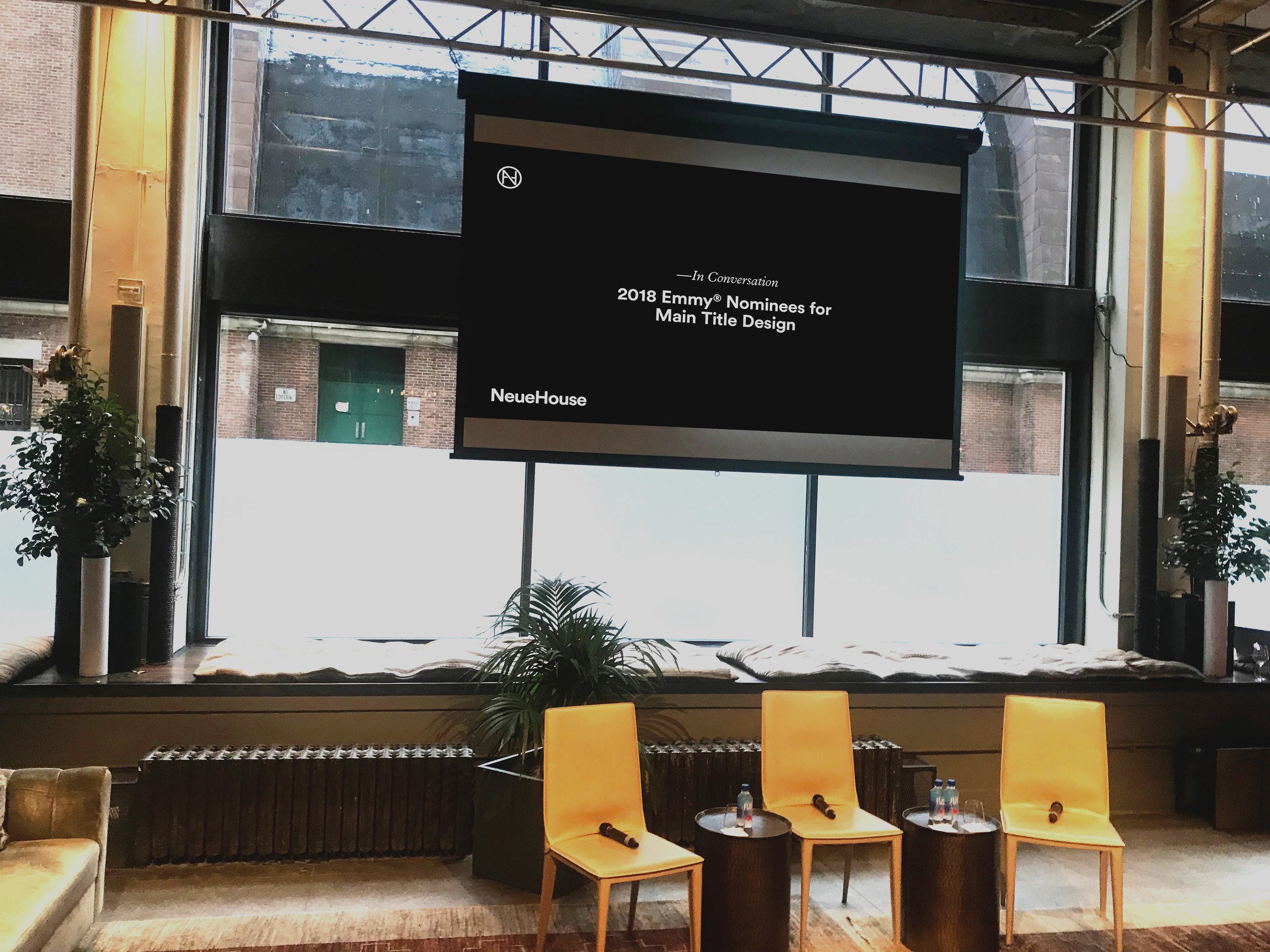
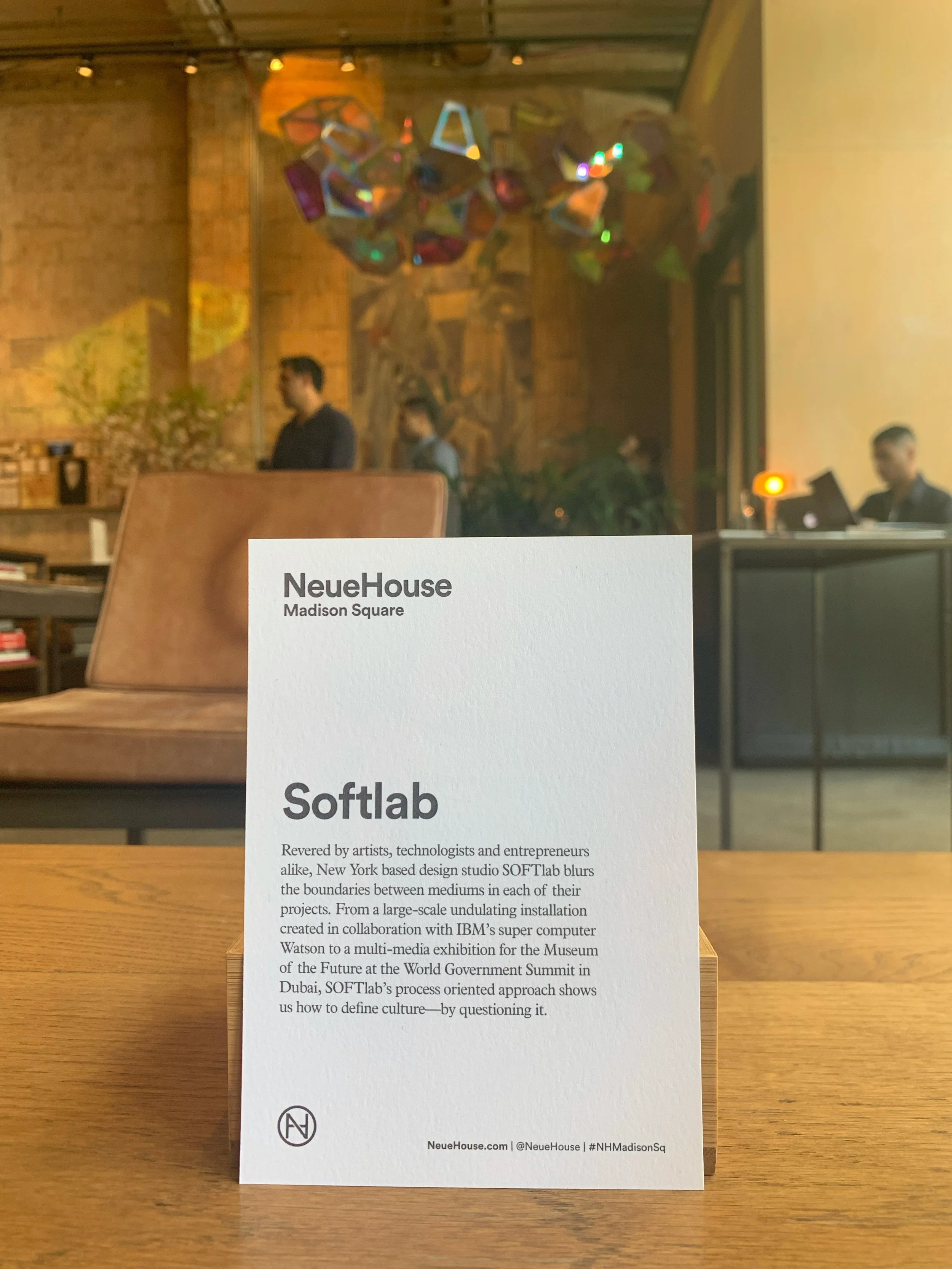
IN-HOUSE NEEDS
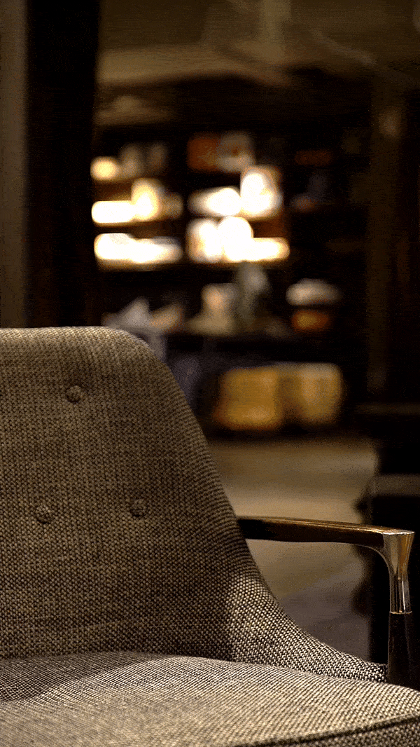
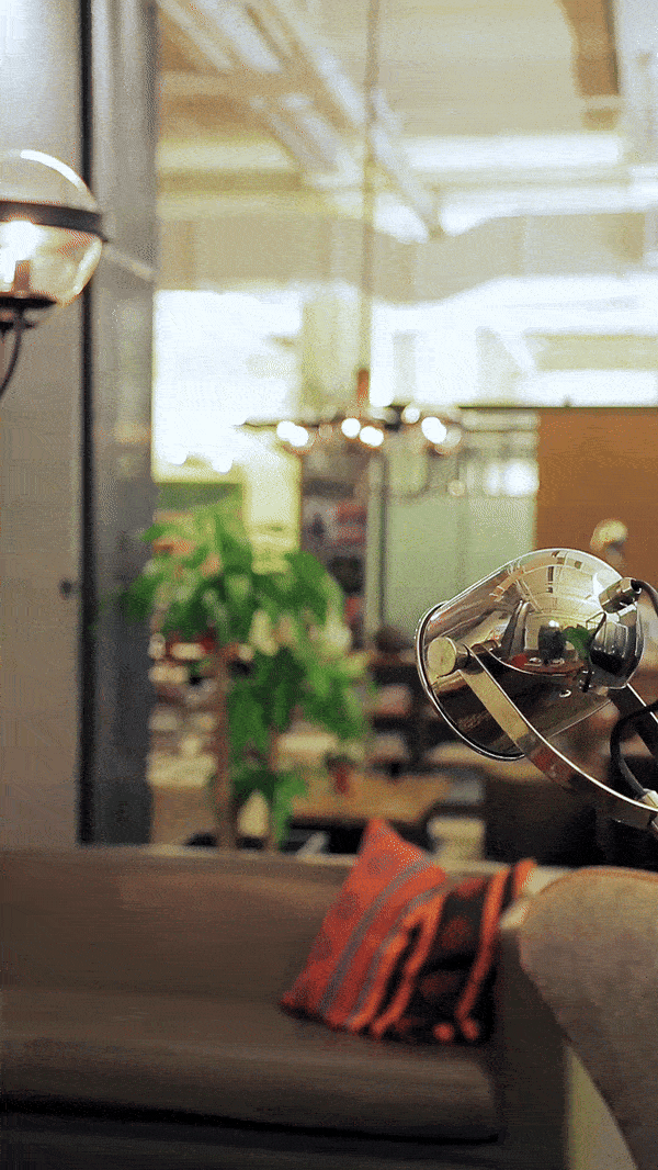
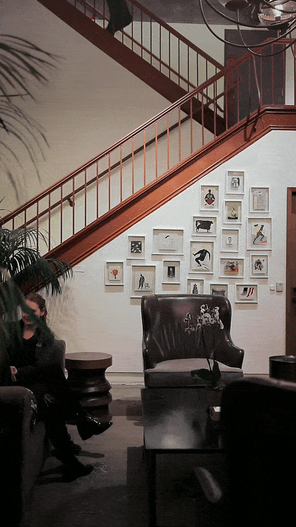
NeueHouse is a private co-working space offering exclusive, world-class programming and hospitality to its members. With locations in Madison Square and Hollywood, California, NeueHouse has been home to movie premieres, New York Times’ panels, and discussions with acclaimed creatives such as fashion icon Diane von Furstenberg and the prominent Chinese artist Ai Wei Wei.
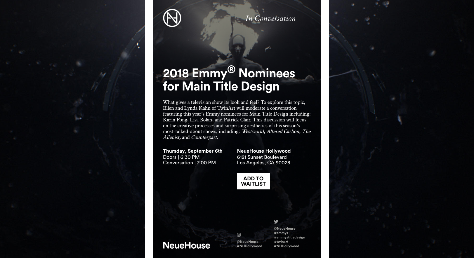
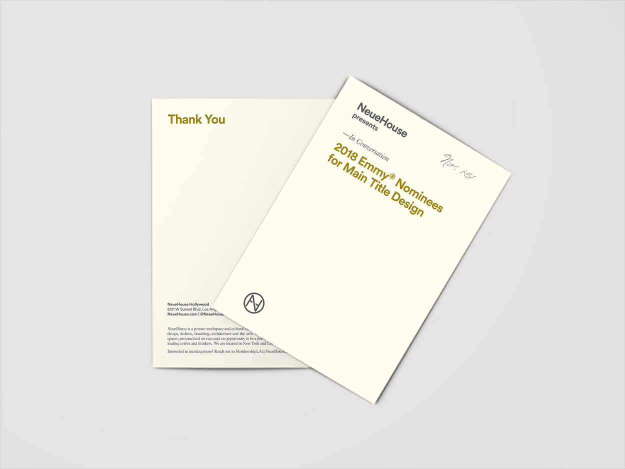
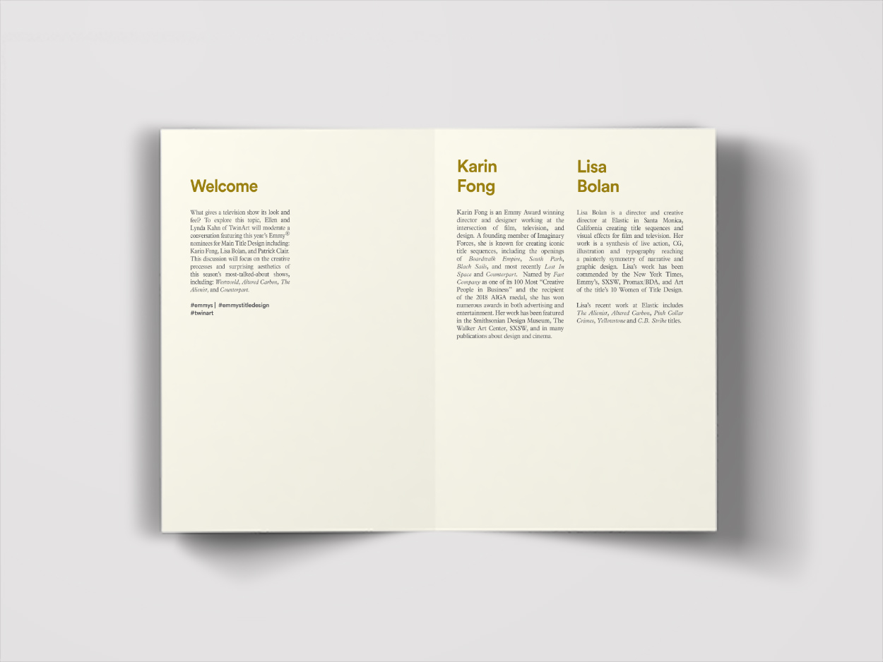
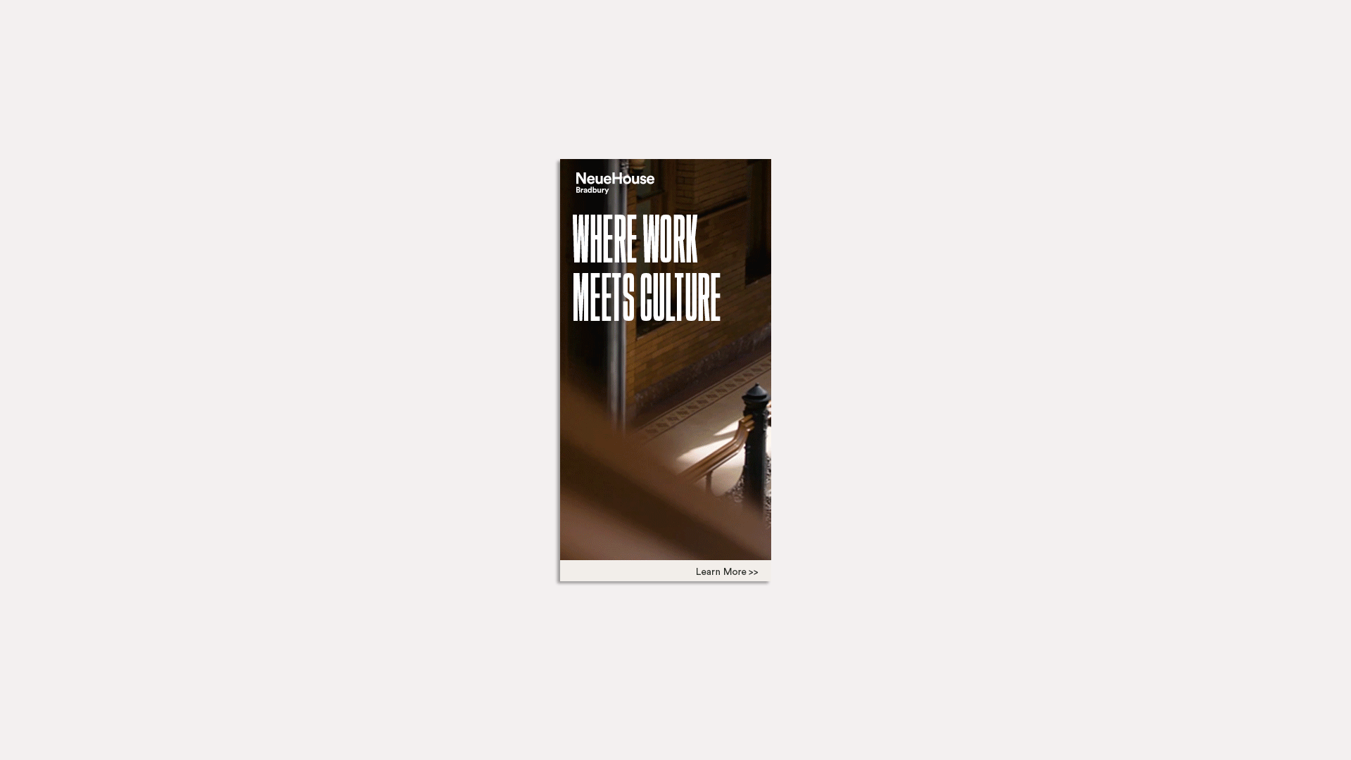
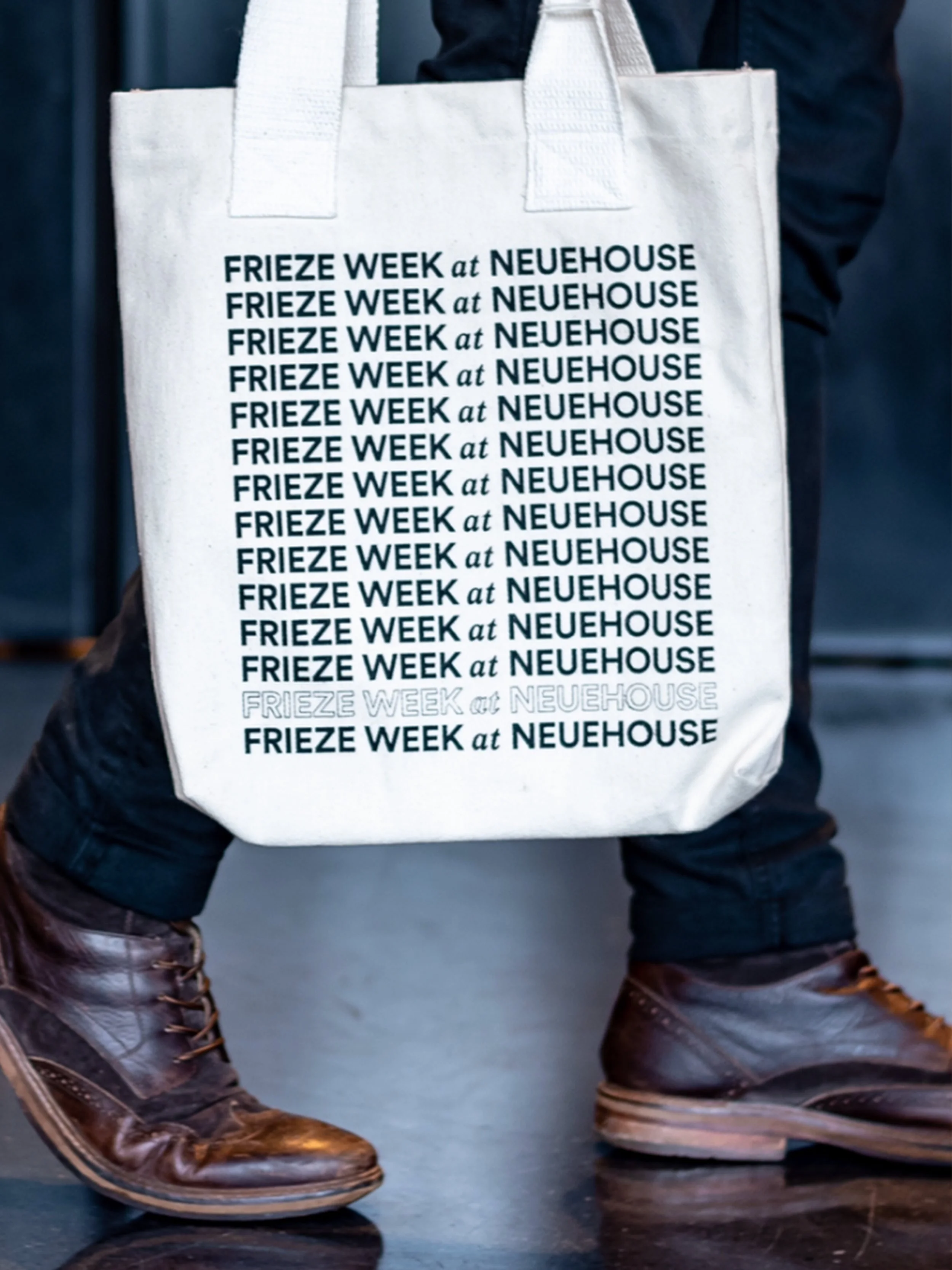
With its far and wide range of services, NeueHouse needed external and internal collateral for their monthly programming such as partner e-invites, folded calendars, brochures, and projeted slides to accompany each event. NeueHouse expanded to its third location NeueHouse Bradbury in Downtown Los Angeles and needed campaign advertisements to be used on partner channels.
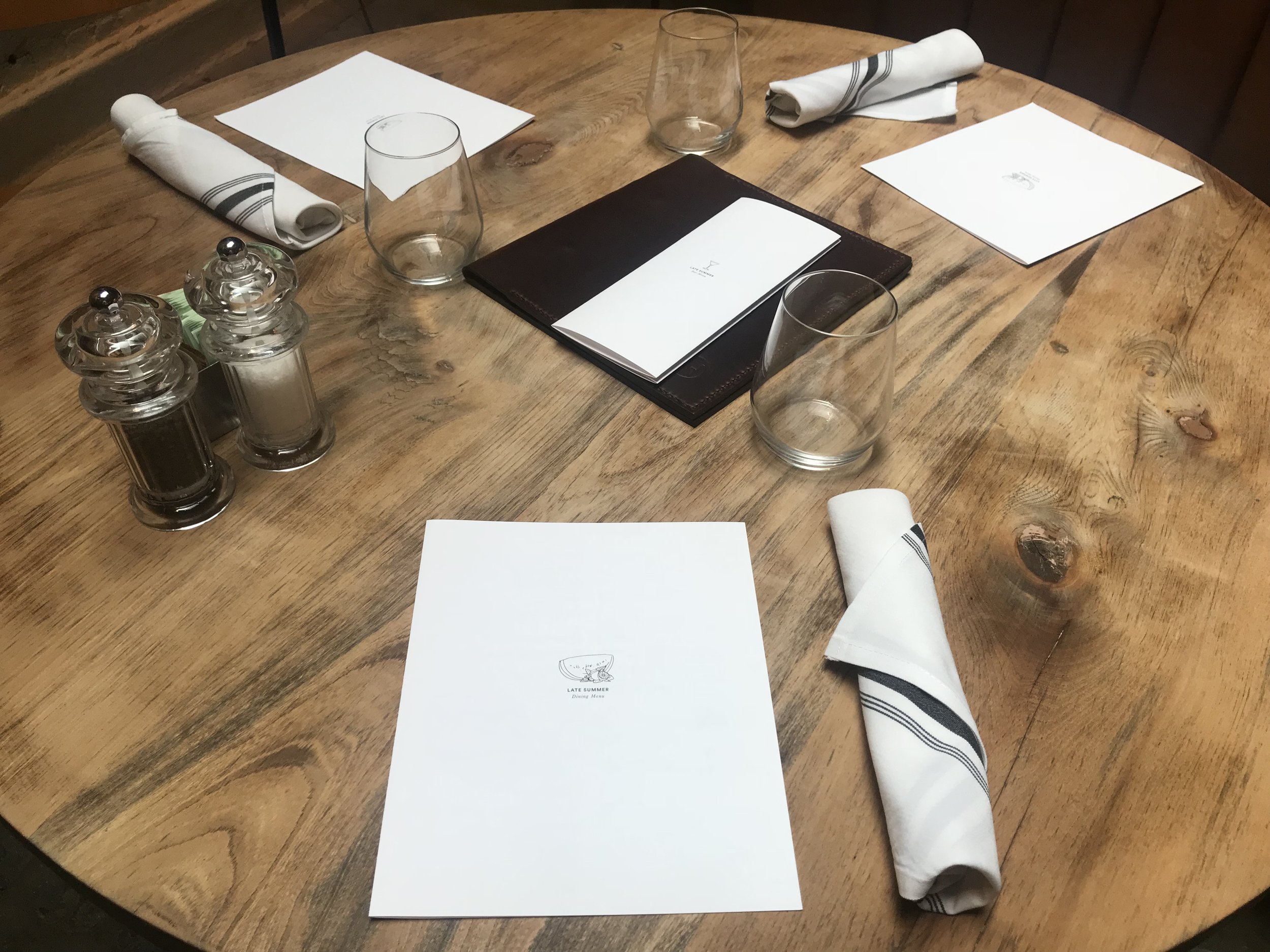
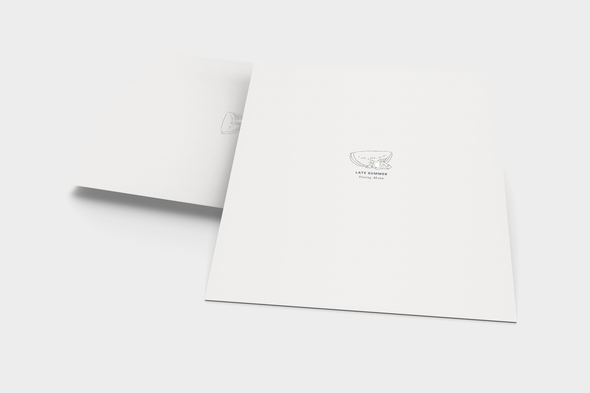
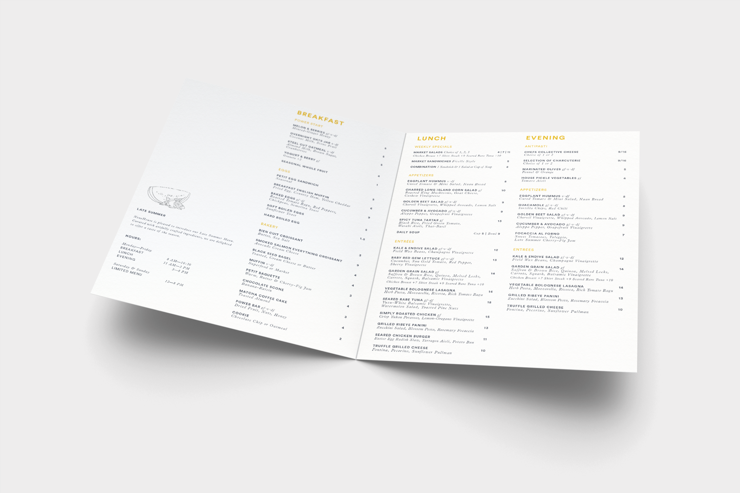
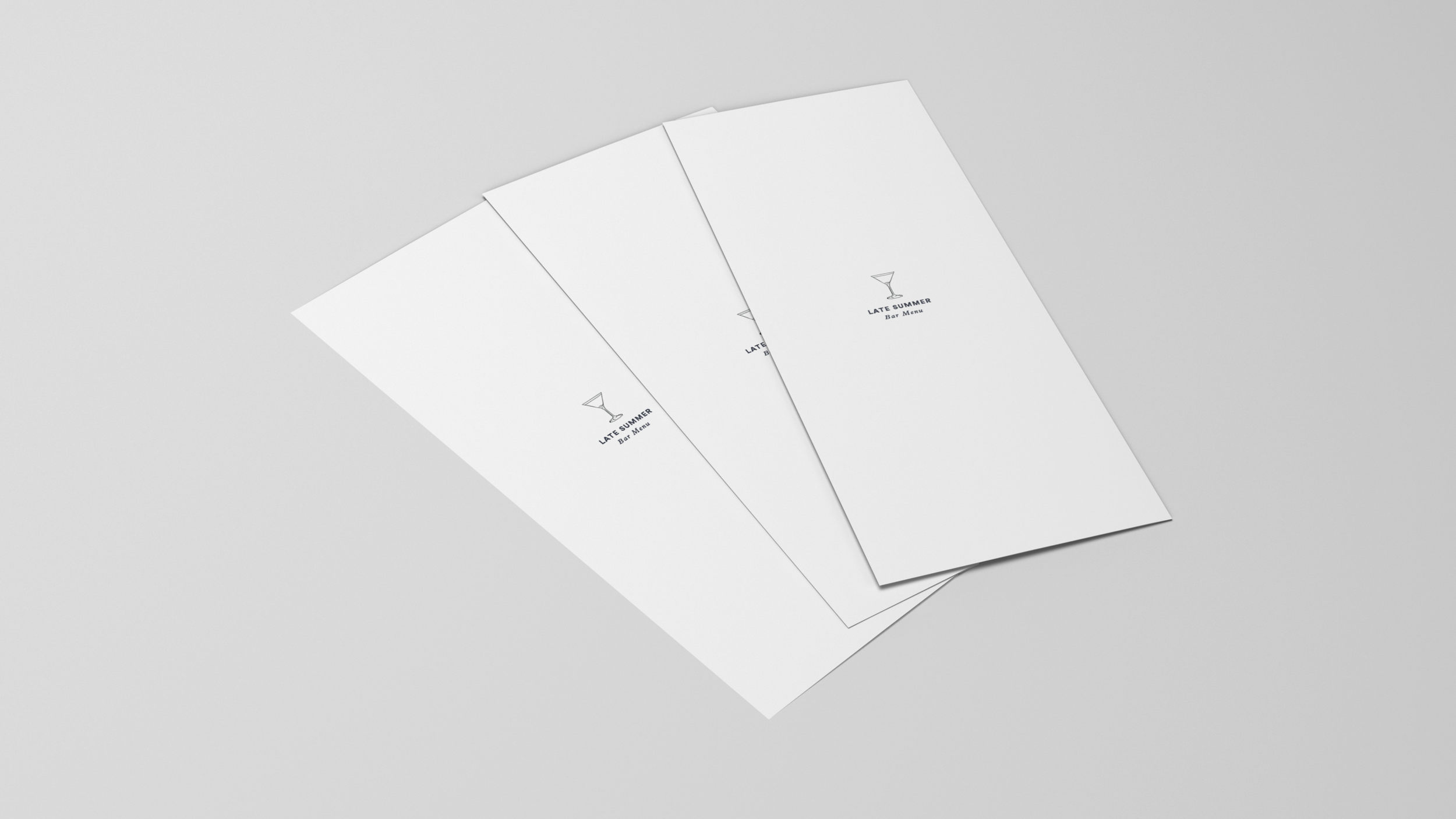
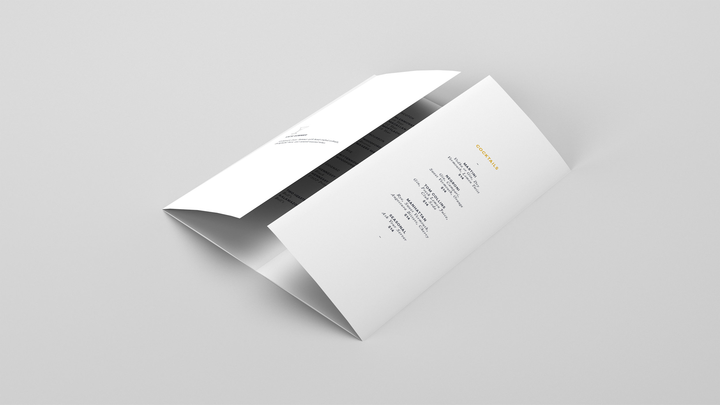
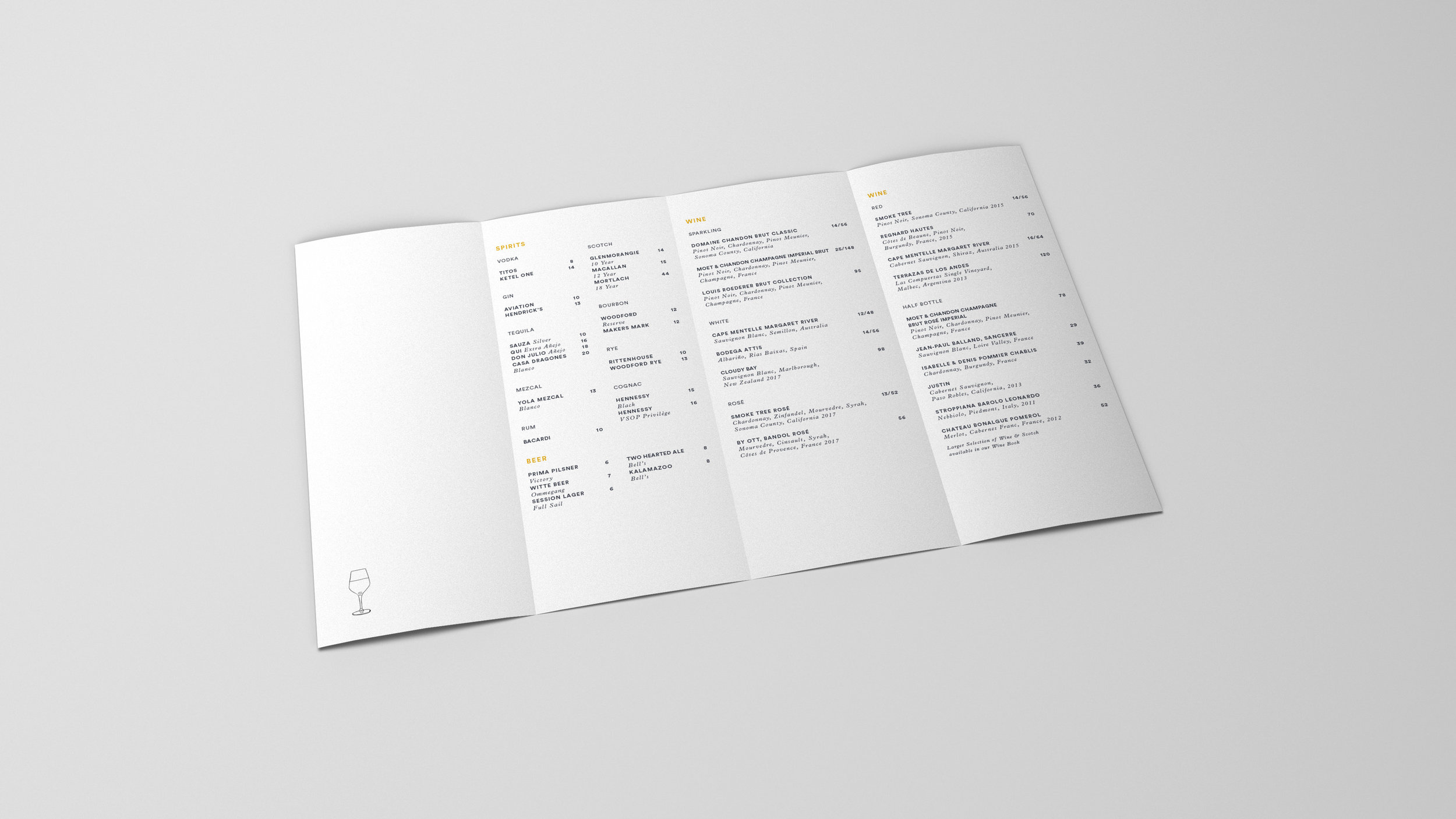
Further, the restaurant in Madison Square wanted to update their menus and signage to coincide with the launch of their much anticipated seasonal menu.
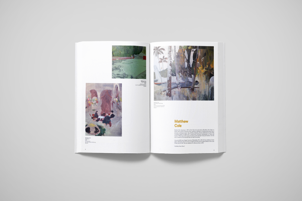
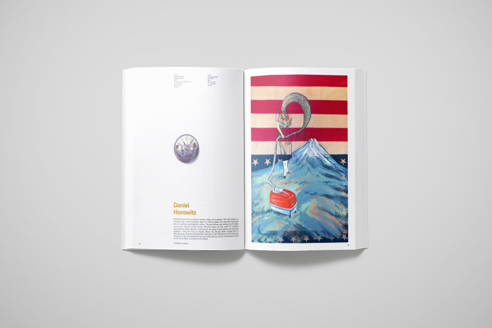
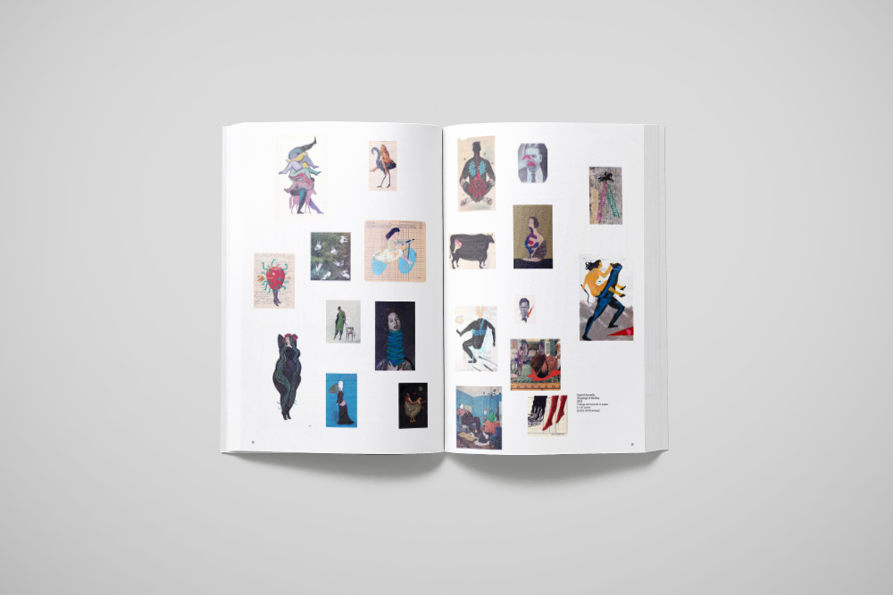
NeueHouse, also functioning as a curated gallery, needed an Art Program detailing work for sale for members to purchase.
DESIGN SOLUTION
Working within NeueHouse’s well-established aesthetic, I created partner e-invites, folded calendars (above), social media video vignettes (above), brochures, and slides for both the Madison Square and Hollywood locations. I introduced both found and original GIFs into their programming collateral, thus modernizing the brand’s communication.
In order to refresh the menus and additional F&B collateral (such as table numbers, menu boards, wine book, and weekly specials), I combined hand-done illustrations with an elegant layout and a meticulous typographic treatment to ensure brand consistency.
I worked within brand guidelines and drew inspiration from high-end art coffee table books to inform the aesthetic of the aforementioned Art Program. Additionally, I created print ads for Emmy Magazine as well as digital GIF ads used on the Frieze website to promote their newest location.
MY ROLE
I worked directly with the art director of NeueHouse creating and executing original concepts, writing copy, and streamlining processes, while also strategizing external and internal communication with the Chief Brand Officer to equip NeueHouse with a competitive advantage in its future pursuits.
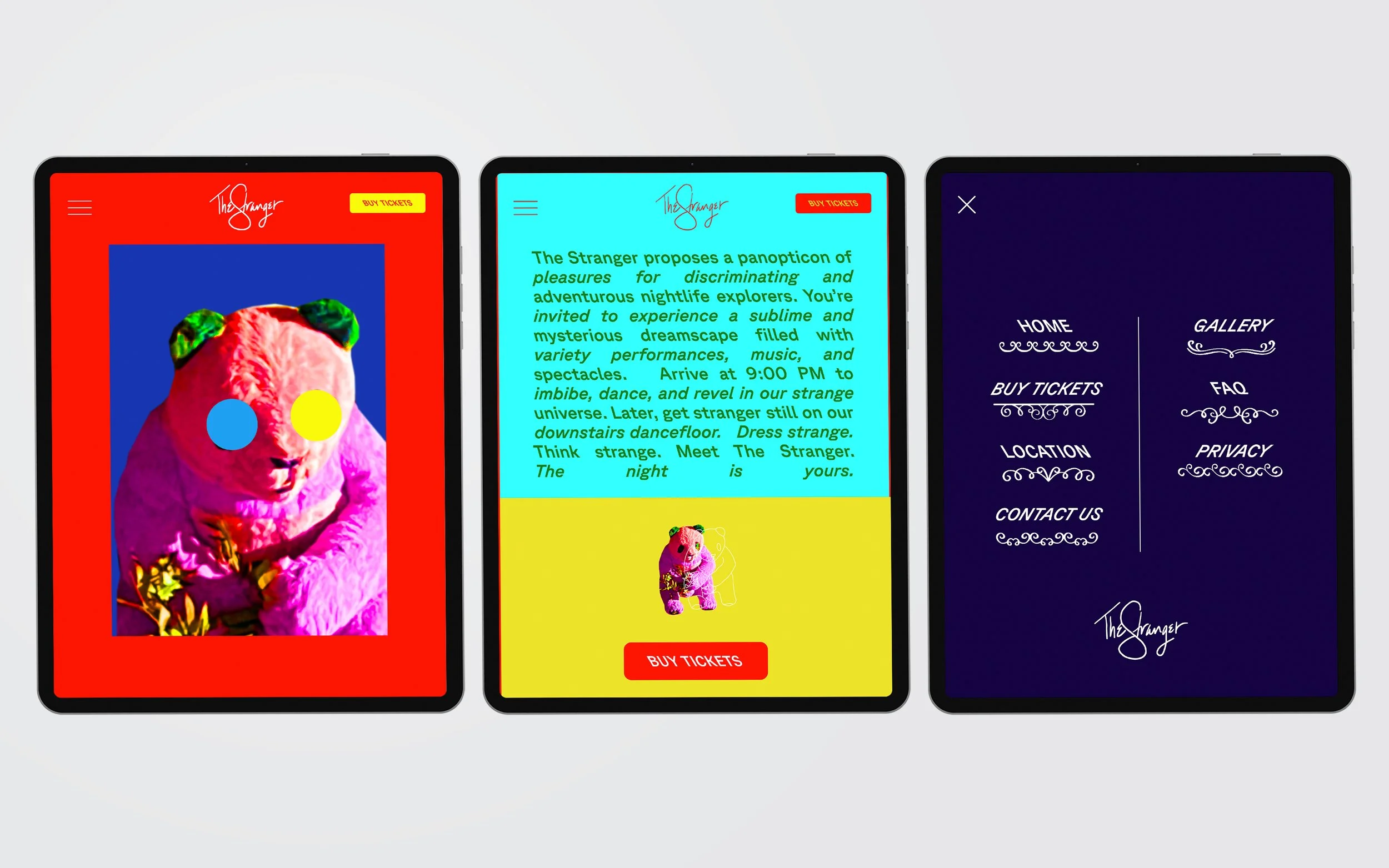
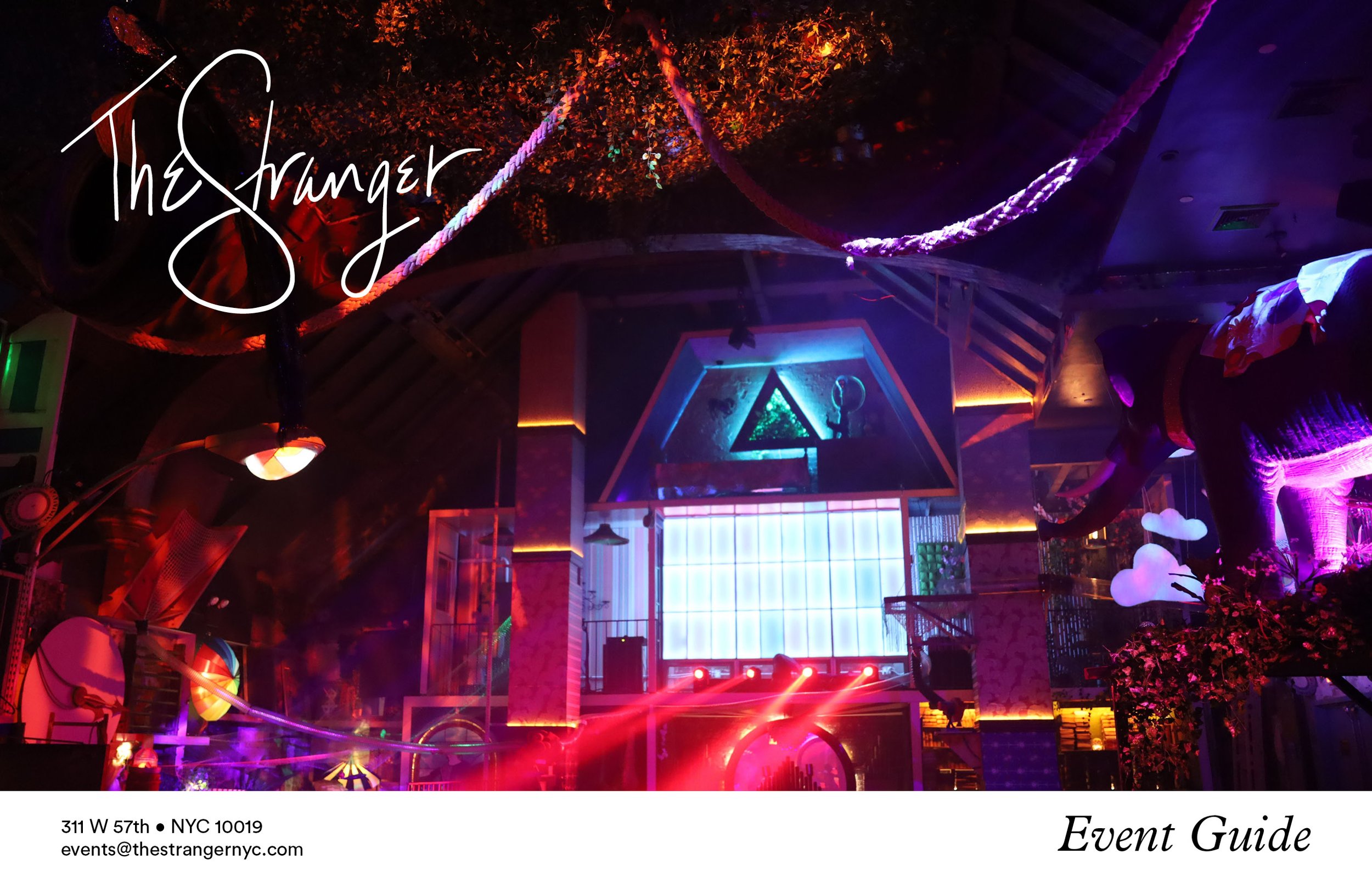
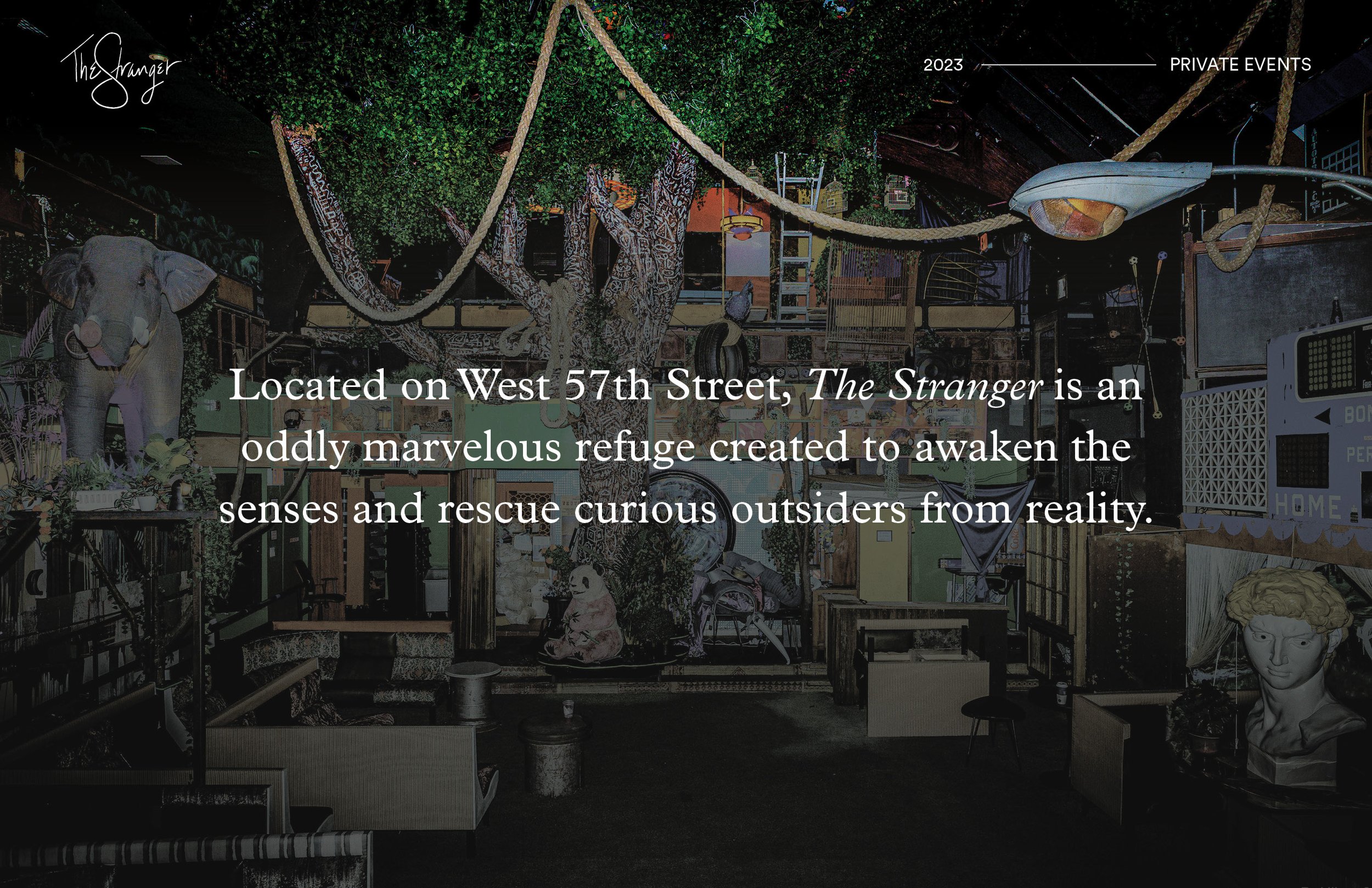
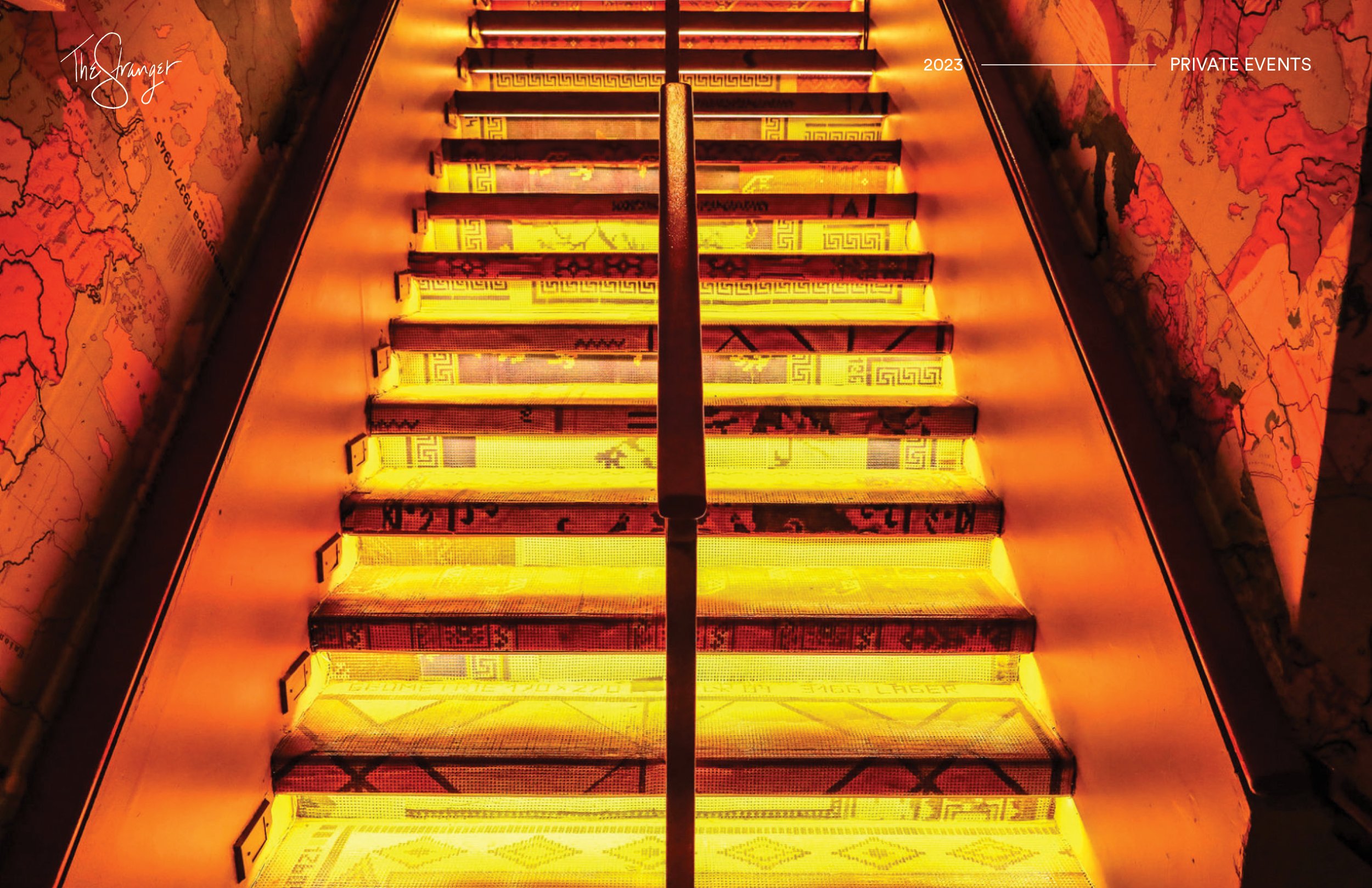
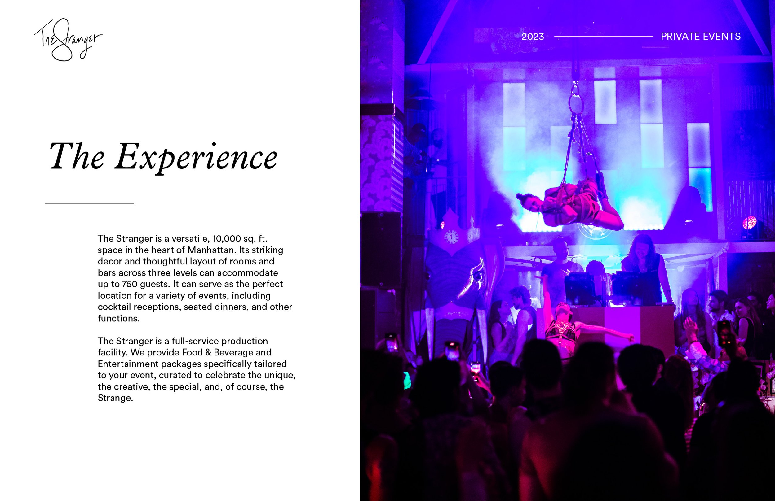
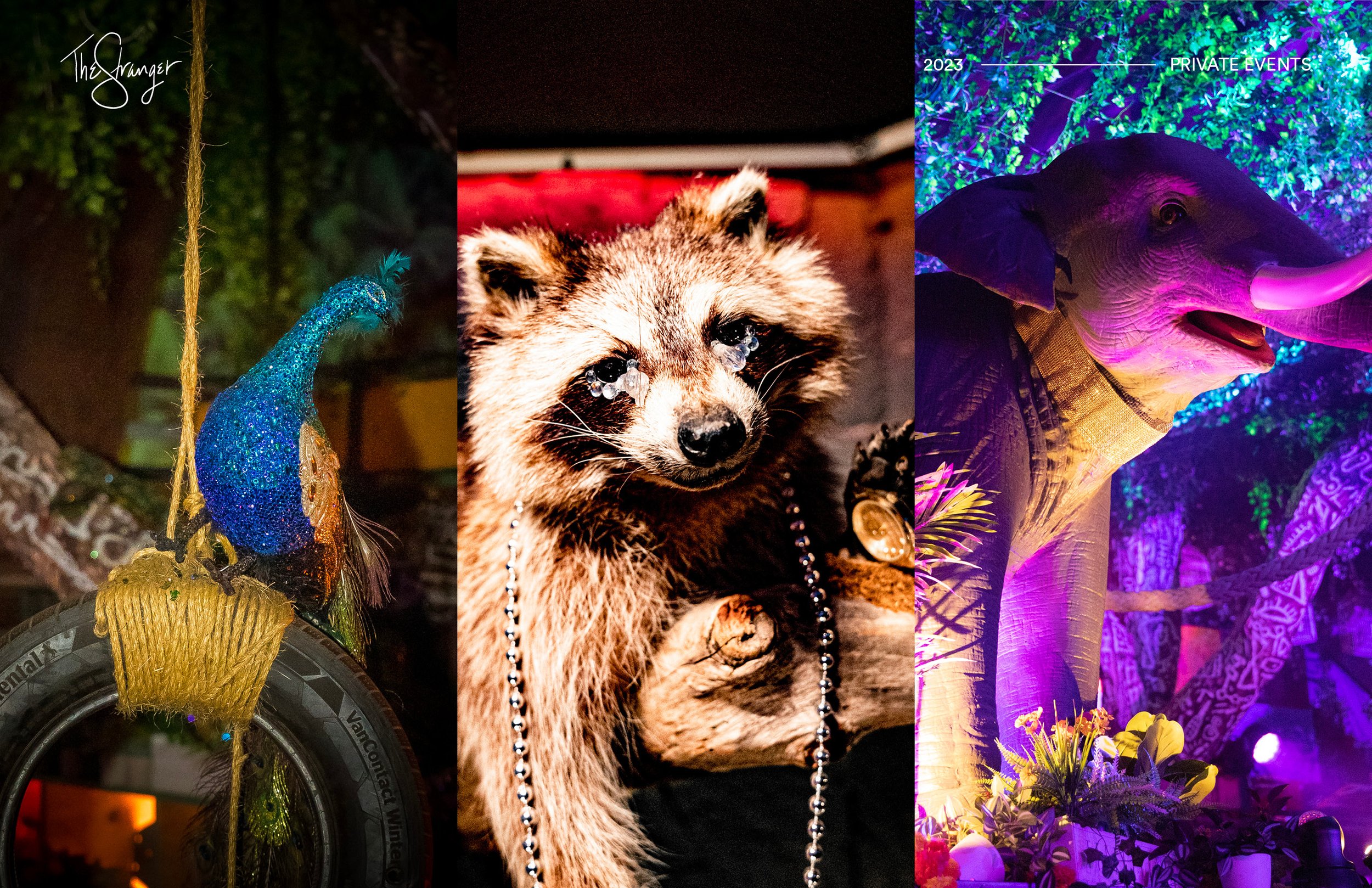
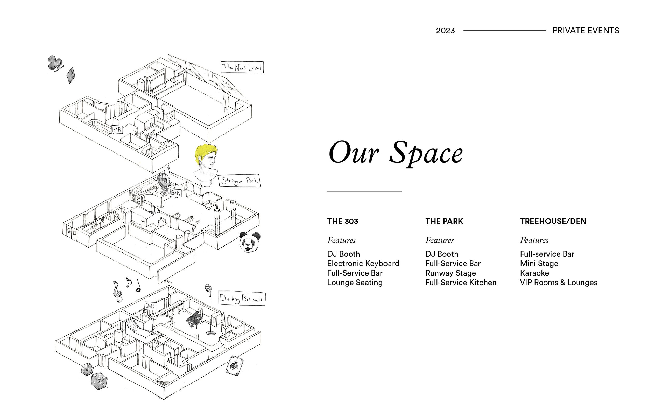
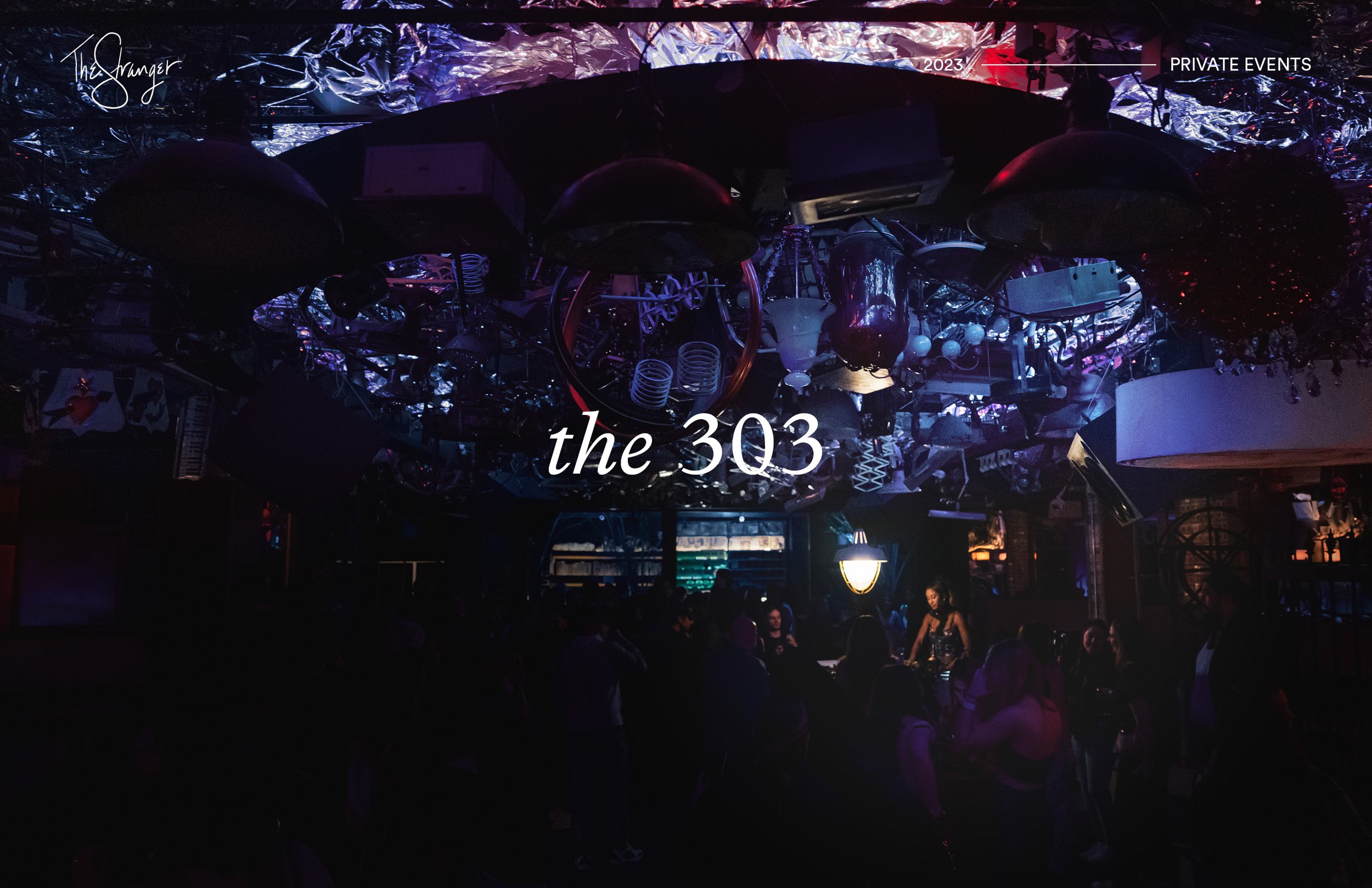
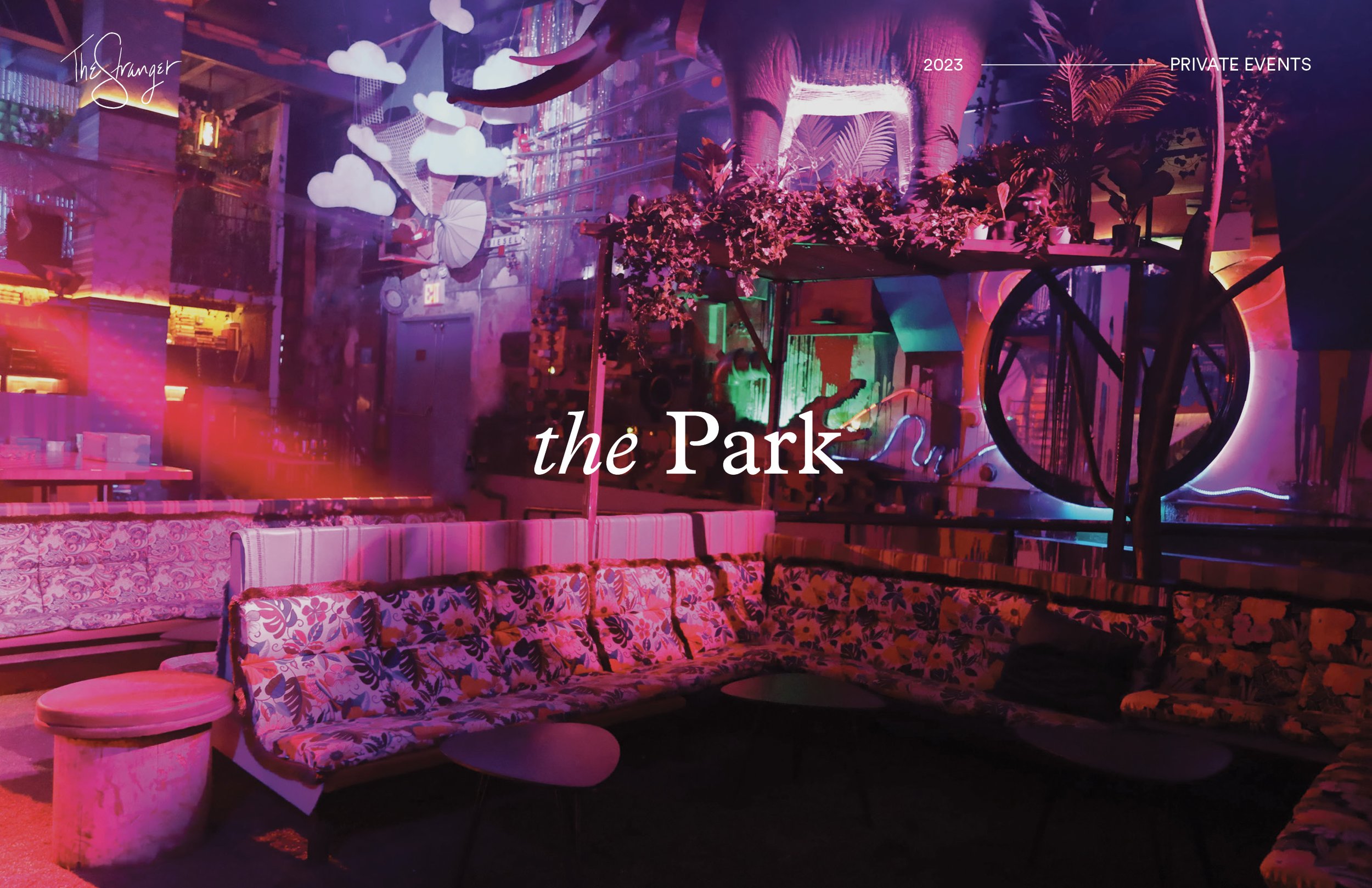
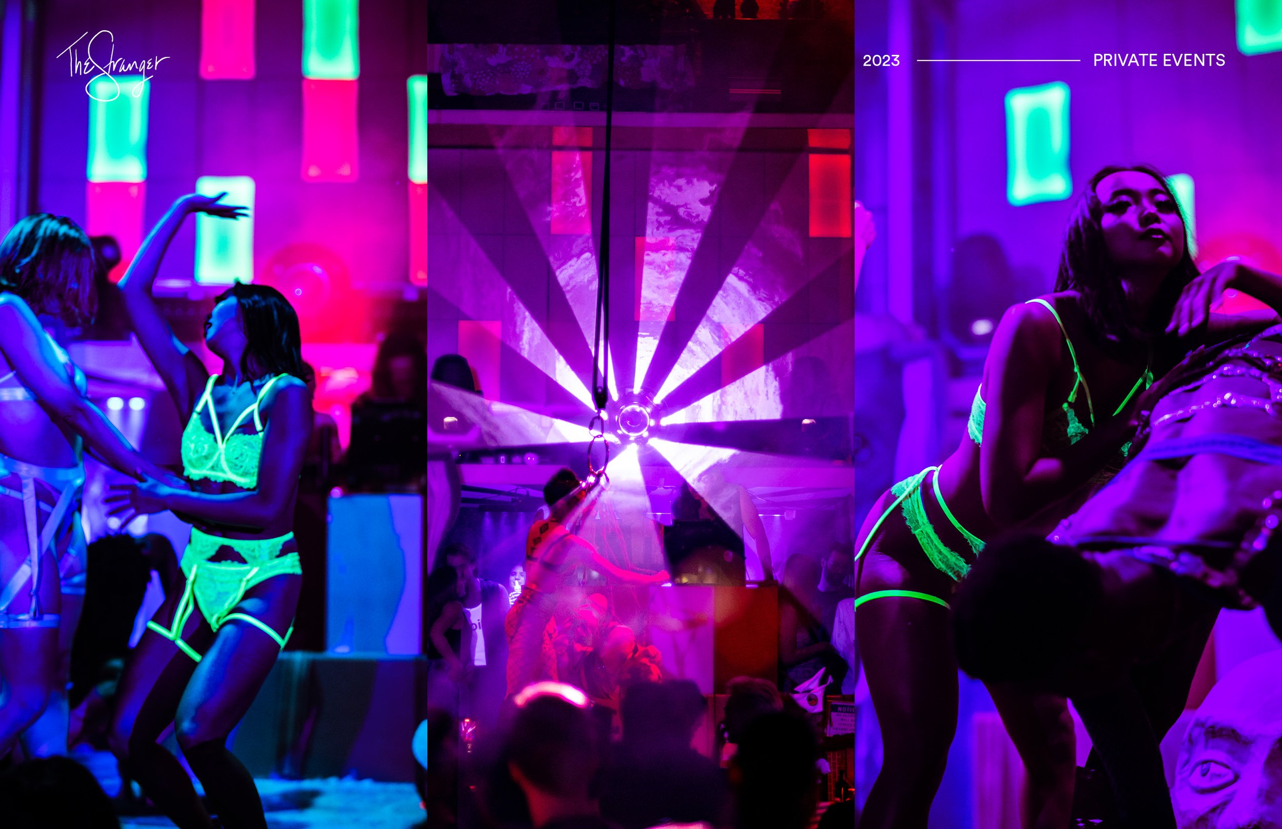
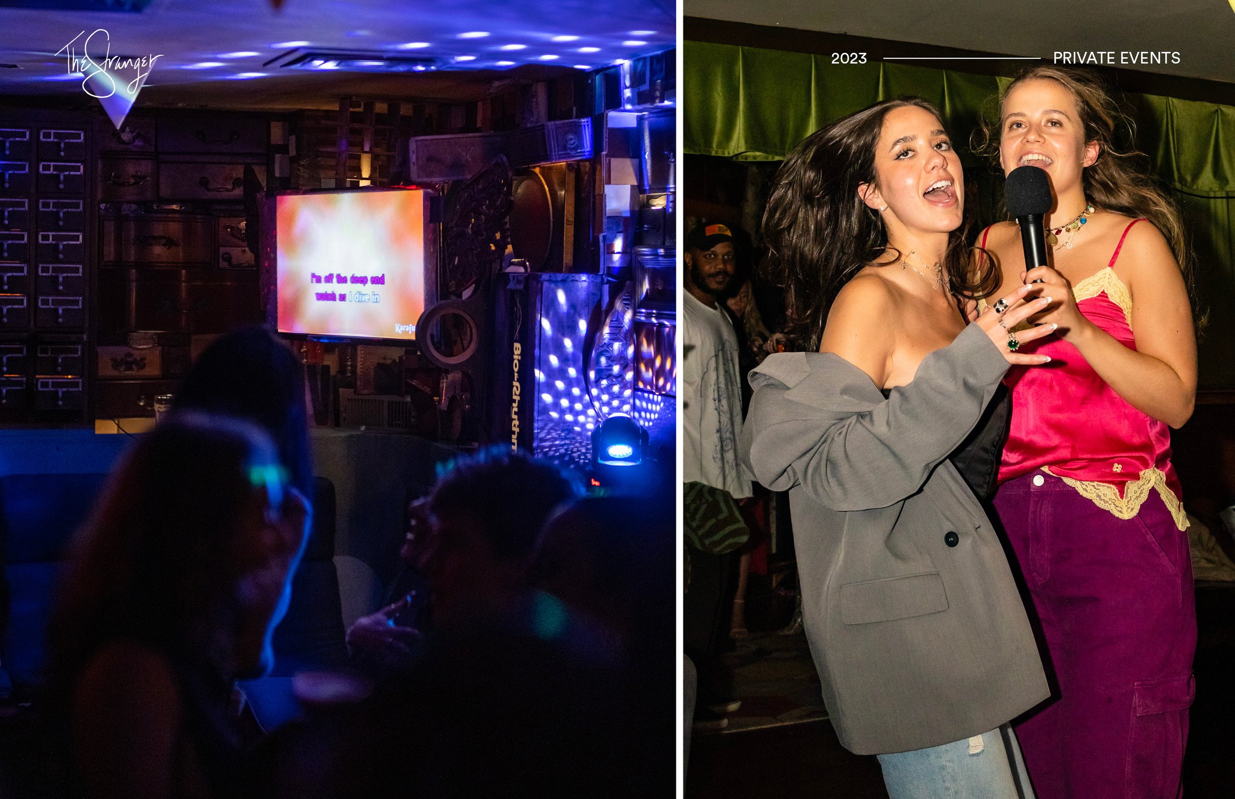
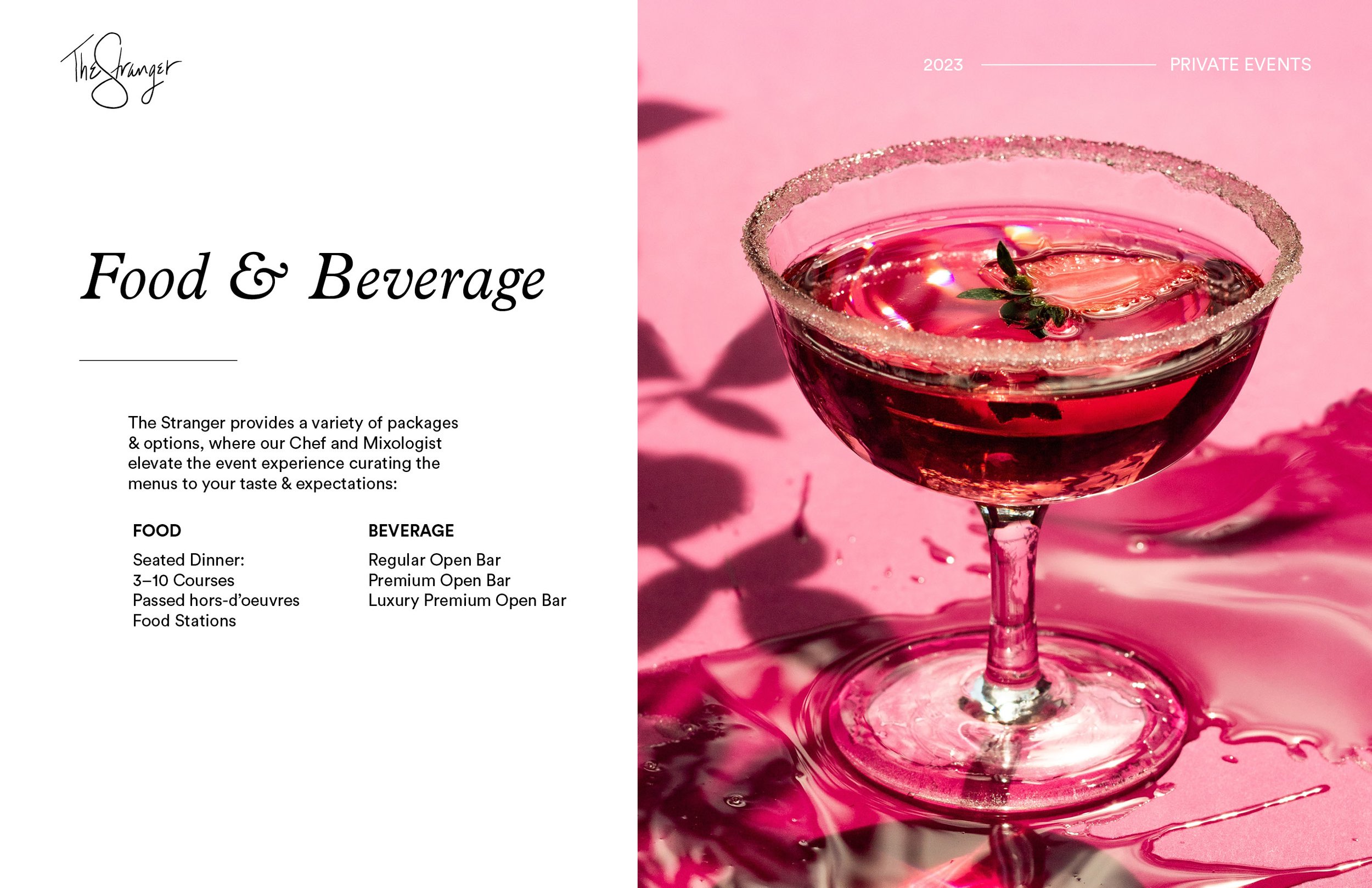
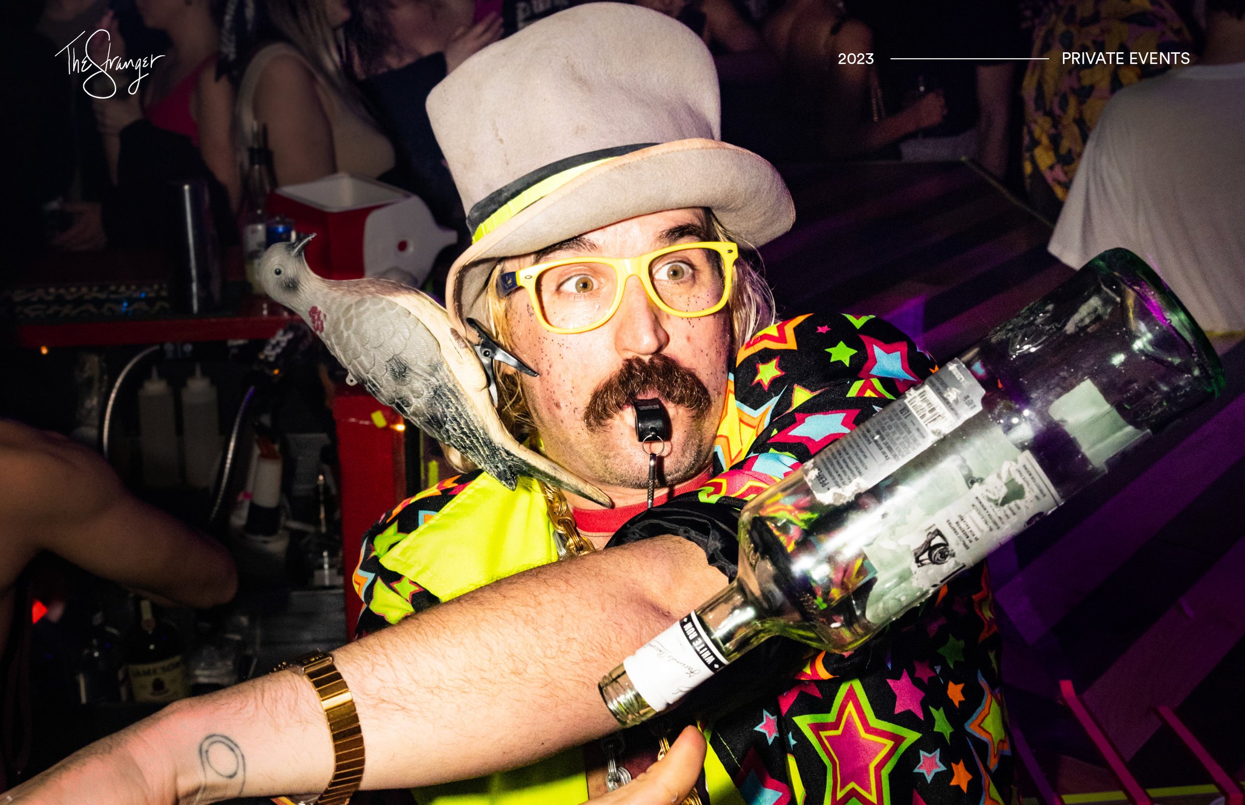
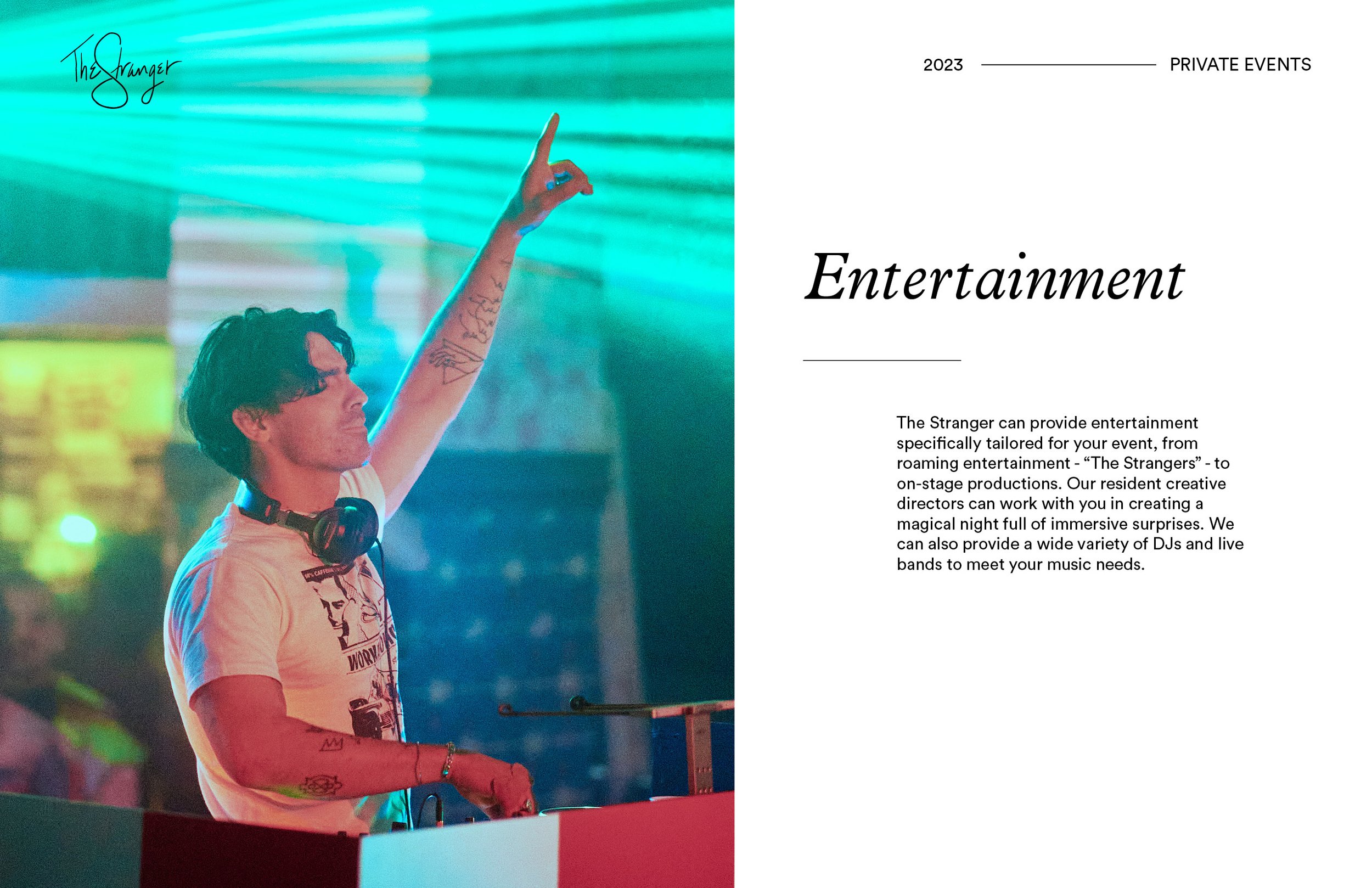
CLIENT NEEDS
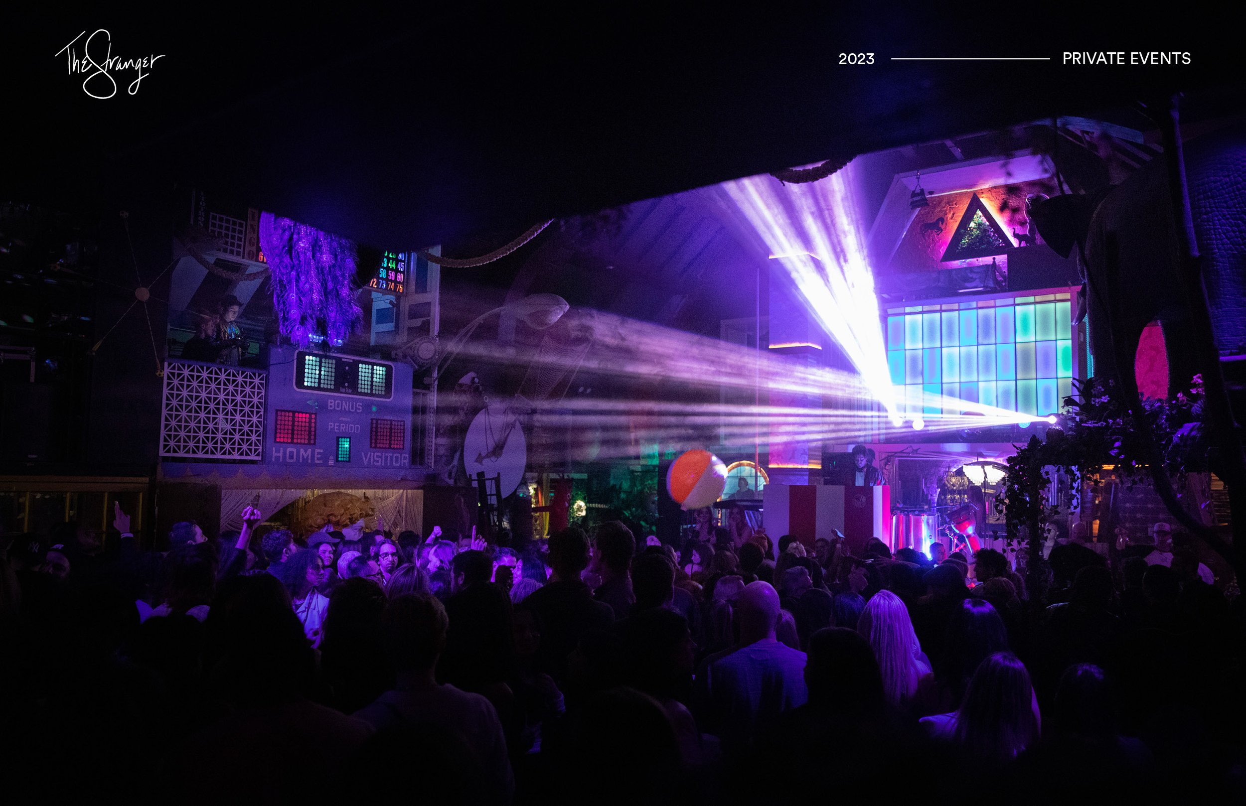
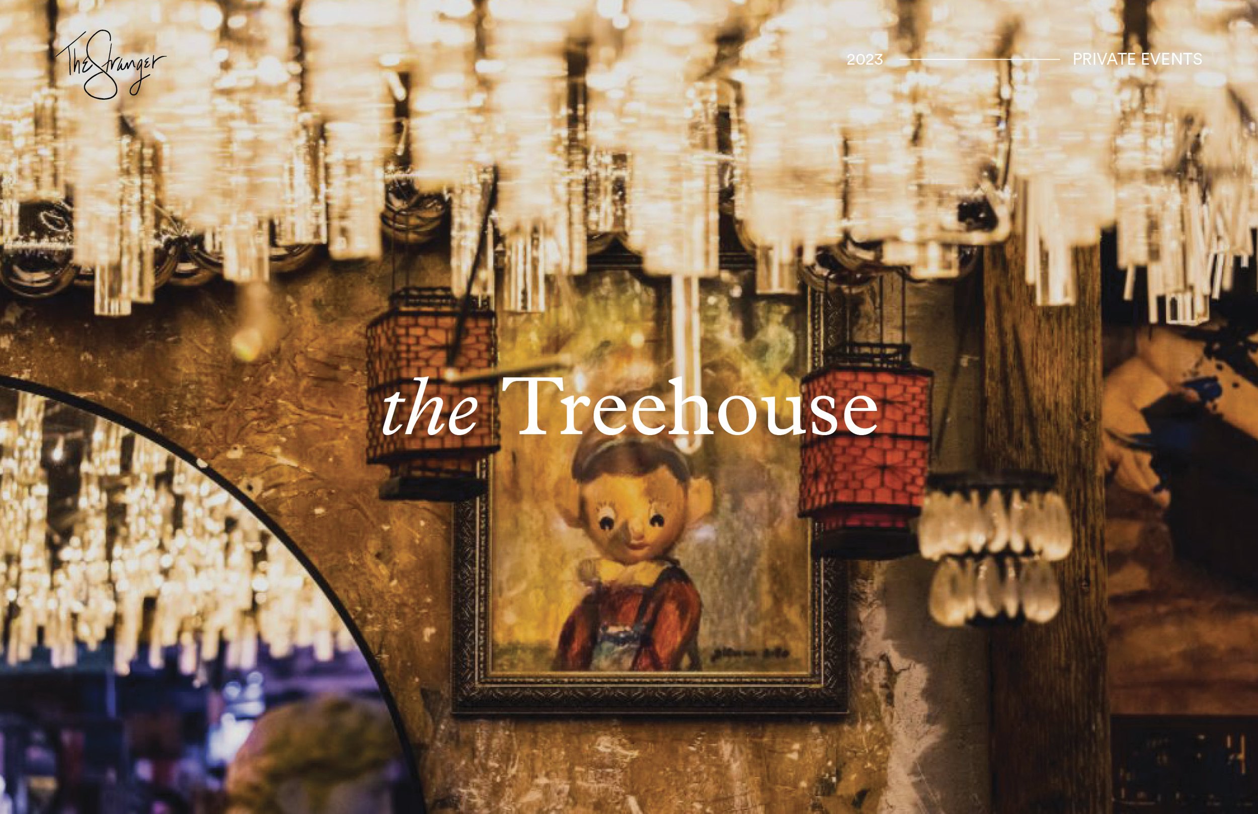
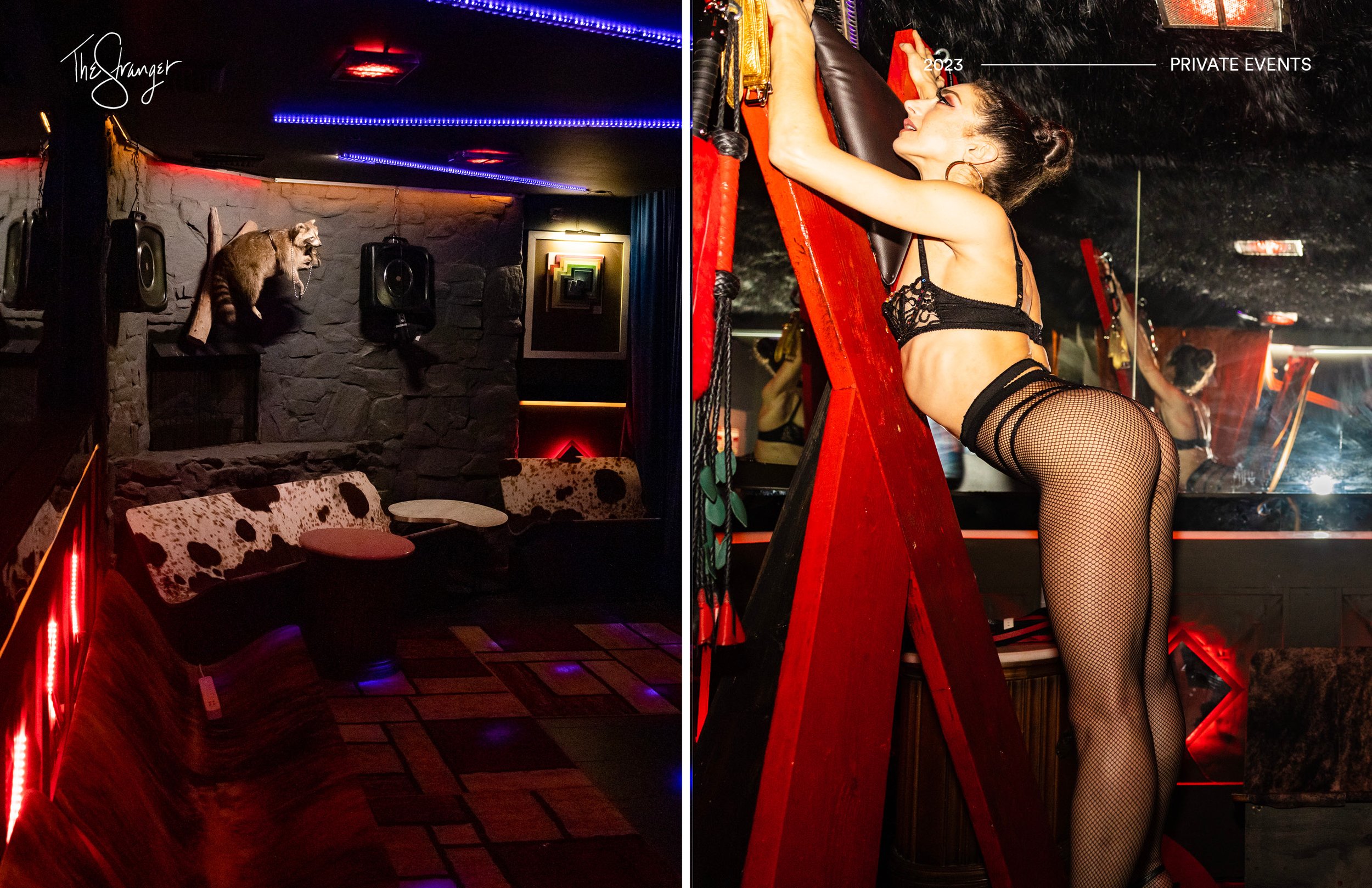
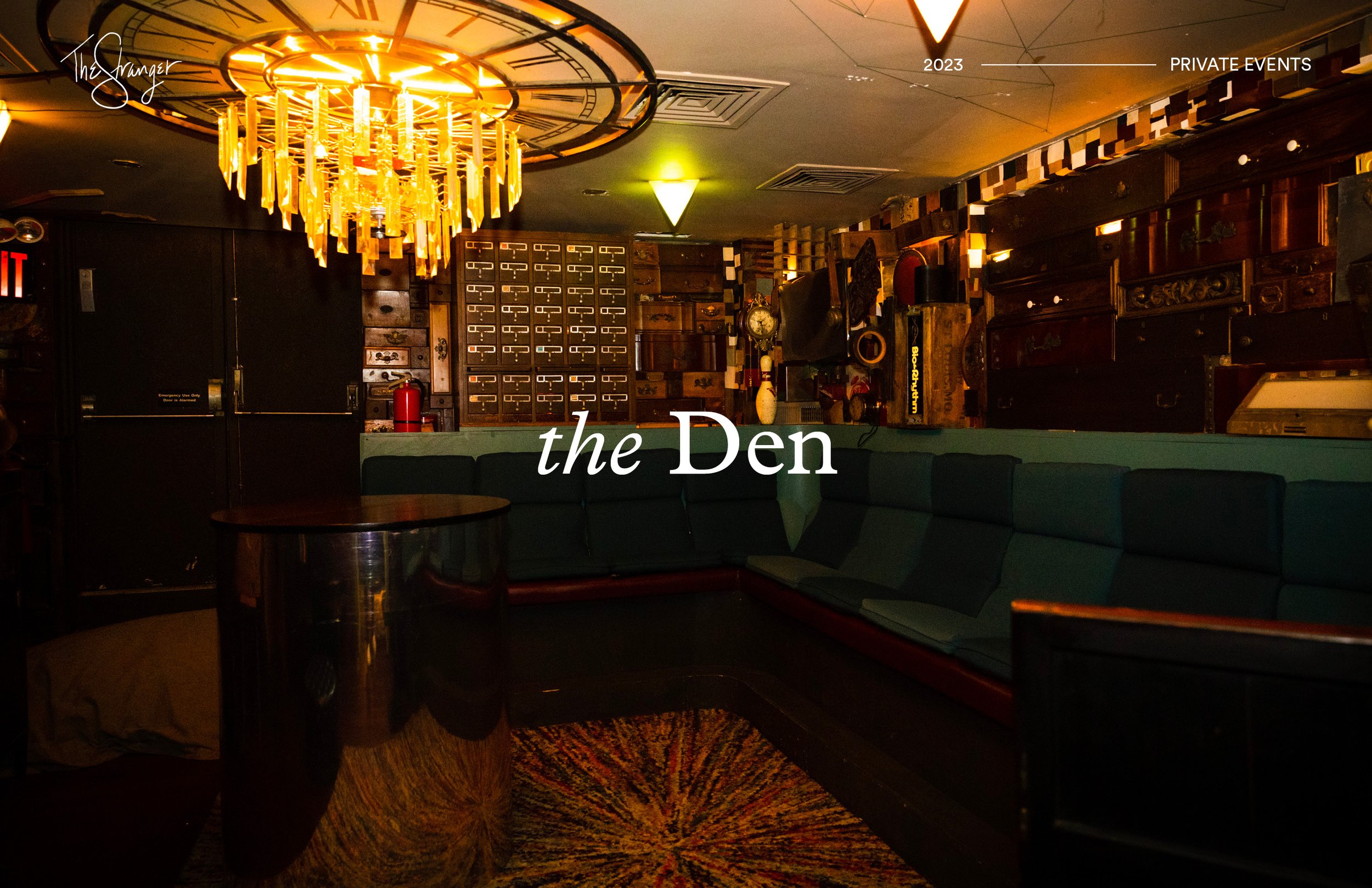
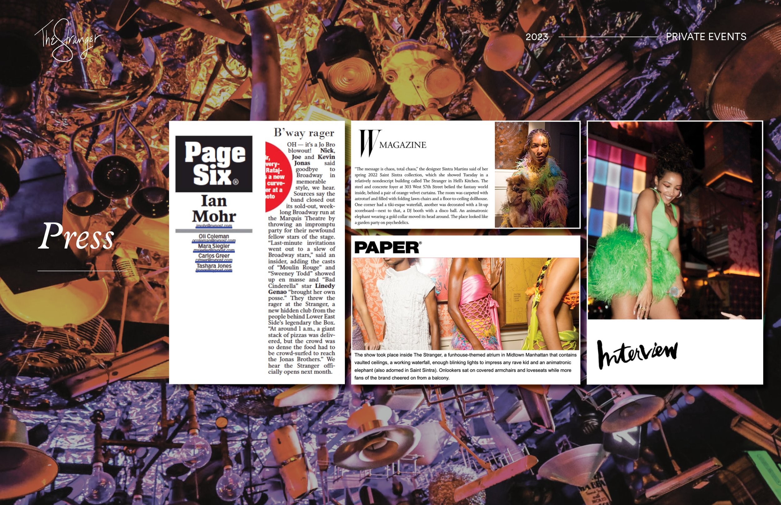
From the producers of Sleep No More and The Box, The Stranger is an immersive nightlife experience in the heart of Manhattan boasting a “sublime and mysterious dreamscape filled with variety performances, music, and spectacles.” With nothing but a logo and a creative brief, the team needed a complete visual identity to then be applied to a ticketing website, marketing material including a Private Events deck, and signage/menus throughout the space.
DESIGN SOLUTION
Starting with the goal of The Stranger to create a mysterious, psychedelic, weird and wacky brand identity, I combined a vibrant color scheme with a whimsical modern typeface. I incorporated illustrations I created based on photographs I took of accoutrements found throughout the space to highlight the other-worldly experience guests would be immersed in at The Stranger.
MY ROLE
I established the brand identity through choice of color scheme, typography, and a minimal, contemporary layout then applying the brand identity to conceptualize and create the website, event decks, promotional flyers, and small bites/cocktail menus for The Stranger. Click here to read about The Stranger in TimeOut New York.
CLIENT NEEDS
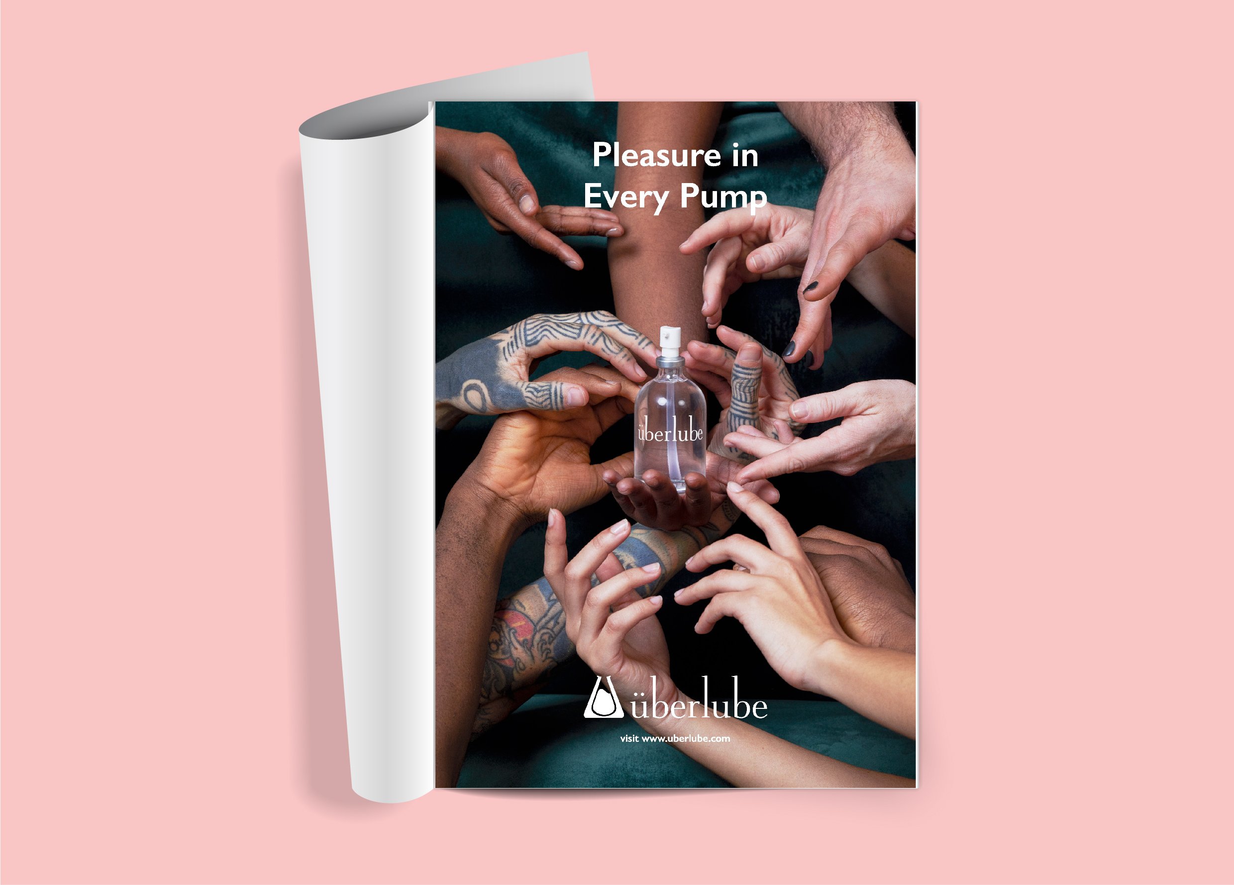
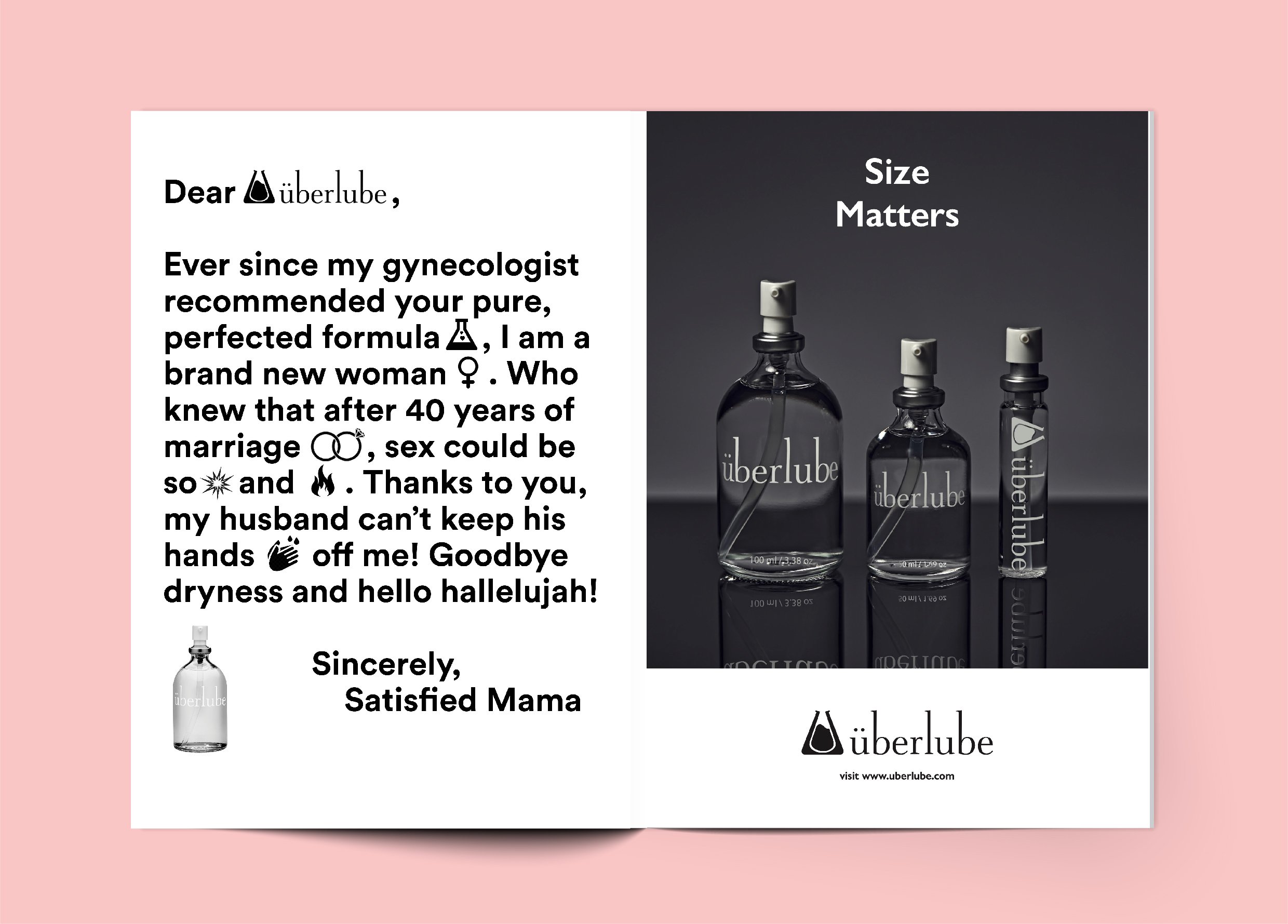
High-end, personal lubricant company überlube sought out a variety of print and digital advertisements to spread the word about their product. They wanted the design to reflect the simple, yet elegant formula.
DESIGN SOLUTION
The use of negative space, a modern sans-serif font with both a sophisticated and inviting character, and eye-catching product photography combined with tongue-in-cheek copy were all used to create rousing advertisements.
MY ROLE
I designed the advertisements and wrote the copy for the marketing collateral found both online and in print. I continue to work with überlube to this day, further strengthening their presence in the lubricant market and growing awareness of the brand.

CLIENT NEEDS
Drink Good Wine, an innovative Los Angeles based wine company that sells a highly-curated seasonal selection of natural wines, needed a full brand identity in addition to a website and various marketing material such as stickers, stamps, and postcards. They wanted the brand to embody the refinement of their curation, while also feeling contemporary and amiable.
DESIGN SOLUTION
First beginning with the logo design, a serifed font was used to give the brand character. To enhance the visual identity, the playful logo was juxtaposed with Renaissance still life paintings as a nod to the historic tradition of wine itself. A pastel color palette was then used to give the brand pop and make it stand out even further. These elements combined work harmoniously in expressing the heart and soul of the Drink Good Wine mission and brand.
MY ROLE
I designed the logo, website, and marketing materials for Drink Good Wine as well as social media assets to promote their seasonal selections.


CLIENT NEEDS
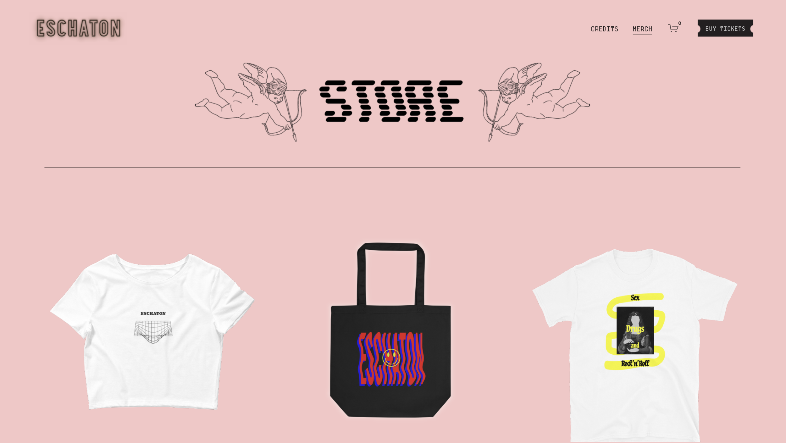
Part cabaret, part immersive theater, Eschaton (pronounced eh·SKUH·taan) is a stunning virtual nightclub with interactive performance pieces occurring weekly via zoom where audience members choose their own adventure through a variety of online rooms. Described as a “wild night out at a singularly outrageous club” by the New York Times, Eschaton’s allure stems from its world-renowned performers, while immersing the viewer in a mysterious, video-game like experience.
Eschaton needed a social media strategy including video flyers to promote their events as well as a website to communicate key information about the shows and merchandise to sell.
DESIGN SOLUTION
Because the show itself is a retro, ephemeral experience, I set poppy, glowing colors against dark backgrounds to evoke a mysterious undertone to their website. Complimenting the retro-tech aspect of the show, I chose videos and photographs provided by the client to create movement and pique interest on their website.
The fonts used are a playful yet refined combination of lo-fi and modern sans serif fonts enhancing the overall look and feel of the site. Click here to visit their full website. Merchandise needed to have an edgey, street-wear feel that was both modern and artistic. With gridded, net art vectors, hand-done illustrations, and collages, I designed shirts, crop tops, bucket hats, and fanny packs for Eschaton.
To create a cohesive, social media presence, I sourced relevant images of historic theater productions, vintage nightlife photos, lo-fi sci fi images, while creating branded posts and videos, resulting in a moodboard that further strengthened the brand voice and vision. Click here to check out their Instagram.
MY ROLE
I was the lead website designer on this project in addition to designing the merchandise, blending both my design and artist background. I continue to schedule, source, and create new content for Eschaton, growing their following more than 35x from when I started. Click here to read about why Eschaton was one of New York Times’ top 20 go to picks for New Years Eve 2020.
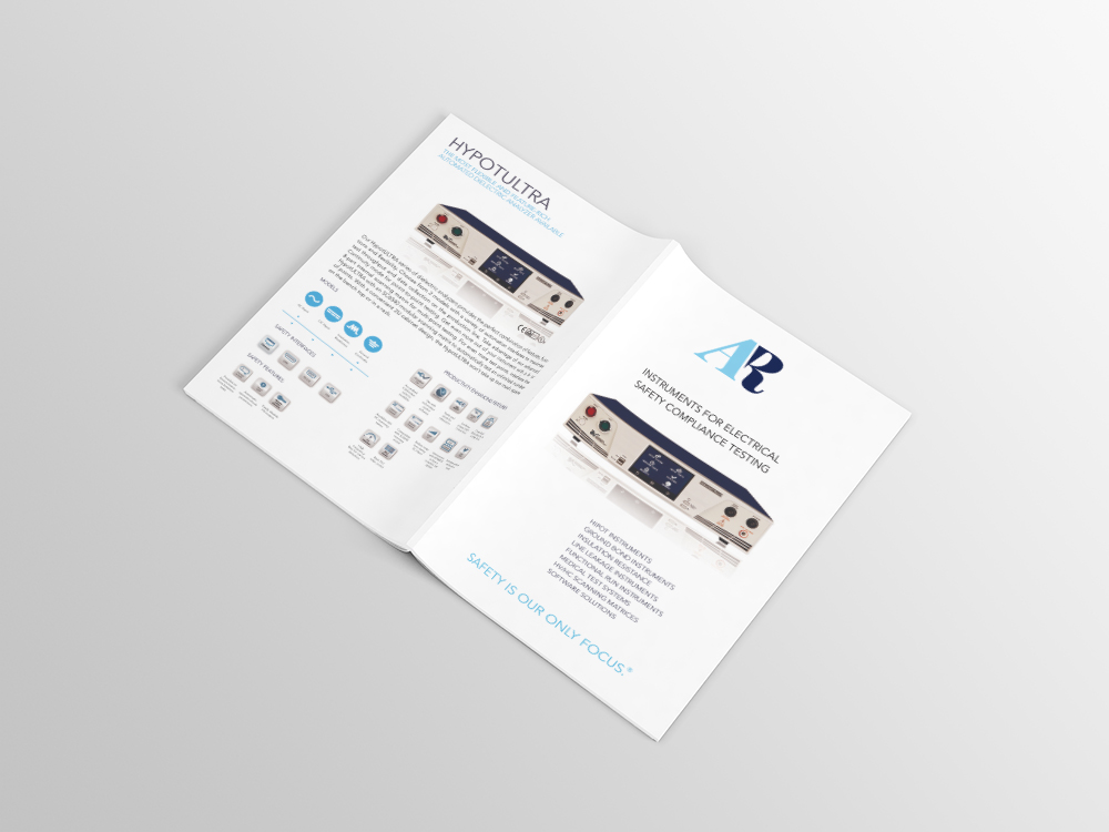
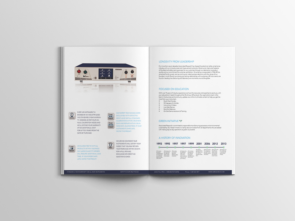
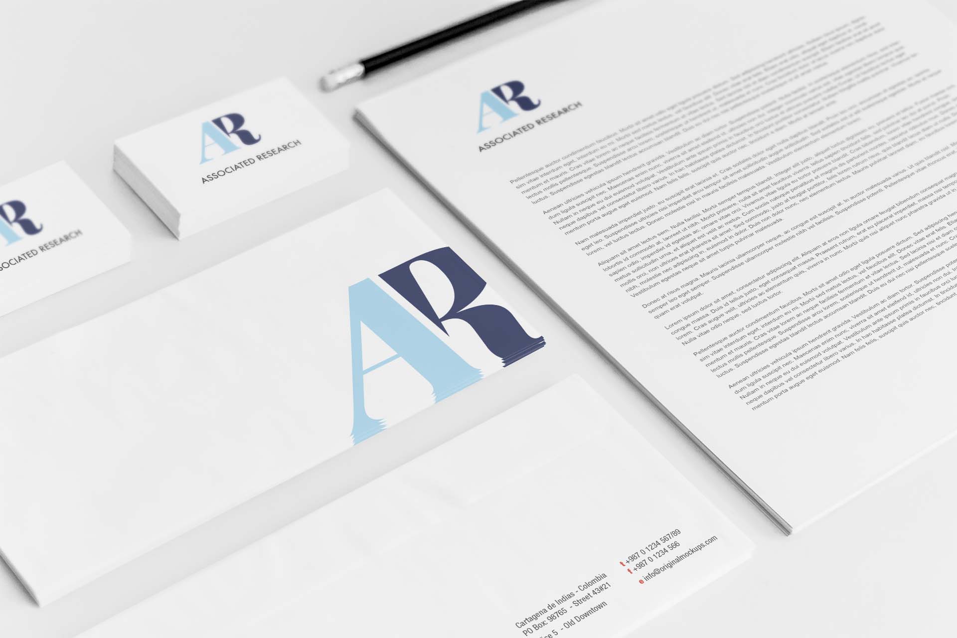
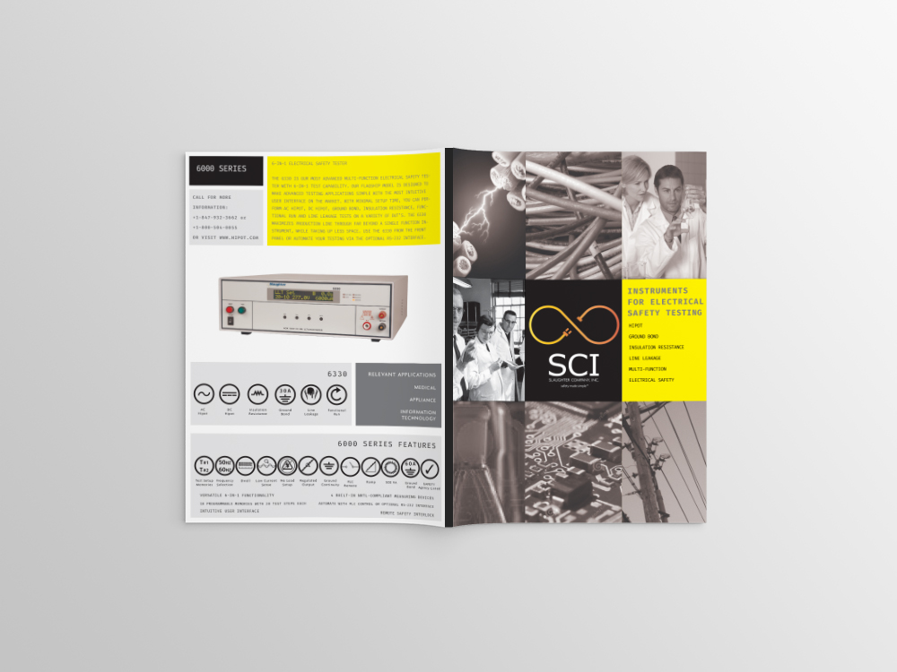
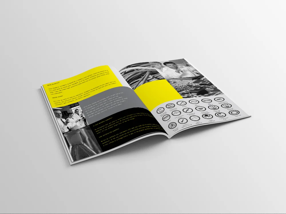
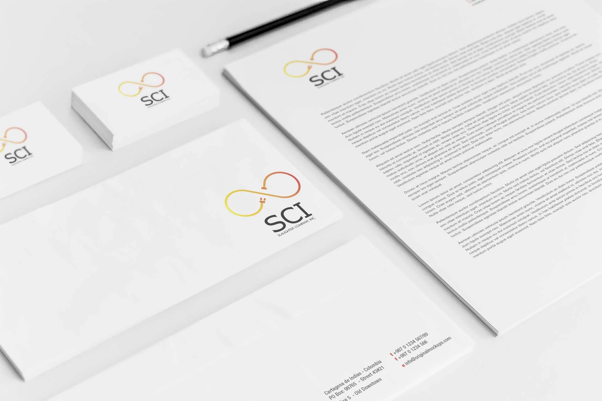
CLIENT NEEDS
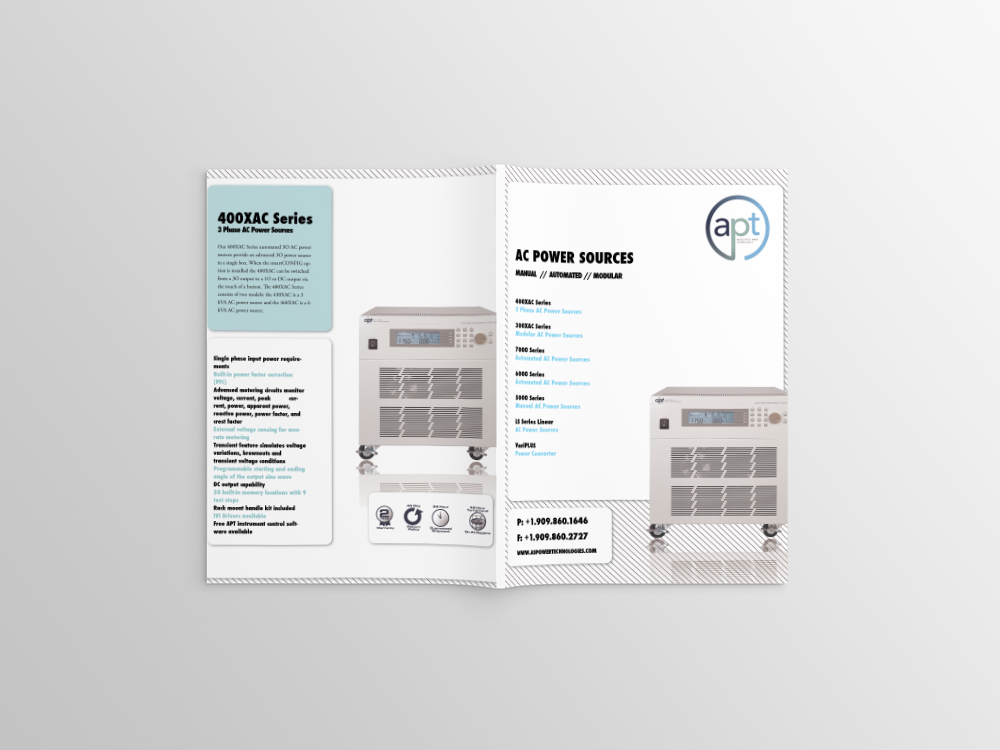
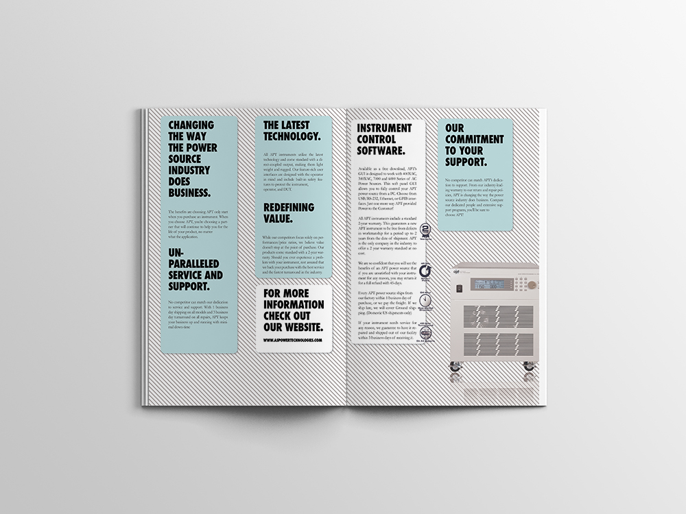
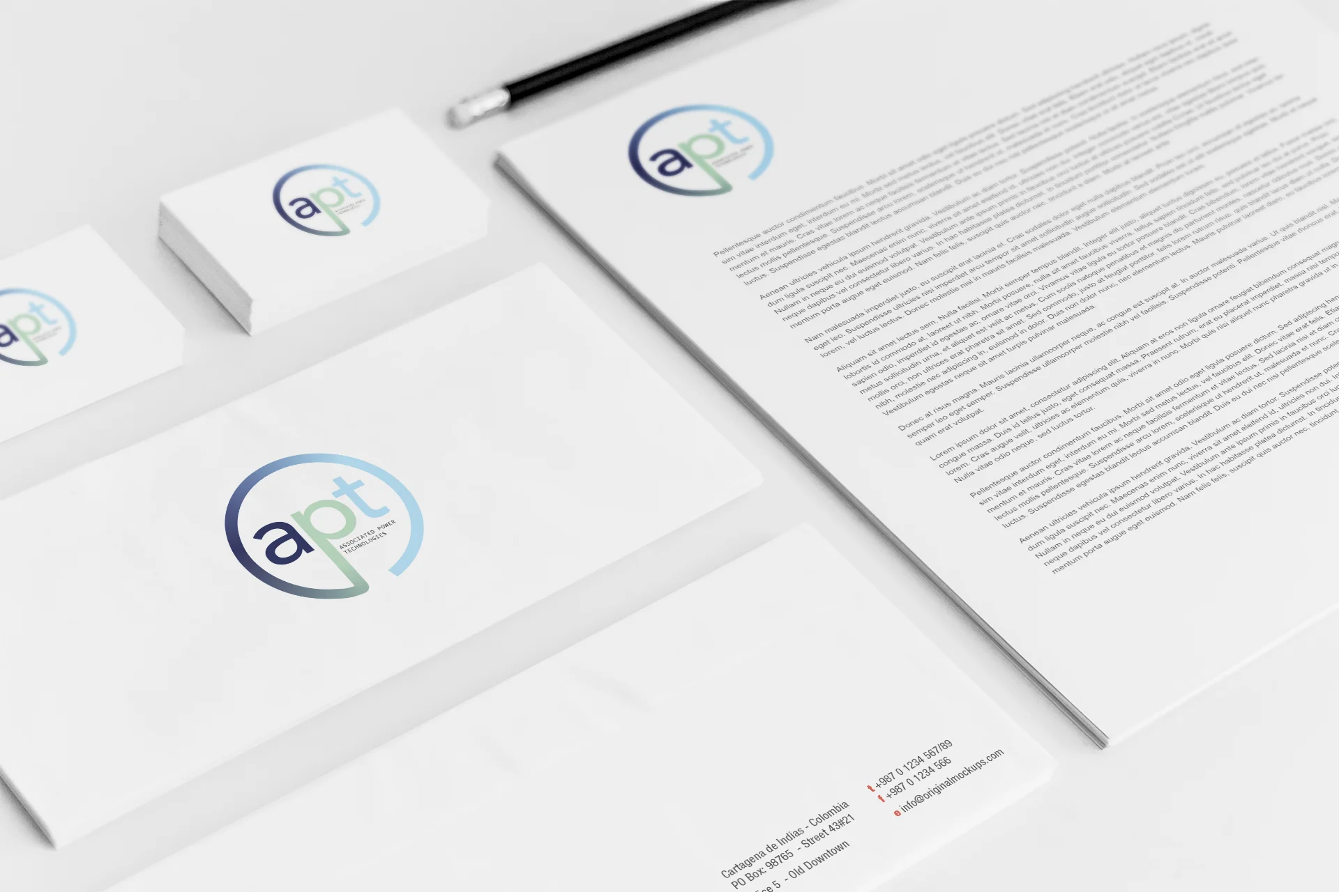
IKONIX, an electrical safety testing company, seeked a brand refresh/complete rebrand of three of their company branches: Associated Research, Associated Power Technologies, and Slaughter Company.
DESIGN SOLUTION
Using a minimal design with simple color palettes, modern typefaces, and concise layouts, the branding is now modern, clean, and easy to understand.
MY ROLE
I was the lead designer at the esteemed Chicagoland ad agency Bee-Line Communications on this project from concept to completion. I created a new brand identity through the design of logos, print materials (brochures, business cards, letterheads), and web collateral (website layout).
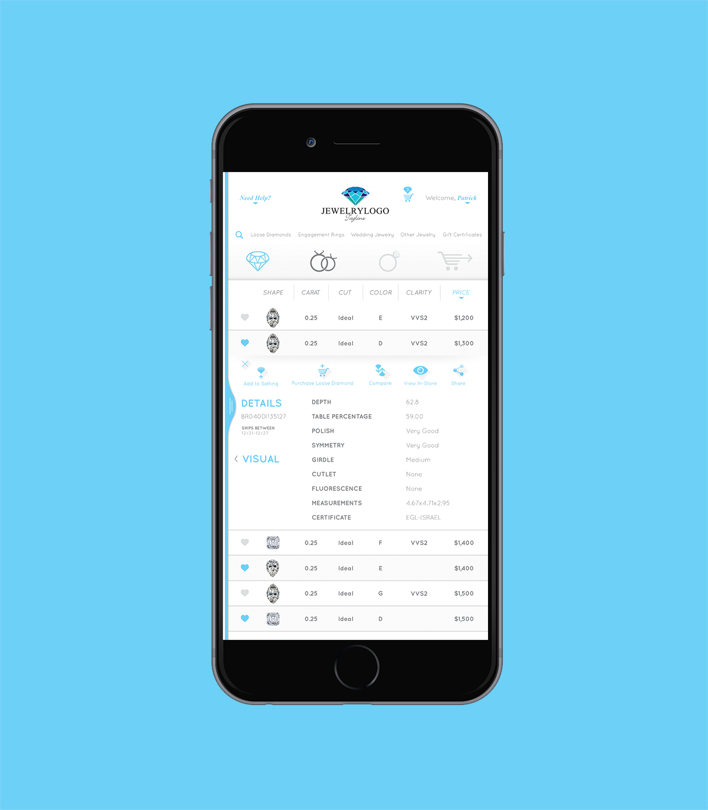
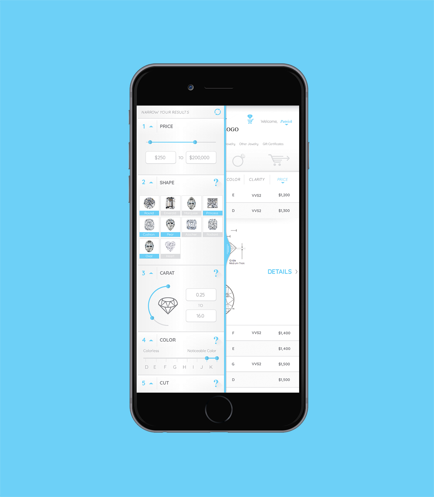
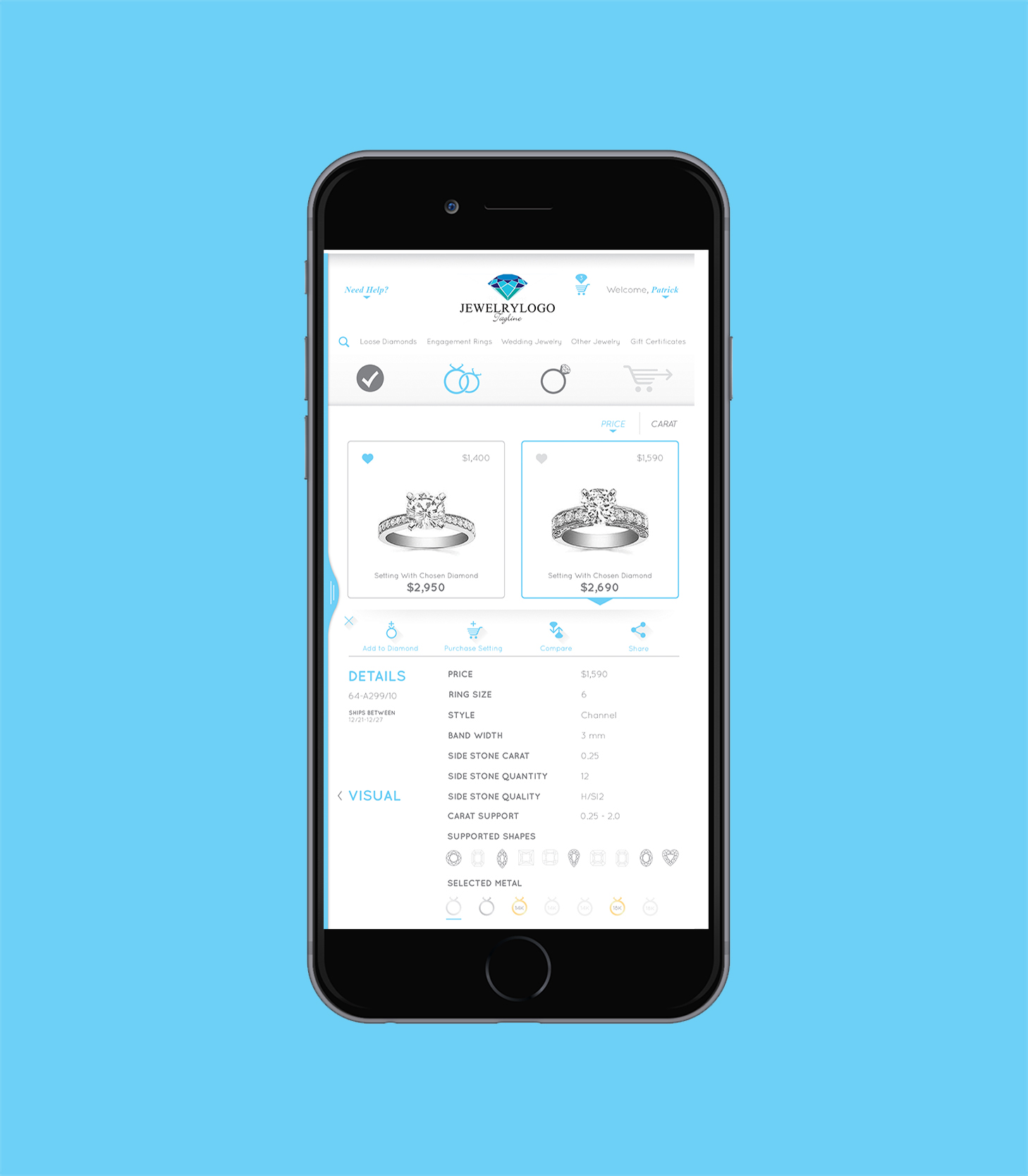
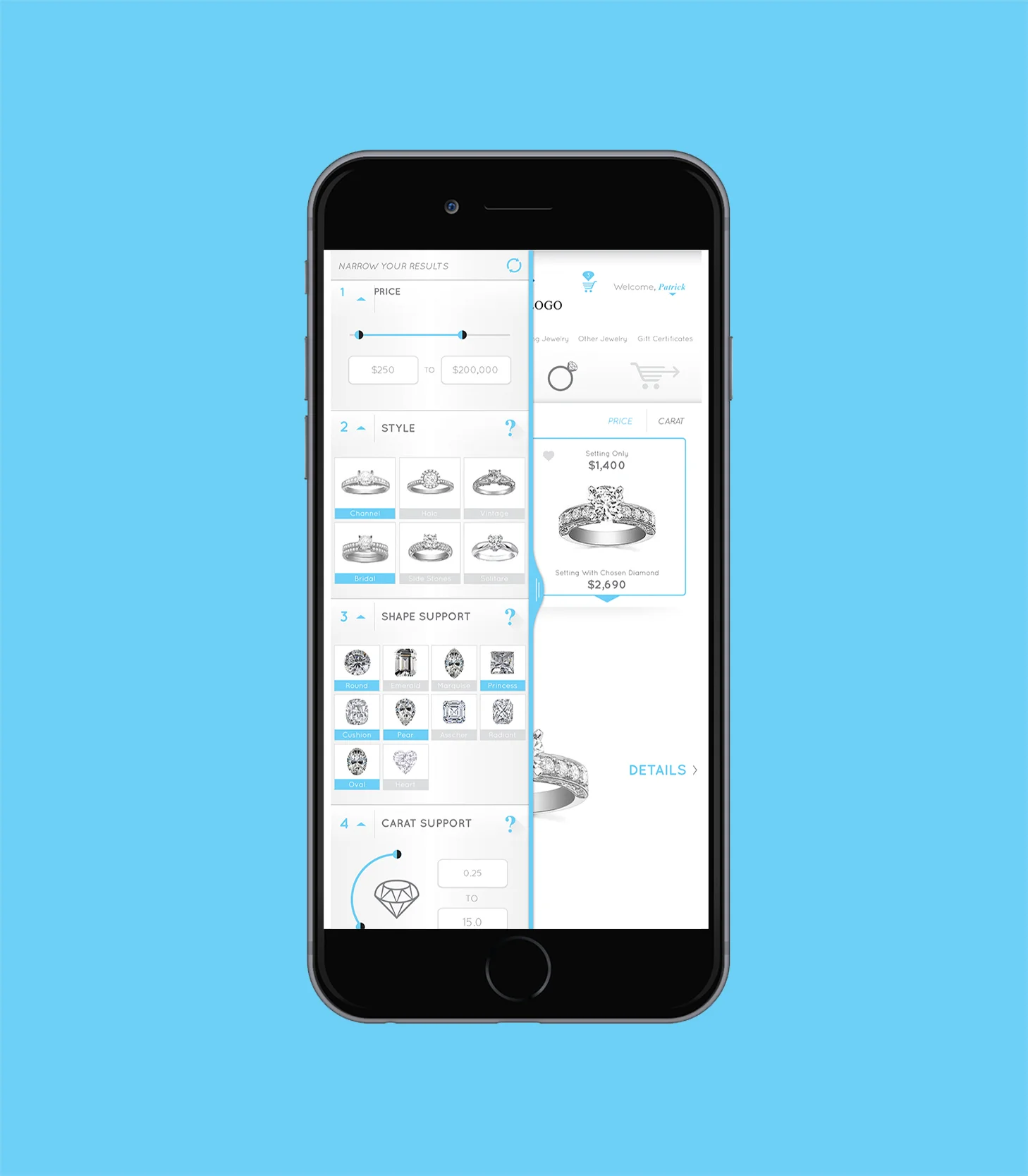
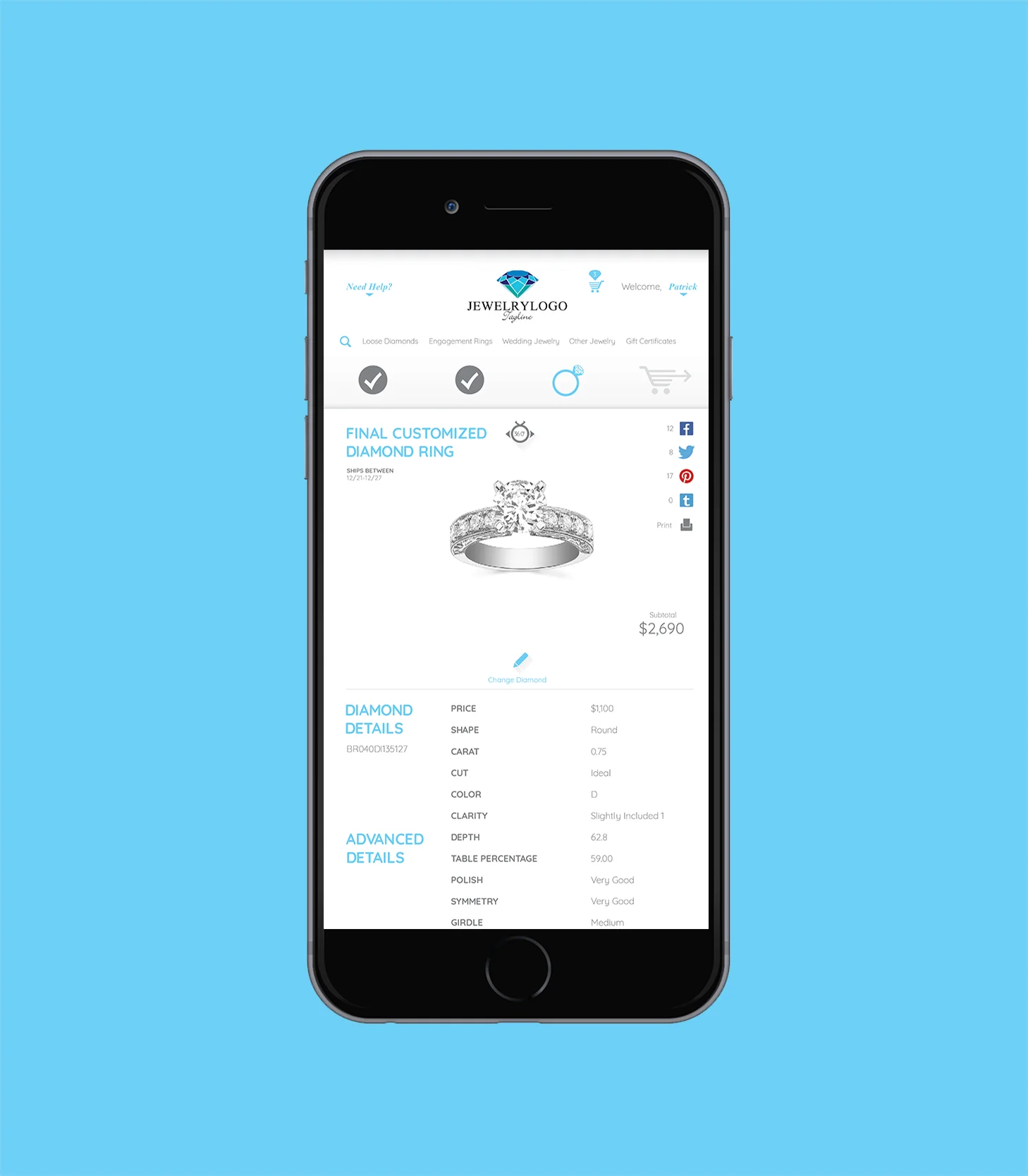
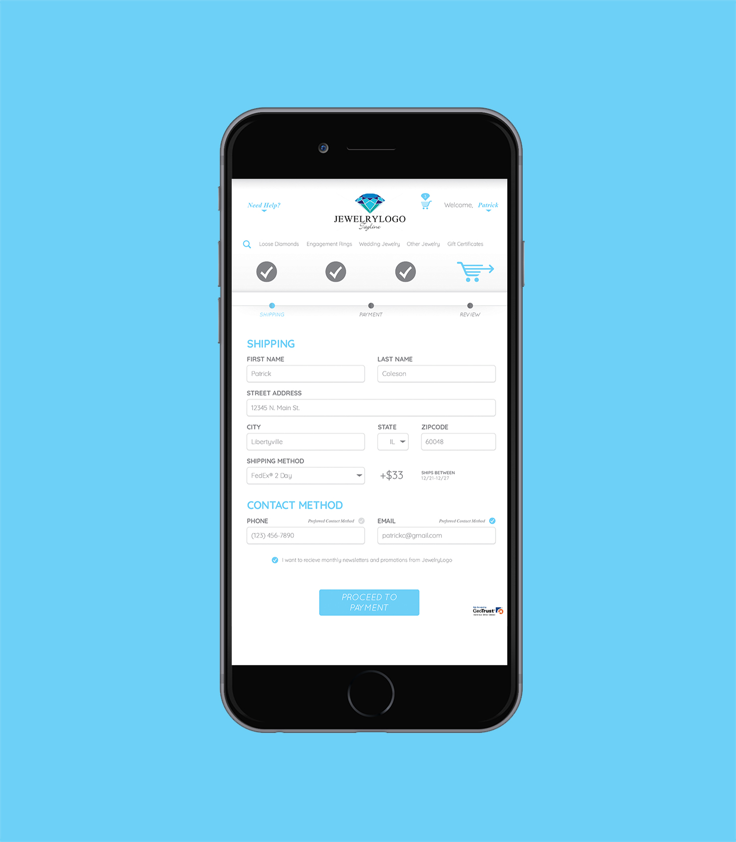
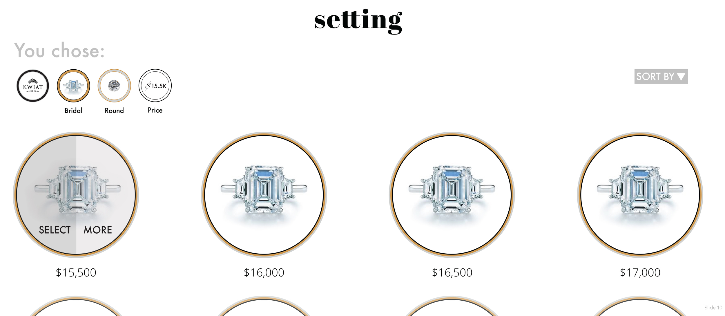
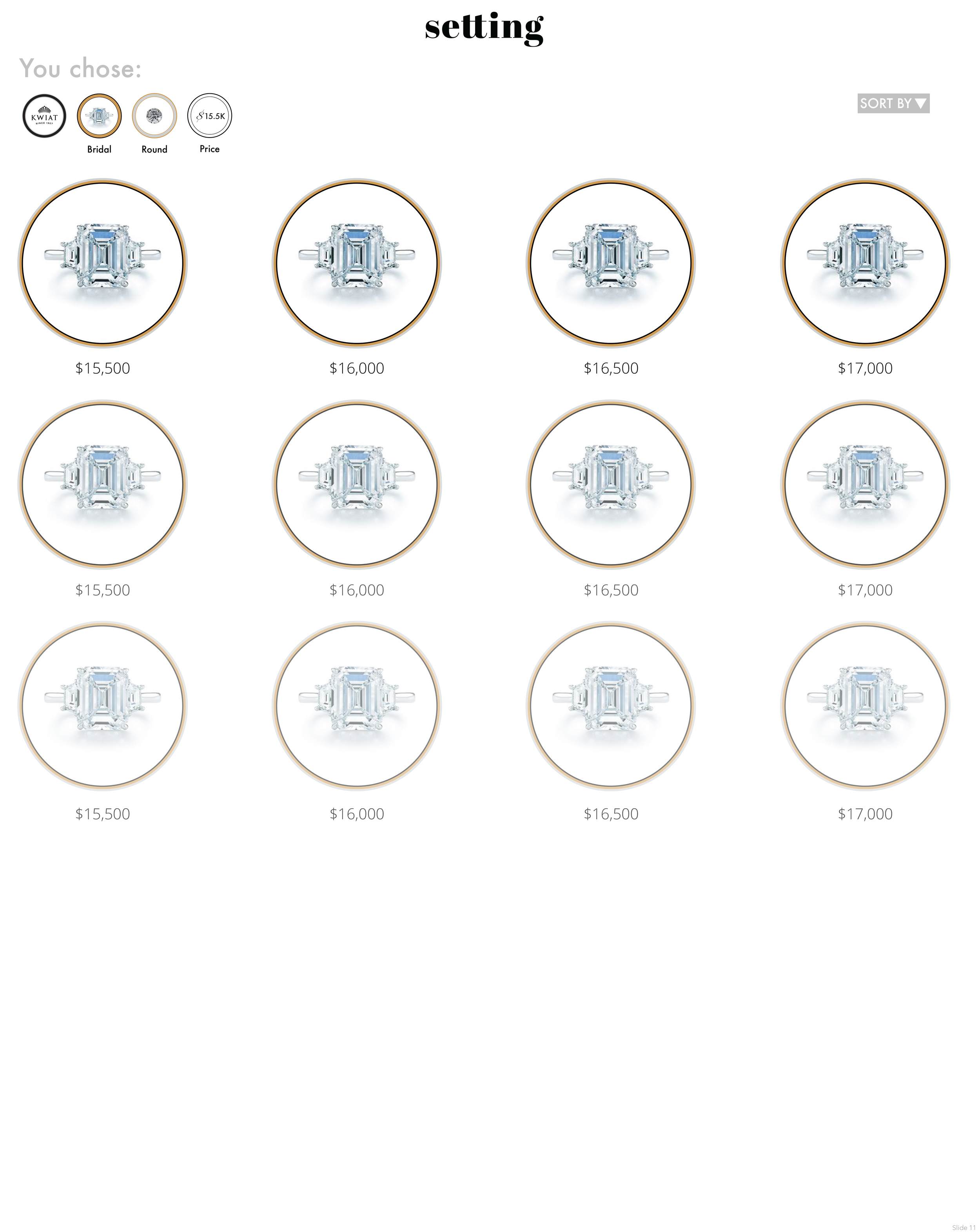
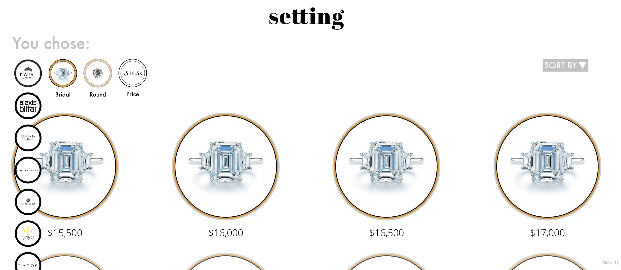
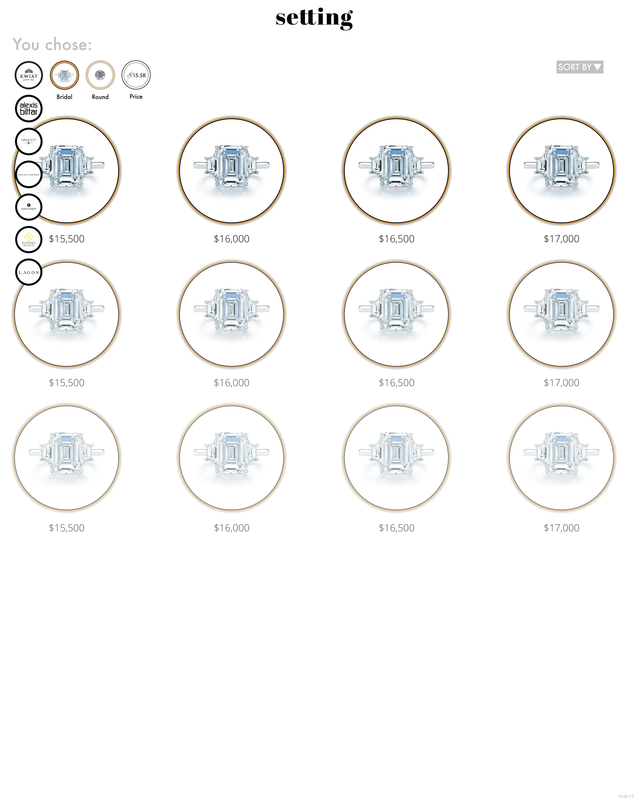
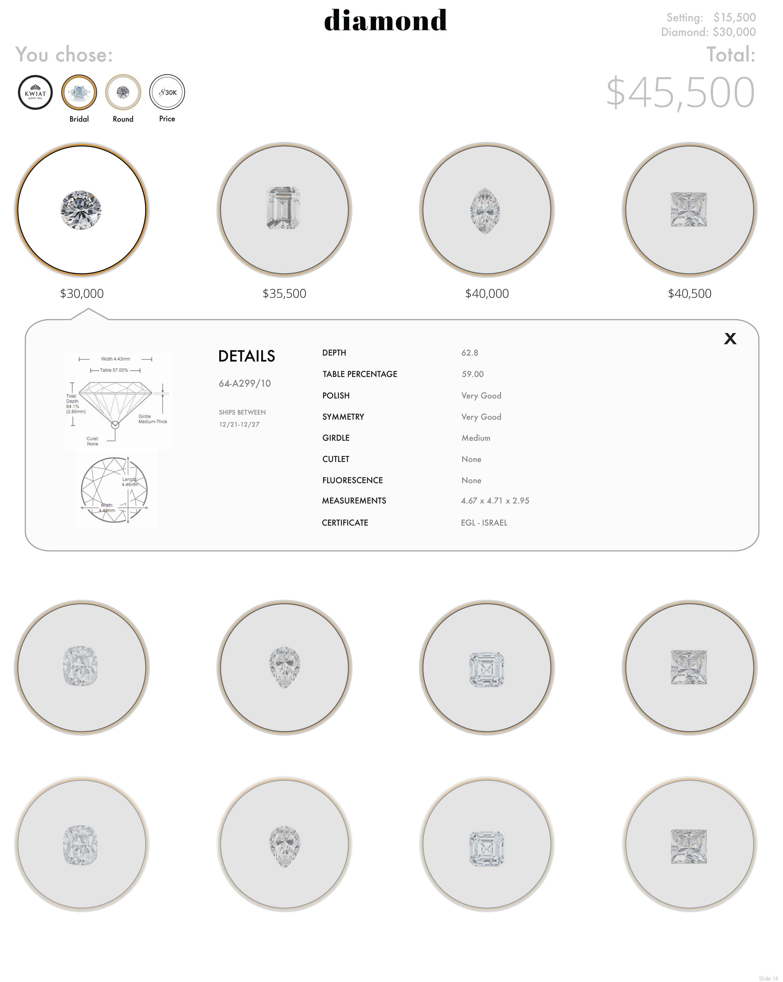
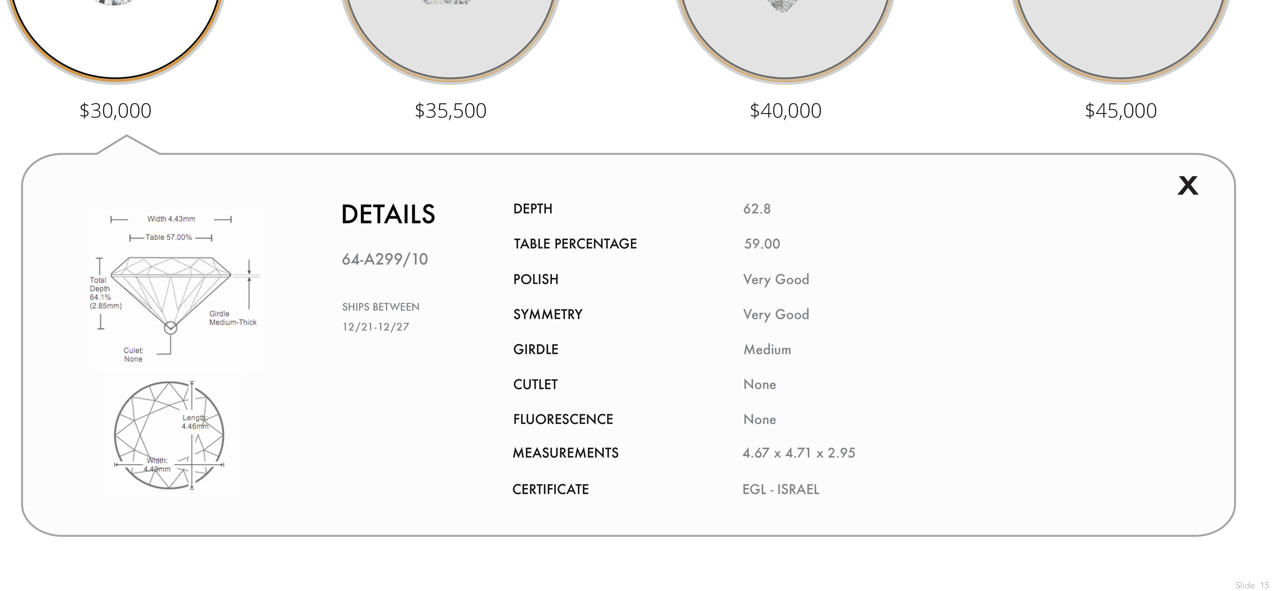
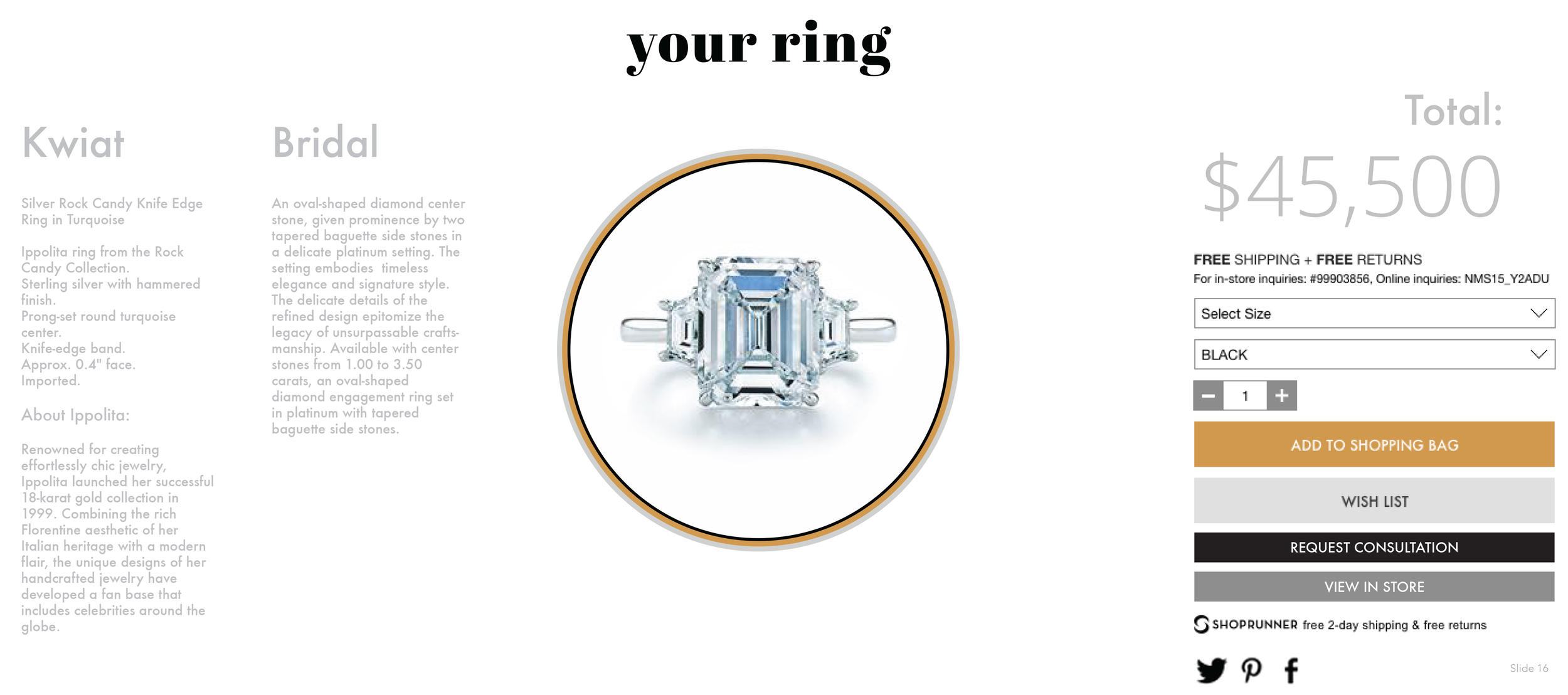
CLIENT NEEDS
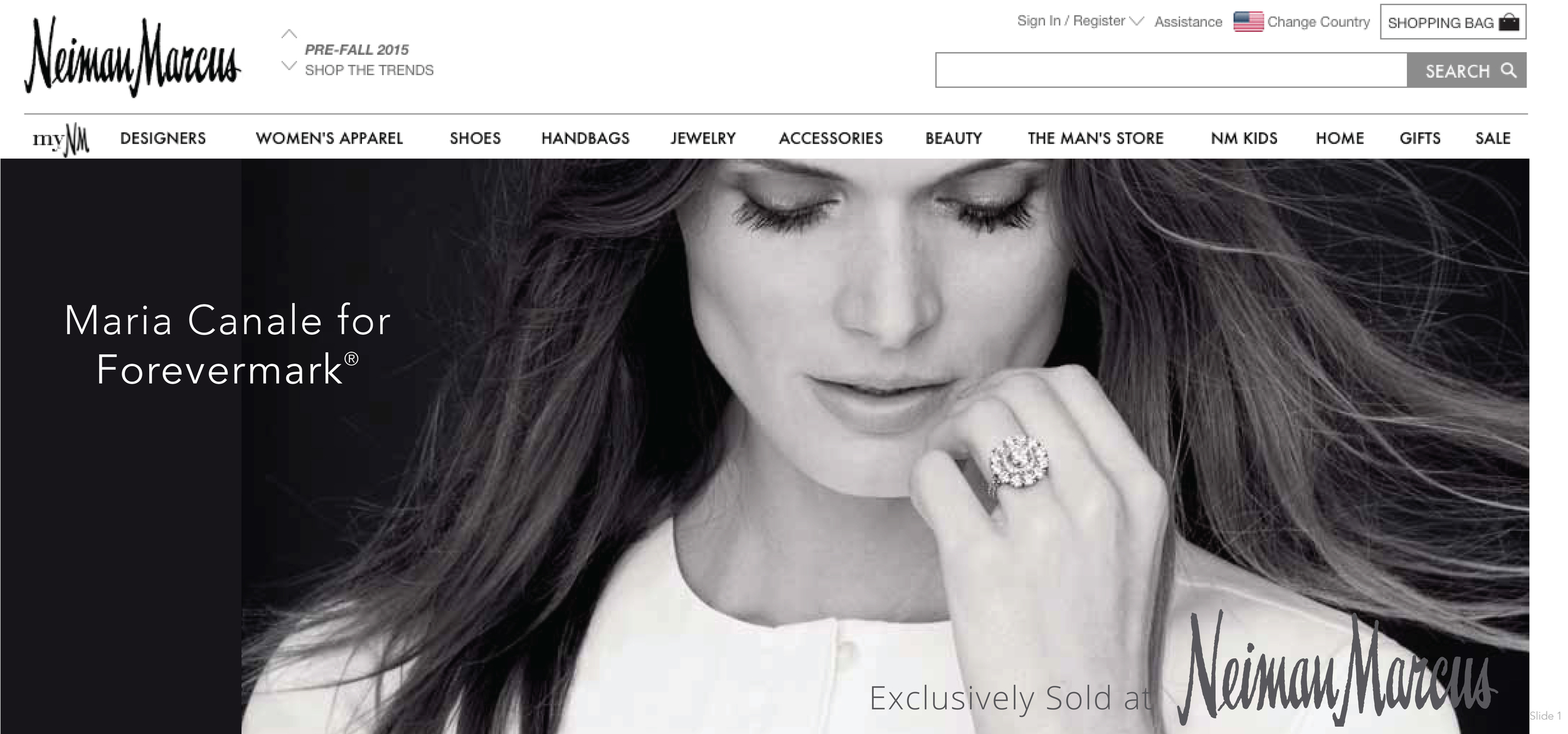
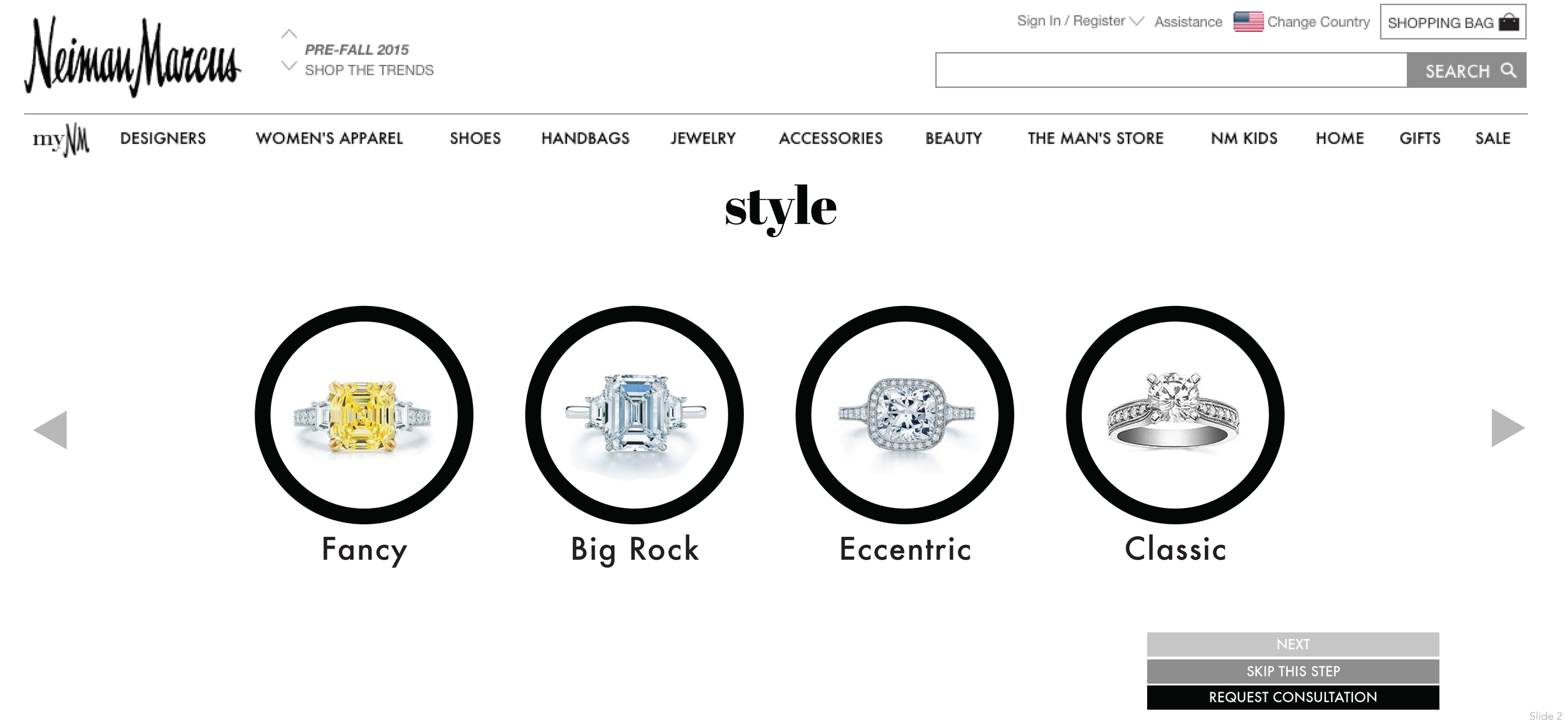
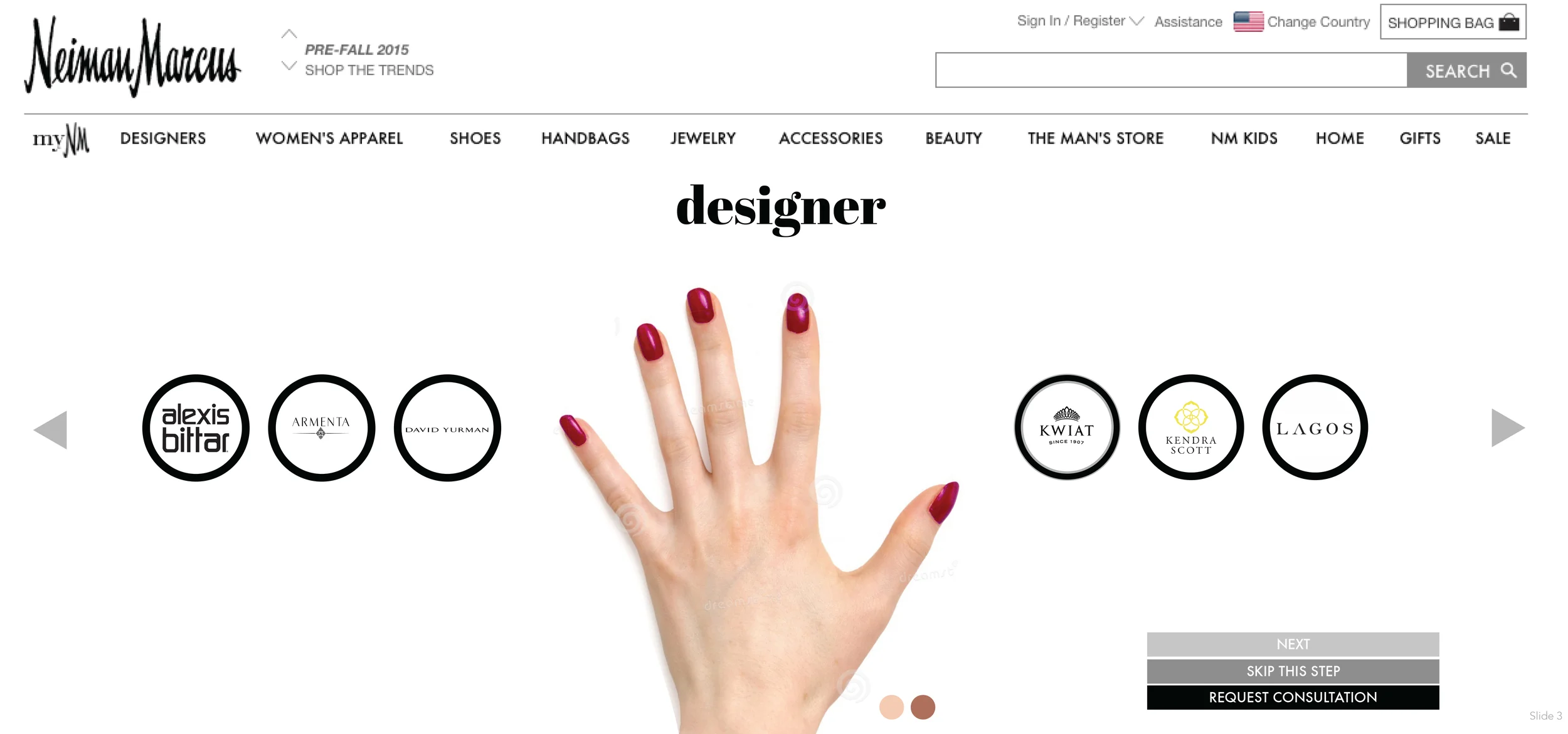
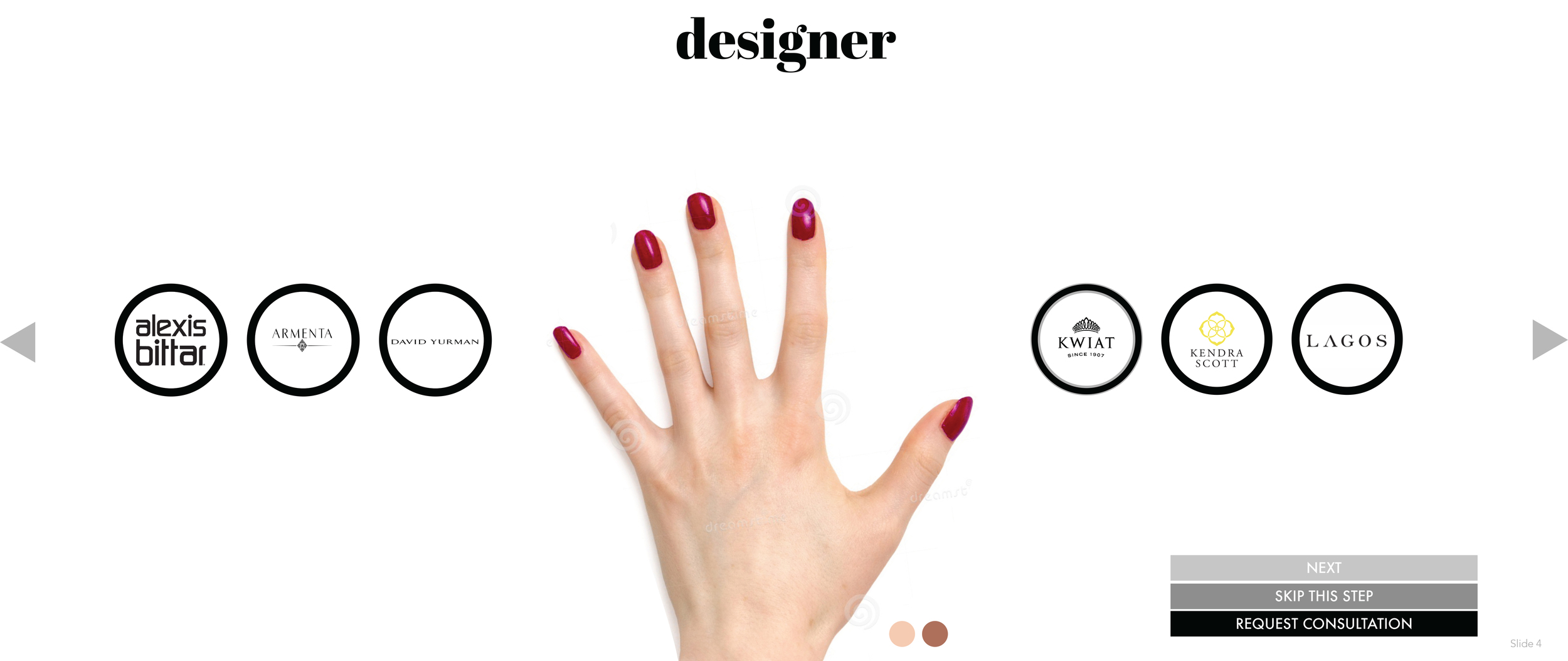
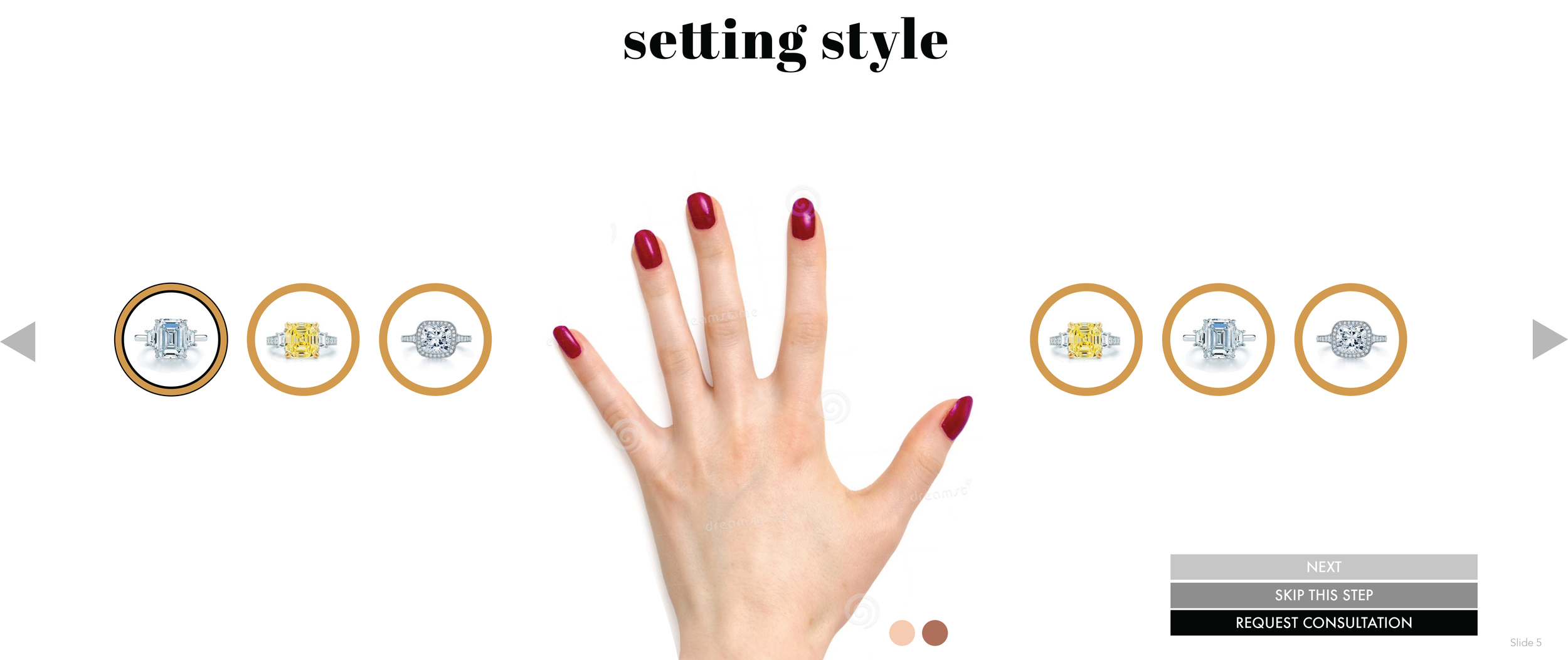
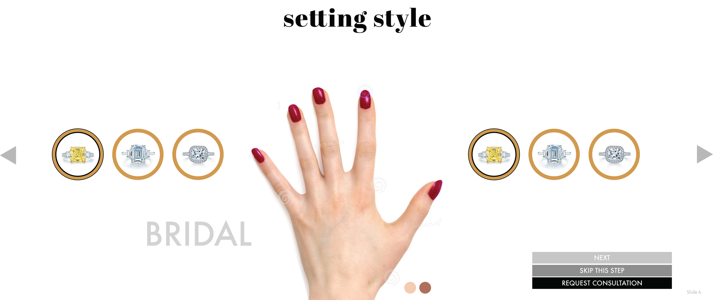
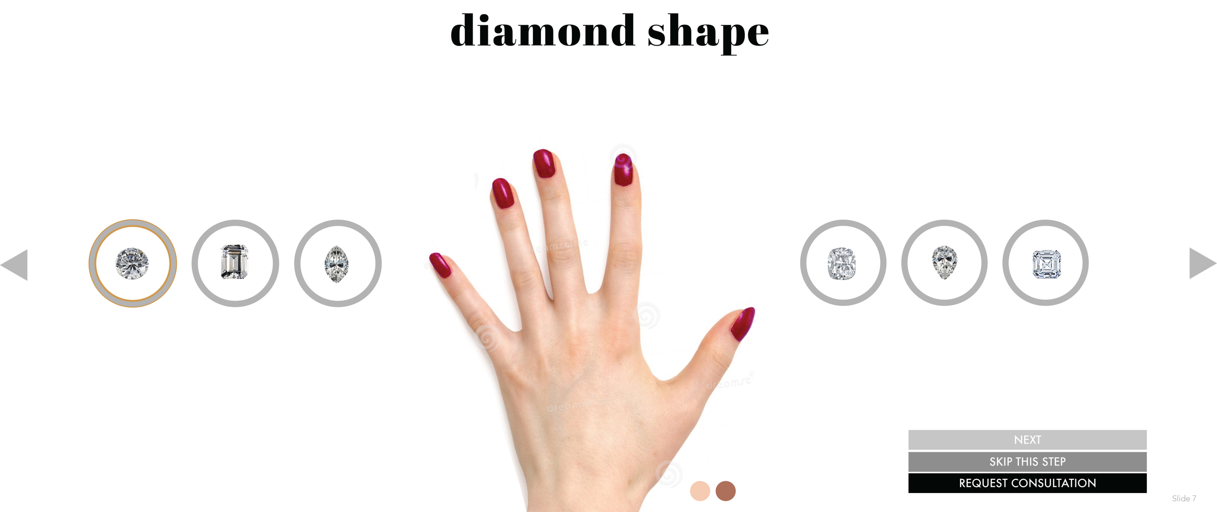
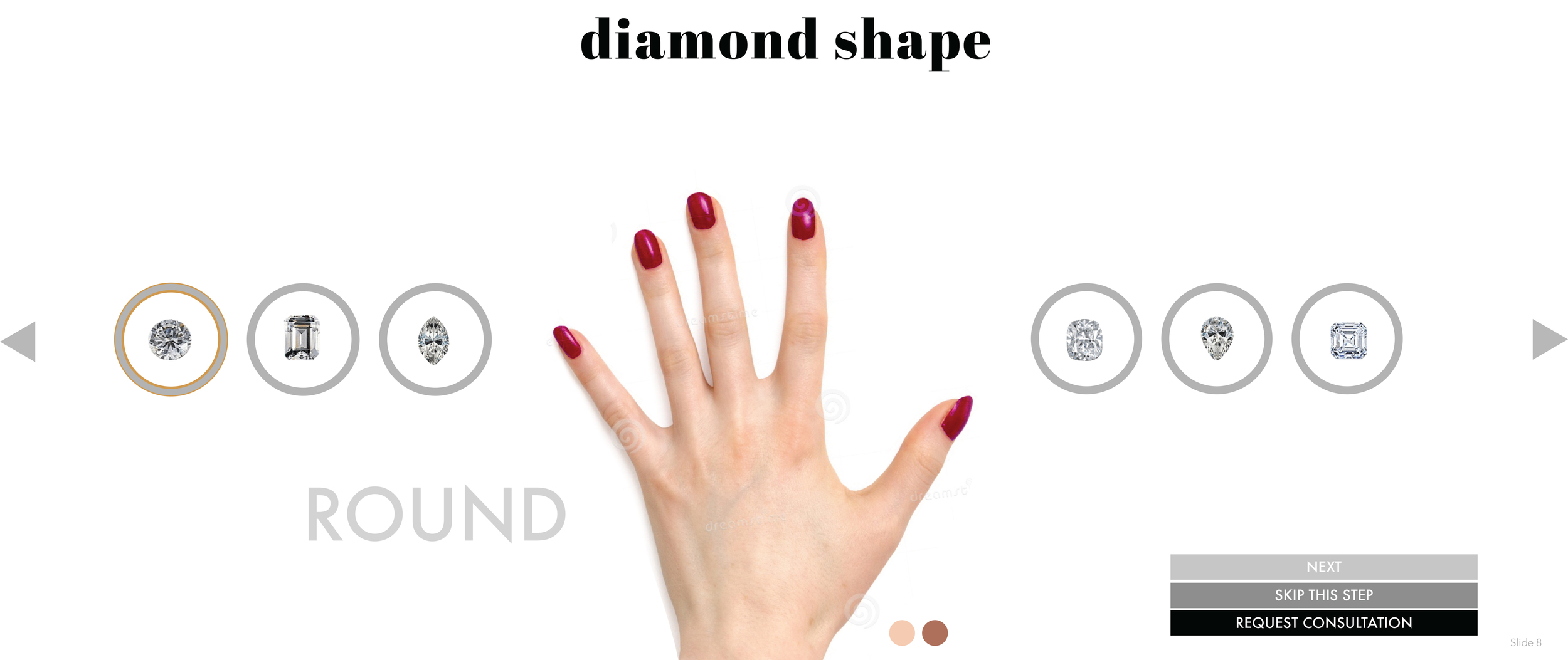
Diamond distributor WRCOBB wanted a digital tool to assist in the customization of diamond rings. They aspired to then pitch this service to Neiman Marcus, while needing to align the subsequent app with the aesthetic of the Neiman Marcus brand.
DESIGN SOLUTION
We first created a detailed mobile and desktop app, guiding users to choose a stone, ring, and setting. Using pale blues, gradients, and extensive user testing, the UI/UX is clear, beautiful, and easy to use.
Through researching Neiman Marcus' web and print collateral, the diamond customization tool successfully mirrors typefaces, color palettes, and general layout of the upscale Neiman Marcus brand, while also functioning parallel to the original app we created.
MY ROLE
I worked with a team of designers to execute the UI/UX for the WRCOBB app. From there, I was the lead designer creating the UI/UX design to fit on the Neiman Marcus website. This project was completed while I was employed at Bee Line Communications.
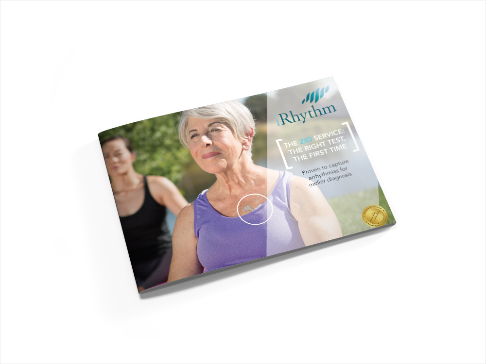
CLIENT NEEDS
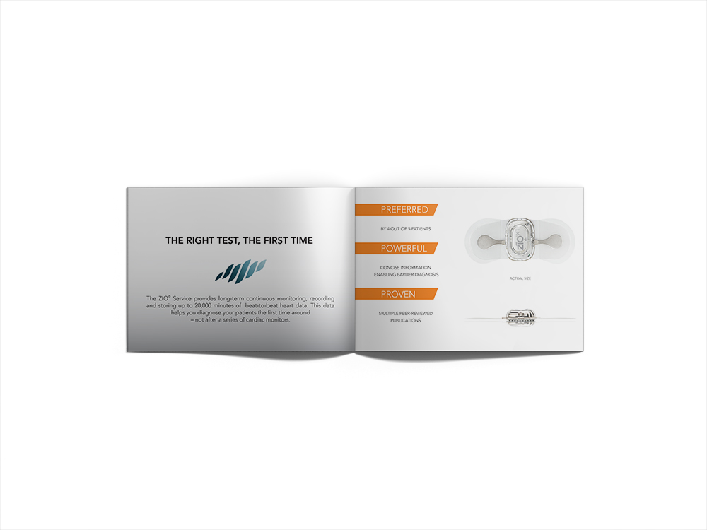
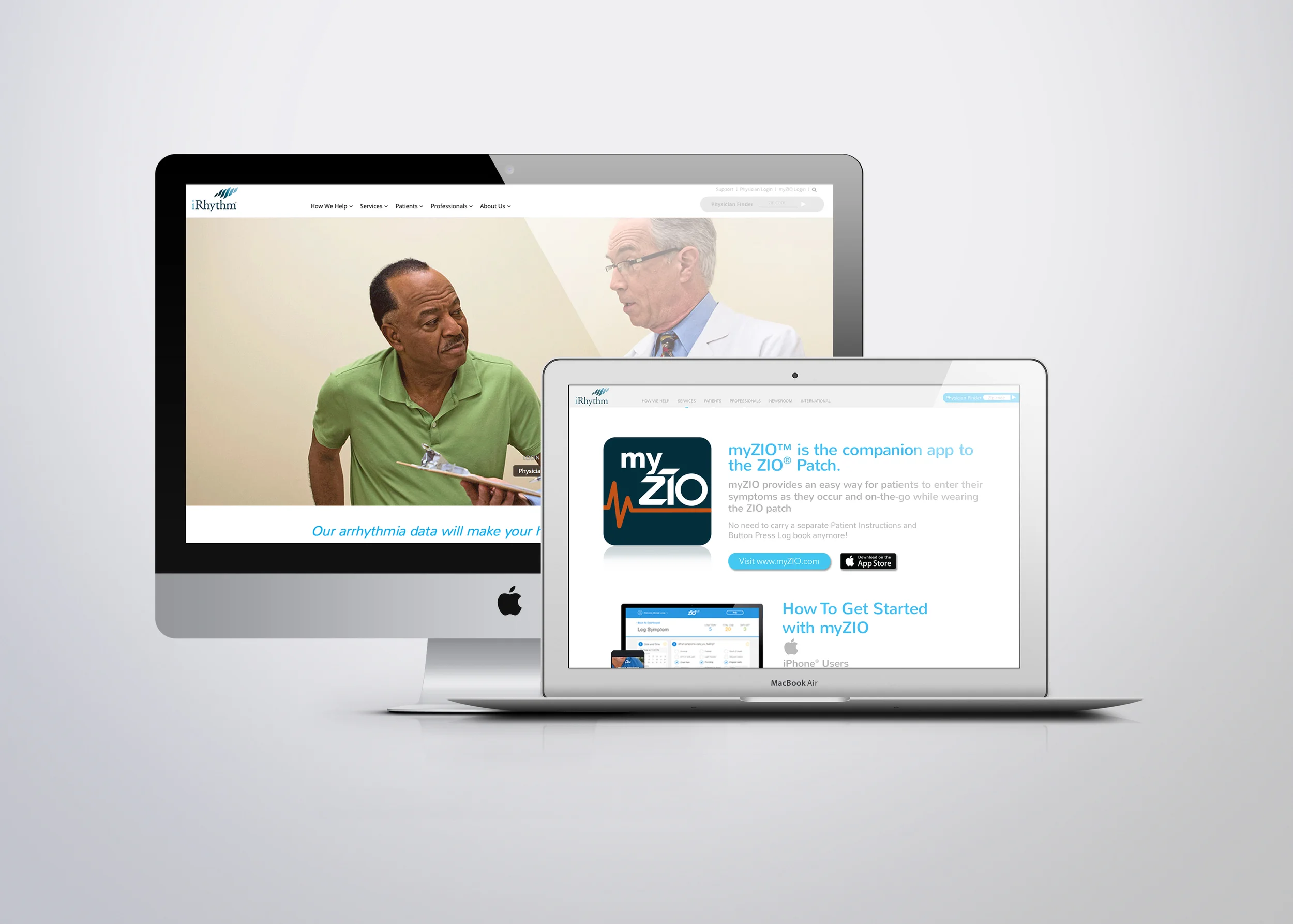
IRhythm, a healthcare company providing state of the art heart monitoring technologies, wanted a catalogue and web banners matching their aesthetic.
DESIGN SOLUTION
Through an exhaustive analysis of their already created material, the design for the supportive collateral used similar photography, typefaces, and color scheme to reinforce the brand.
MY ROLE
I was the sole designer of the catalogue and one of three supportive designers in the creation of complimentary web banners. This project was completed while I worked for Bee Line Communications.
CLIENT NEEDS
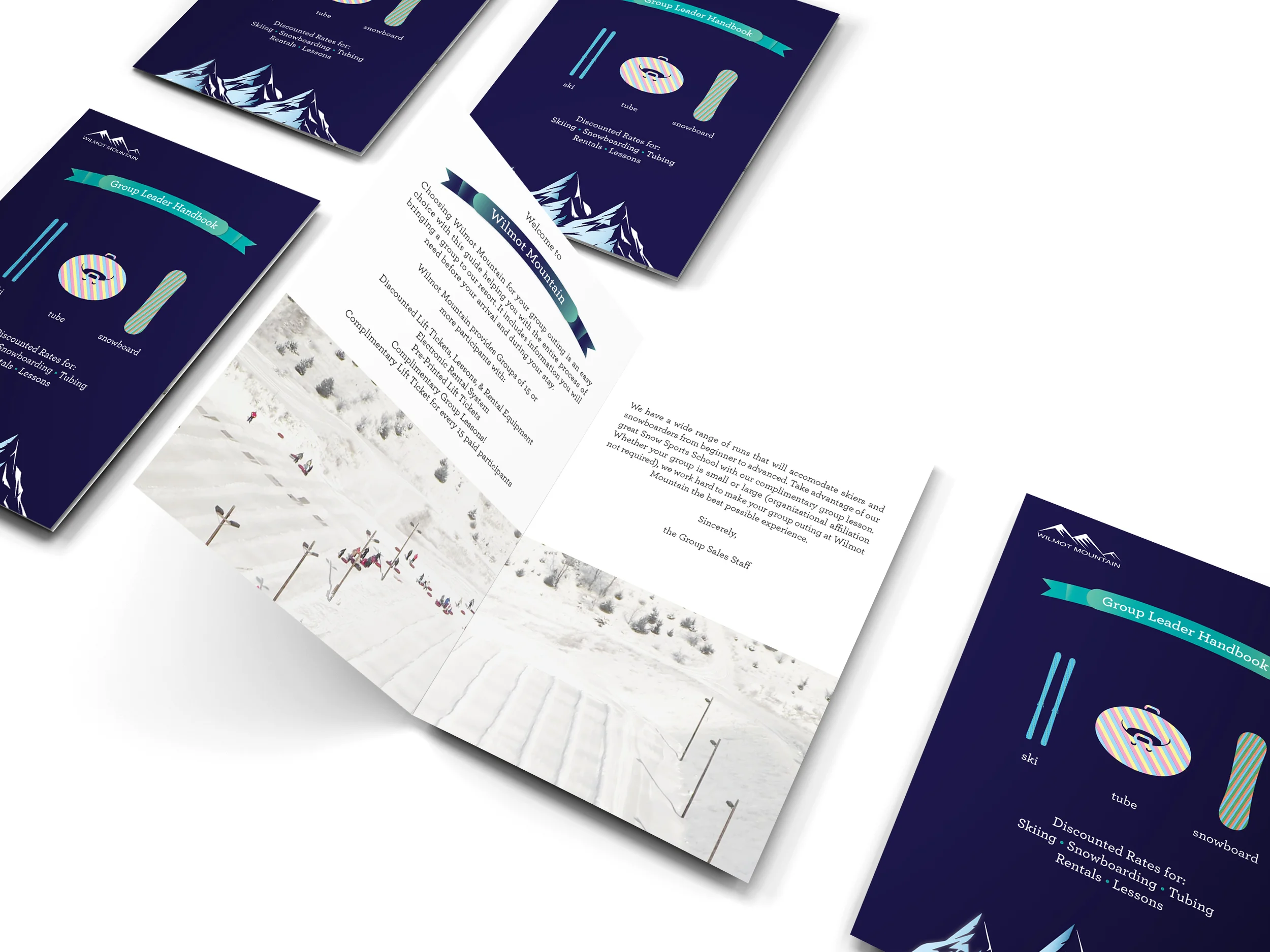
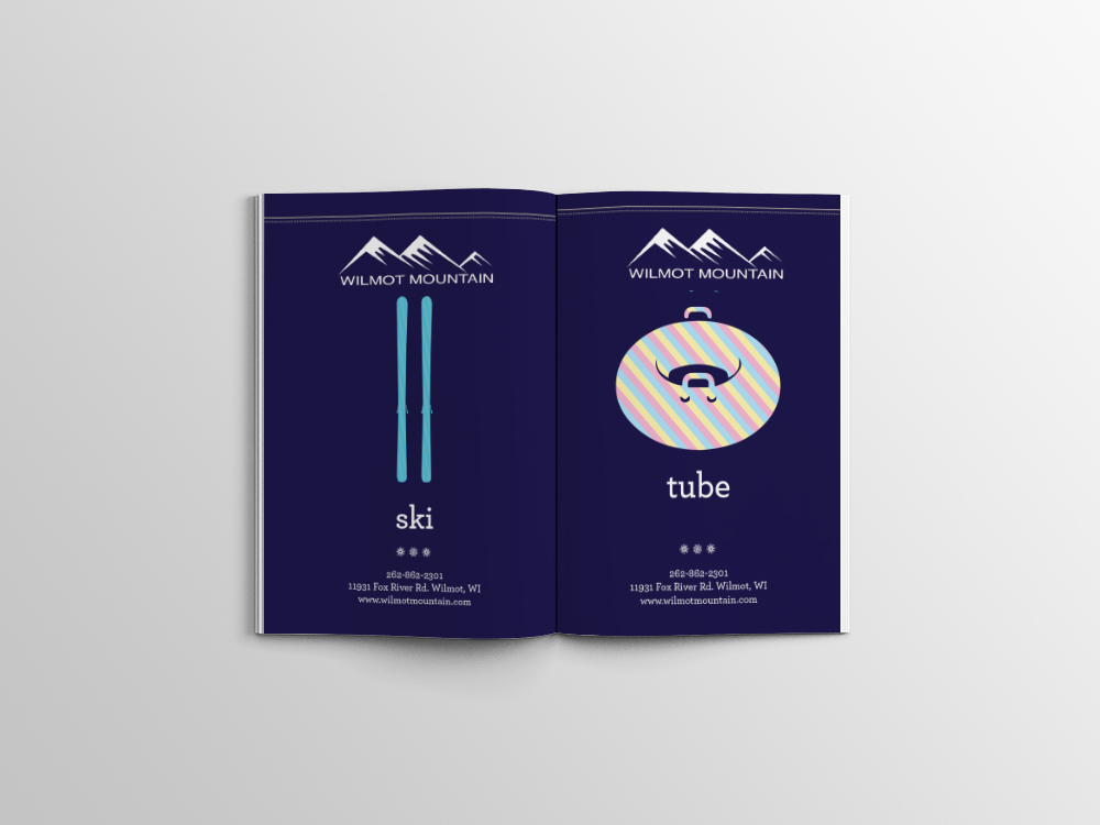
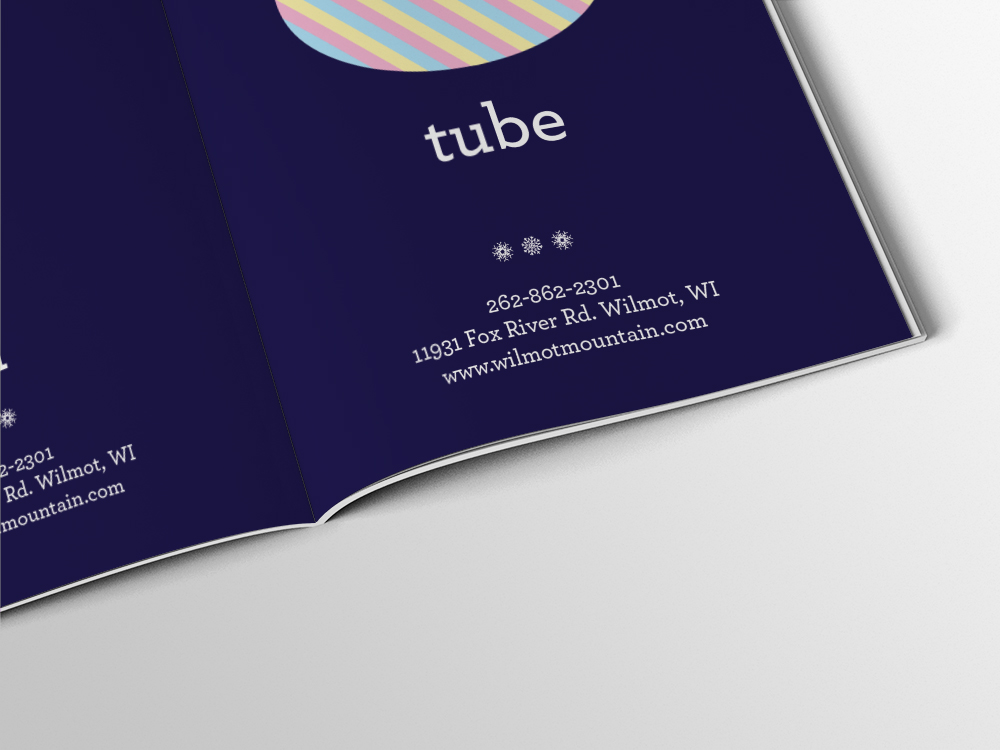
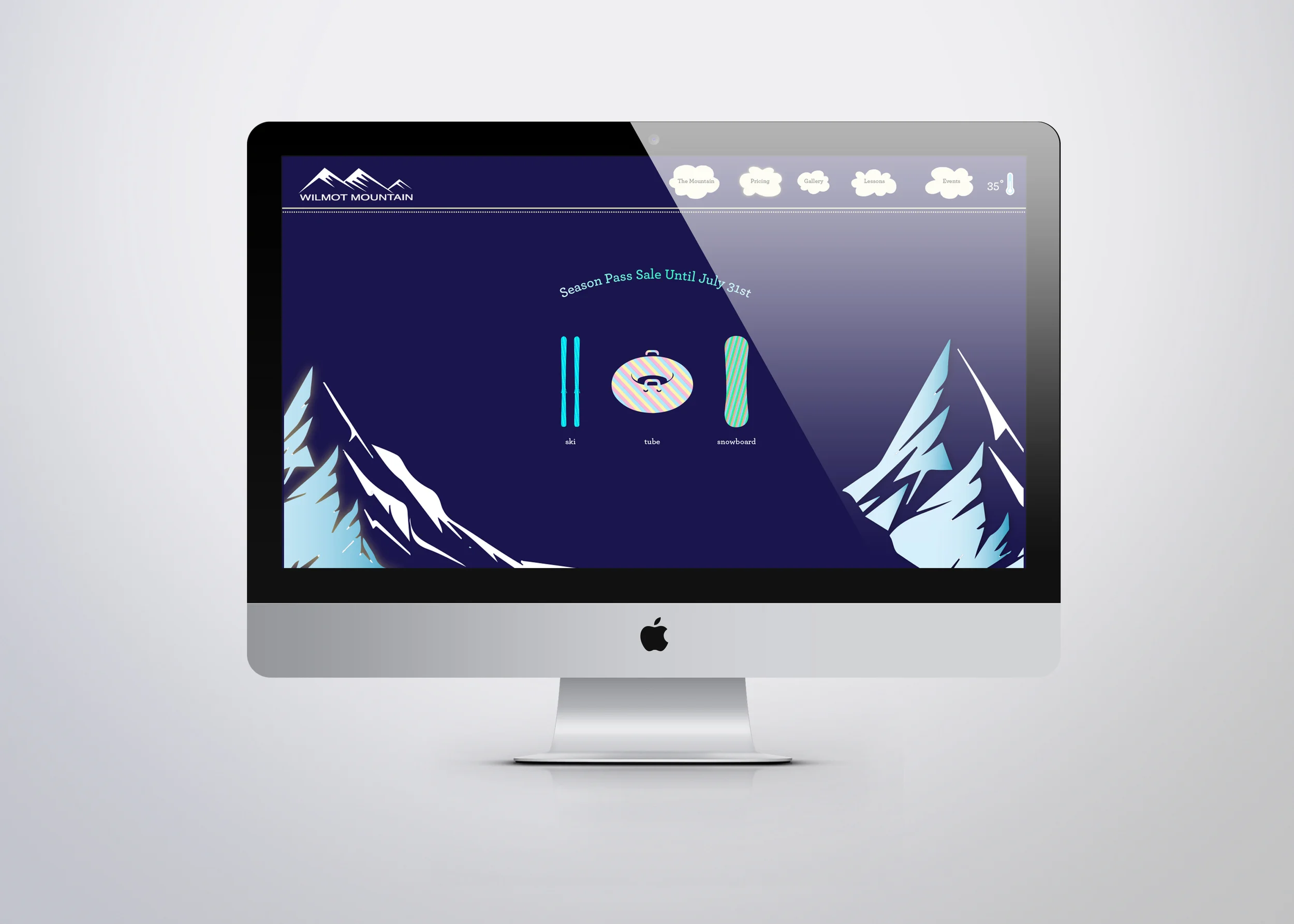
The managers at Wilmot Mountain in Wisconsin, seeked a refreshed brand identity that could be applied across web platforms and print material. Wilmot Mountain wanted to evolve toward a brand that matched their family friendly services of skiing, snowboarding, and tubing.
DESIGN SOLUTION
The typefaces, colorful patterns, and illustrated elements contribute to a playful design, appealing to children, adults, and families.
MY ROLE
I was the lead designer on this project, aesthetically pairing web concepts with brochures and potential print advertisements. I worked on this project while at Bee Line Communications.
CLIENT NEEDS
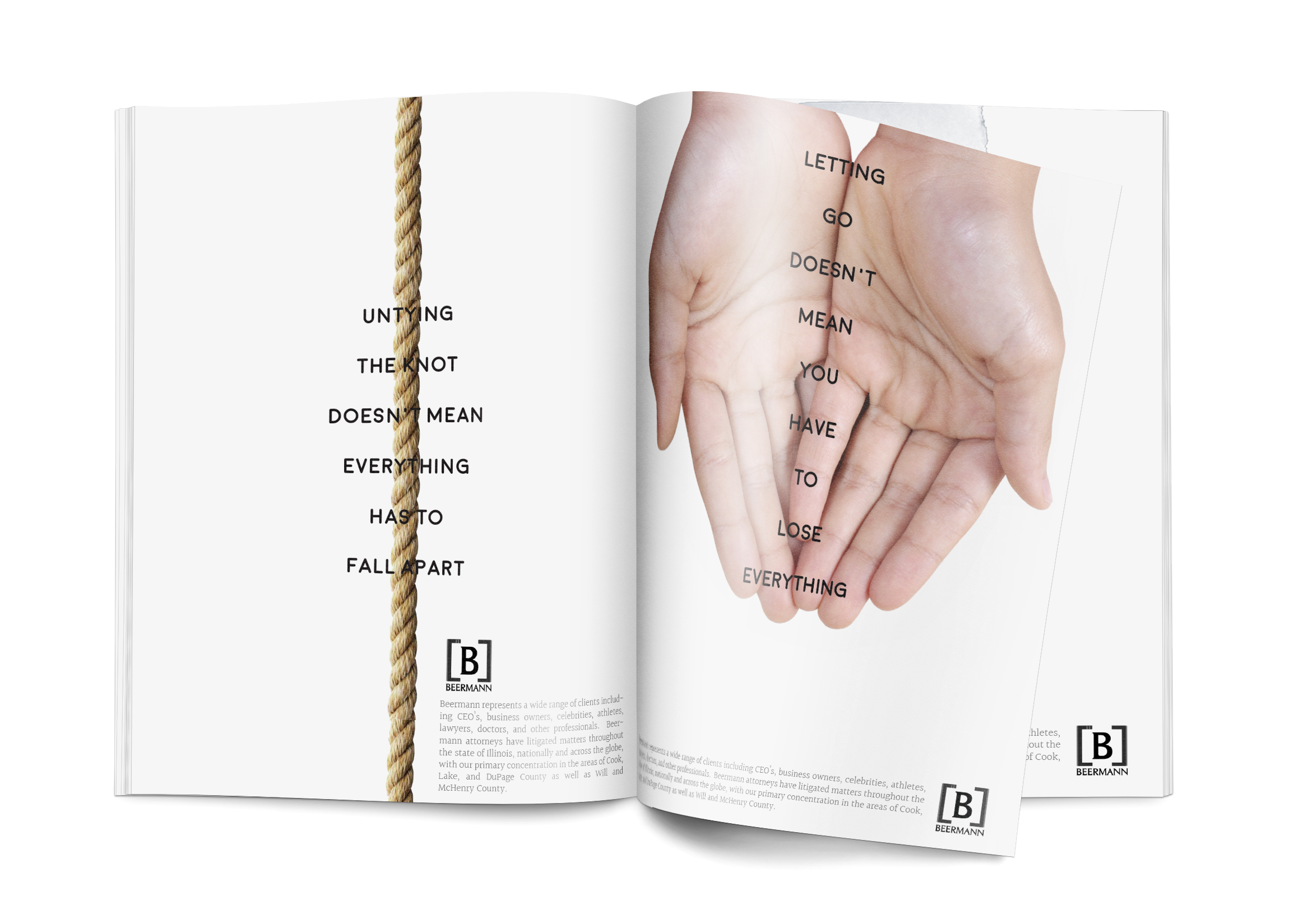
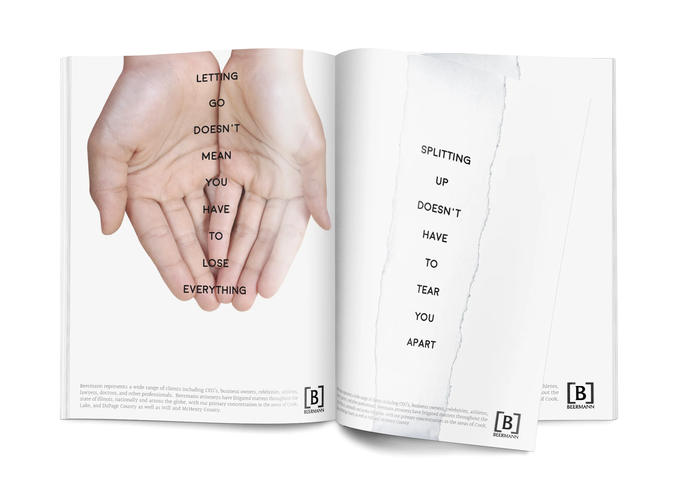
Beermann Law, a Chicago based divorce attorney, seeked to refresh their brand both through visual design and copy. They wanted their brand to feel safe, modern, and respectful of couples who were considering a divorce.
DESIGN/COPY SOLUTION
The simple use of text overlayed onto photography and the use of white space achieve the desired impact of the brand feeling secure and empathetic. The copy is comforting, sensitive, and considerate toward potential clients who are dealing with the prospect of divorce.
MY ROLE
I designed and wrote the complimentary copy for potential print advertisements, while working at Bee-Line Communications.
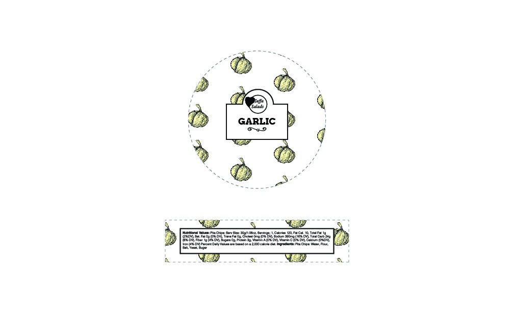
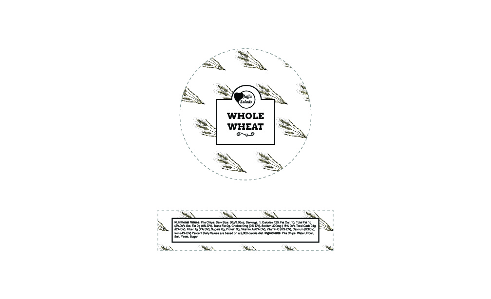
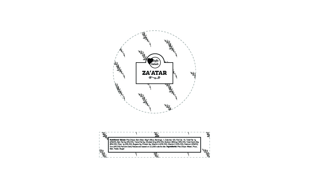
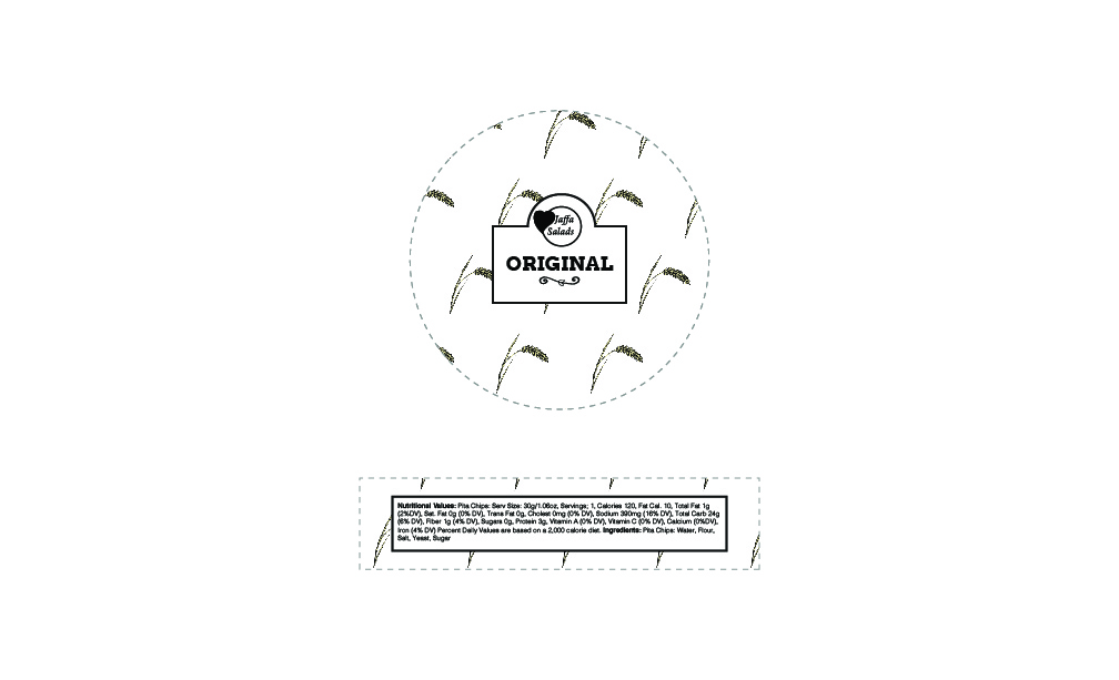
CLIENT NEEDS
Jaffa Salads is a Chicagoland Pita Chip company that has unique Hummus and Guacamole Recipes. They wanted a brand that felt fresh, organic, and elegant. These are the front and side labels that are used on a snack pack for 4 flavors of their Pita Chips.
DESIGN SOLUTION
Using hand-done illustrations, pattern, white space, and a modern typeface, the result matches the client's branding goal.
MY ROLE
I designed the front and side labels, working directly with the client to match their needs.